Talk:Yvonne Hartman: Difference between revisions
No edit summary |
|||
| (10 intermediate revisions by 5 users not shown) | |||
| Line 8: | Line 8: | ||
== Infobox image == | == Infobox image == | ||
[[File:Yvonne Hartman.JPG|right]] | [[File:Yvonne Hartman.JPG|thumb|right]] | ||
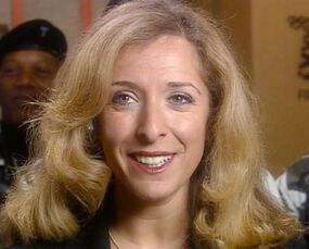
I changed the infobox image to the one to the right some time ago but have removed it as there was no discussion. I'd like to formally suggest that it replace the current one, which has people other than Yvonne in frame and isn't as closely cropped on her face. -- [[User:Jack "BtR" Saxon|Saxon]] ([[User talk:Jack "BtR" Saxon|✉️]]) 15:50, October 10, 2019 (UTC) | I changed the infobox image to the one to the right some time ago but have removed it as there was no discussion. I'd like to formally suggest that it replace the current one, which has people other than Yvonne in frame and isn't as closely cropped on her face. -- [[User:Jack "BtR" Saxon|Saxon]] ([[User talk:Jack "BtR" Saxon|✉️]]) 15:50, October 10, 2019 (UTC) | ||
:If we're going to change it, it needs to be cropped much more closely. See [[Tardis:Guide to images]] for our cropping standards. [[User:Shambala108|Shambala108]] [[User talk:Shambala108|<span title="Talk to me">☎</span>]] 16:53, October 10, 2019 (UTC) | |||
:::Cropped. -- [[User:Jack "BtR" Saxon|Saxon]] ([[User talk:Jack "BtR" Saxon|✉️]]) 17:12, October 10, 2019 (UTC) | |||
[[File:YvonneWithTroops cropped.jpg|thumb]] | |||
::::Honestly, I'd rather maintain the current file, but crop it (indeed, I've uploaded a cropped version of it for this discussion's sake). Sure, there still is a background character, but that's it - only background. And the current file has the advantage of Yvonne looking towards the text. [[User:OncomingStorm12th|OncomingStorm12th]] [[User talk:OncomingStorm12th|<span title="Talk to me">☎</span>]] 00:30, October 11, 2019 (UTC) | |||
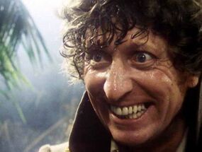
Neither image is cropped enough. See this image of the [[Fourth Doctor]]? This is taken from the cropping section of [[Tardis:Guide to images]] and should be used as a guideline for how much to crop. [[User:Shambala108|Shambala108]] [[User talk:Shambala108|<span title="Talk to me">☎</span>]] 01:05, October 11, 2019 (UTC) | |||
[[File:FourTypicalSmile.jpg|thumb|right]] | |||
:Surely at least the first one is cropped well enough. It's cropped far closer than, say, the [[Eleventh Doctor|Eleventh]] or [[Twelfth Doctor]]'s. -- [[User:Jack "BtR" Saxon|Saxon]] ([[User talk:Jack "BtR" Saxon|✉️]]) 01:10, October 11, 2019 (UTC) | |||
:Hey. Going to quickly chip in that the Eleventh and Twelfth Doctor's images were decided after '''lengthy''' discussions rather than quick fire image changes. Images are also meant to meet other criteria like facing the article and being suitable for mobile devices (which the Fourth Doctor image also covers). The way the Yvonne proposal has been cropped is clearly '''different''' from the guideline photo and the one we currently use. Cheers :D [[User:Snivystorm|<font face="Georgia"><font color="#1E90FF">''Snivy''</font></font>]]<font face="Arial"><font color="dodgerblue"> </font> [[User talk:Snivystorm|<small style="border-style: initial; border-color: initial; "><font face="Cambria"><font color="Grey">✦ ''The coolest Pokemon ever'' ✦</font></font></small>]]</font> 10:43, October 11, 2019 (UTC) | |||
::Lengthy discussion notwithstanding, it doesn't change the fact that almost 50% of the Eleventh Doctor's infobox image is blank space. But that's neither here nor there - I'd support Yvonne's infobox image being changed to either of the ones above whilst failing to understand how the first should be cropped. -- [[User:Jack "BtR" Saxon|Saxon]] ([[User talk:Jack "BtR" Saxon|✉️]]) 11:10, October 11, 2019 (UTC) | |||
:::Yvonne may be looking more centre than left (looking left is not a hard rule, but definitely a priority unless options are limited), but the first image suggestion in this section is a far better candidate than the image currently in the infobox, which lacks sufficient contrast for a clear view of the subject. She is against a backdrop the same colour as her hair in the current image, and there is a distracting second face in the corner.{{User:SOTO/sig}} 02:25, July 9, 2020 (UTC) | |||
::::To clarify, I am referring to the version of the file at the top of this section which was ''later'' uploaded on 13 October 2019. The version commented upon above was indeed in need of cropping. The current crop is what we were looking for.{{User:SOTO/sig}} 02:30, July 9, 2020 (UTC) | |||
Latest revision as of 02:30, 9 July 2020
Would it be too egotistical to add to/replace this with my summary of her in the Torchwood Institute entry? --The Professor 23:37, 6 September 2006 (UTC)
- Nope. If you feel guilty about it, just keep a couple of words in here and there. Azes13 23:49, 6 September 2006 (UTC)
Yvonne's Fate?[[edit source]]
What happened to her when the breach was opened? Was she sucked into the Void like the parallel universe Cybermen? Curious about this, since as far as I know, the converted Torchwood One employees weren't sucked in. Proof of this is Lisa Hallett who was 'partially converted' (and if the 'void stuff' was part of the conversion process, surely she was converted enough to be sucked in). Spaceyavin ☎ 09:13, April 21, 2013 (UTC)
Infobox image[[edit source]]
I changed the infobox image to the one to the right some time ago but have removed it as there was no discussion. I'd like to formally suggest that it replace the current one, which has people other than Yvonne in frame and isn't as closely cropped on her face. -- Saxon (✉️) 15:50, October 10, 2019 (UTC)
- If we're going to change it, it needs to be cropped much more closely. See Tardis:Guide to images for our cropping standards. Shambala108 ☎ 16:53, October 10, 2019 (UTC)
- Honestly, I'd rather maintain the current file, but crop it (indeed, I've uploaded a cropped version of it for this discussion's sake). Sure, there still is a background character, but that's it - only background. And the current file has the advantage of Yvonne looking towards the text. OncomingStorm12th ☎ 00:30, October 11, 2019 (UTC)
Neither image is cropped enough. See this image of the Fourth Doctor? This is taken from the cropping section of Tardis:Guide to images and should be used as a guideline for how much to crop. Shambala108 ☎ 01:05, October 11, 2019 (UTC)
- Surely at least the first one is cropped well enough. It's cropped far closer than, say, the Eleventh or Twelfth Doctor's. -- Saxon (✉️) 01:10, October 11, 2019 (UTC)
- Hey. Going to quickly chip in that the Eleventh and Twelfth Doctor's images were decided after lengthy discussions rather than quick fire image changes. Images are also meant to meet other criteria like facing the article and being suitable for mobile devices (which the Fourth Doctor image also covers). The way the Yvonne proposal has been cropped is clearly different from the guideline photo and the one we currently use. Cheers :D Snivy ✦ The coolest Pokemon ever ✦ 10:43, October 11, 2019 (UTC)
- Lengthy discussion notwithstanding, it doesn't change the fact that almost 50% of the Eleventh Doctor's infobox image is blank space. But that's neither here nor there - I'd support Yvonne's infobox image being changed to either of the ones above whilst failing to understand how the first should be cropped. -- Saxon (✉️) 11:10, October 11, 2019 (UTC)
- Yvonne may be looking more centre than left (looking left is not a hard rule, but definitely a priority unless options are limited), but the first image suggestion in this section is a far better candidate than the image currently in the infobox, which lacks sufficient contrast for a clear view of the subject. She is against a backdrop the same colour as her hair in the current image, and there is a distracting second face in the corner.
× SOTO (☎/✍/↯) 02:25, July 9, 2020 (UTC)
- Yvonne may be looking more centre than left (looking left is not a hard rule, but definitely a priority unless options are limited), but the first image suggestion in this section is a far better candidate than the image currently in the infobox, which lacks sufficient contrast for a clear view of the subject. She is against a backdrop the same colour as her hair in the current image, and there is a distracting second face in the corner.
- Lengthy discussion notwithstanding, it doesn't change the fact that almost 50% of the Eleventh Doctor's infobox image is blank space. But that's neither here nor there - I'd support Yvonne's infobox image being changed to either of the ones above whilst failing to understand how the first should be cropped. -- Saxon (✉️) 11:10, October 11, 2019 (UTC)


