Tardis:Infobox images: Difference between revisions
No edit summary Tag: sourceedit |
No edit summary Tag: sourceedit |
||
| Line 1: | Line 1: | ||
{{mosnav|p=Infoboxes|c=Infobox policies|you may=[[Tardis:Image policy]]}} | {{mosnav|p=Infoboxes|c=Infobox policies|you may=[[Tardis:Image use policy]]}} | ||
{{moss|Choose [[:category:infoboxes|'''Infobox''']] images wisely. And make 'em at least 420px wide, please.}} | {{moss|Choose [[:category:infoboxes|'''Infobox''']] images wisely. And make 'em at least 420px wide, please.}} | ||
{{sc|T:IBOX PICS}} | {{sc|T:IBOX PICS}} | ||
Revision as of 23:20, 24 May 2017

|
Don't let a pretty face ignite a war → Infobox images You may be also looking for Tardis:Image use policy |
Infobox pictures should be the best possible illustration of the subject of the article, across mobile, desktop and app views of our wiki.
Mobile is when everything changes, and we've got to be ready.
Portable infobox code allows the infobox image to be as wide as the device on which it's viewed. Ironically, this means infobox pictures can be bigger on phones than they are on desktop!
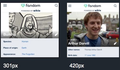
For the benefit of our sizable mobile audience, infobox images should have a minimum natural width of 420px wide. This allows the infobox code to automatically resize the picture so that it will fill the width of most phone screens. See the difference, below, between an image that's naturally 301px and one that's 420px.
Widescreen preferred
Furthermore, it's preferred that images be cropped to a widescreen aspect ratio. For best results, and relatively easy math, a good one to use is the AR of BBC Wales programming in general: 1.77:1. So, if you're aiming for a 420px width, you know that your height would be 420 / 1.77, or 237px. A pic that's 420px wide x 237px tall will fit these requirements. Make a blank template with those dimensions in an image editor, and you can easily achieve exactly the right size, every time. Easy!
To help future proof against ever-widening phones, it's not a horrible idea to go for 500px widths. If you did, then your height would be 282px.
Portrait guidelines
While widescreen images are certainly preferred, we know there are times where a widescreen image just isn't possible. Some comic panels, for instance, are portrait-orientated, making it hard to get a widescreen image. Even so, if your aspect ratio is really small (meaning that the picture has significantly more height than width), you can test the limits of what the infobox code can handle.
For portrait orientation, try to hit an aspect ratio of no less than .75. Once you hit an AR of less than .5 (that is, your height is more than double your width), the infobox will become unnecessarily long on desktop, and it'll become so truncated on mobile as to be unhelpful.
Book and magazine covers
Obviously, book and magazine covers are naturally portrait oriented, unless the book itself has a very odd shape. Make your image exactly fit the entire cover. It'll look fine on desktop -- and it'll be the best it can be in mobile environments. In the case of covers, we want the whole thing, no matter what gets truncated on mobile.
Hold on a second ...
Longtime editors of the site will see the immediate challenge of this requirement. For around a decade, we had a rule that said the natural width of an image had to be at least 250px. So we've built up a library of images that are smaller than 420px. Does this mean that previously "law abiding" images will be summarily deleted?
No. And yes.
This rule definitely should not be taken to mean, "Kill all the < 420px images." Obvious exception should be taken for images that really can't be blown up any more. Some characters are so minor as to not be dominant in a frame, no matter how hard you try. And if the image comes from a low-resolution 1960s programme -- or a Polystyle comic strip -- it can be even more challenging. But you should at least try to meet the 420px before giving up. And if you can't hit the 420px threshhold, you should leave {{narrow pic}} on the filepage that you can't figure out how to make the pic work better.
Good examples of < 420px pics that should be tagged and kept are:
However, if the source material would obviously and easily allow for an image of a greater size to be taken, admin are at complete liberty to delete existing, smaller images without warning.
For instance, if an image of Sarah Jane from Pyramids of Mars were 250px, it could be safely and immediately deleted. It's obviously possible and easy to get a better screenshot from a DVD these days.

