Doctor Who logo: Difference between revisions
| Line 124: | Line 124: | ||
Image:Title9a.png|Logo Nine, 2005 | Image:Title9a.png|Logo Nine, 2005 | ||
Image:2007 S3 title Logo.jpg|Logo Ten, 2006-2009 | Image:2007 S3 title Logo.jpg|Logo Ten, 2006-2009 | ||
Image: | Image:DW-Logo-2010.png|Logo Eleven, 2010- | ||
</gallery> | </gallery> | ||
Revision as of 20:36, 6 January 2010
Over the decades, numerous logos have been introduced for the Doctor Who series and associated merchandise.
Though a coincidence, with the upcoming redesign and regeneration, the Eleventh Doctor will see the introduction of the eleventh logo, though the logo has not always changed with each Doctor (e.g. Logo Nine was used for the Tenth Doctor for a time).
Television
1960s
Logo One
Used from 1963 to 1966, Season 1 to Season 4
This logo was a simple white text on a black background, it was used to great effect to create the title sequence. It is associated with William Hartnell's tenure as the First Doctor. It remained in use for Patrick Troughton's first few stories up through The Moonbase. It saw some use on merchandising such as Doctor Who Annual and the Frederick Muller novelisations. Much later, in the 1980s, Marvel Comics combined Logo One with elements of Logo Four for its Doctor Who comic book.
Logo Two
Used from 1966–1969, Season 4 - Season 6
This logo made its first appearance with The Macra Terror. The font was altered to Times New Roman, a completely new "howlaround" pattern was created and Patrick Troughton's face was added for the first time. Initially it used the same music as the previous logo, but starting from Episode 2 of The Faceless Ones, a new arrangment of the theme replaced the old one. It does not appear to have been widely used on merchandising, though it did appear on the record release Doctor Who: Variations on a Theme years later. A variation utilizing thicker, sans serif lettering was used by Target Books on its earliest novelisations before moving into a variant of Logo Four.
1970s
Logo Three
Used from 1970–1974, Season 7 - Season 10
Primarily associated with Jon Pertwee's time as the Third Doctor. While the title sequence was shown in colour, in order to achieve an effect similar to previous sequences it was originally designed in black and white.
This served as the basis of the logo initially created for Doctor Who: The TV Movie; - see Logo Eight below.
Logo Four
Used from 1974–1980, Season 11 - Season 17
Known informally as the "diamond logo" and commonly associated with Tom Baker's time as the Fourth Doctor, this logo was actually introduced during Jon Pertwee's time as the Third Doctor for his final season. Although known as the diamond logo, in fact the diamond-shaped background was often omitted when the logo was used on books and other merchandise. The logo returned to service in the 1980s and 1990s when it was used for video releases of the series (in lieu of logos Five and Six).
An altered, metallic version of the Diamond Logo was used for the Virgin Missing Adventures book line, and select other tie-in publications and merchandising by Virgin in the years preceding the introduction of Logo Eight. See #Variants in other media below.
1980s
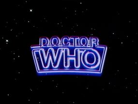
Logo Five
Used from 1980–1984, Season 18 - Season 21.
Introduced in the final season of Tom Baker's era (Season 18), this revamp of the logo complimented the new title sequence of a 'star field', it was then used throughout Peter Davison's time as the Fifth Doctor. This logo is known colloquially as the "neon sign" or "neon tube" logo. After a brief lag after its introduction the logo began to be used on merchandise such as the Target Books novelisations and Doctor Who Magazine.
Logo Six
Used from 1984–1986, Season 22 - Season 23
Introduced as Colin Baker took the role of the Sixth Doctor, this was similar to the previous logo, but tinted purple along with the rest of the title sequence giving it a more colourful hue. It also takes on a slightly curved appearance along the bottom. This variant was only used for the TV series broadcasts; all merchandise including books relating to Colin Baker's era and DWM continued to use the original version of Logo Five (except for Matt Irvine's book Special Effects).
Logo Seven
Used from 1987–1989, Season 24 - Season 26
For Sylvester McCoy's Seventh Doctor a new title sequence was produced using computer generated imagery, with the new logo being a three dimensionally animated part of the title sequence. The logo was subsequently adopted by DWM and the Target Books line, as well as for merchandise. Following the TV series' end in 1989 this logo would continue to be used for the Virgin New Adventures novels and other merchandise including Doctor Who Magazine until the early 90s when it was replaced on most products (except the New Adventures books) by the more famous Logo Four. Its final on-screen use was for the 1993 mini-episode Dimensions in Time.
1990s
Logo Eight
Used in 1996, Doctor Who: The TV Movie
This logo was used for Doctor Who: The TV Movie, with Paul McGann as the Eighth Doctor and is in fact a modified version of the logo used in Season 7 - Season 10, changed to blue and very subtle differences in the lettering (most noticeable in the letters "C" and "R" of "DOCTOR"). A notable difference is that the TV movie presents a 3-D version of the logo, which is briefly viewed from the rear.
Following the TV movie it was used as part of BBC Eighth Doctor Adventures, from The Eight Doctors to Autumn Mist it was silver in colour, then from Interference - Book One onwards was blue in colour. It was also used for the BBC Past Doctor Adventures novels (again starting off silver and then changing to blue). During the 40th anniversary year, 2003, a variation of this logo appeared on some merchandise, with the H in WHO modified to become a 4, creating W40. Although replaced by a new logo when the series was revived in 2005, as of 2009, this logo remains the franchise's official logo on merchandise (books, DVD releases, and audio including the Big Finish Productions line) relating to the first eight Doctors. As of 2009 the logo has been in continuous use in one form or another for close to 13 years, making it the longest-running logo. (Although Logo Four has been used frequently since its introduction in 1974 and continues to be used on some merchandising in 2008 (such as comic books), it has not been used without interruption as it was supplanted by later series logos before its brief revival in the early 1990s.)
2000s
Logo Nine
Used from 2005-2006, Series 1 - Series 2
For the first time the two words of the title are presented horizontally rather than vertically, and as reported by BBC News the new design was initially controversial with some fans. This logo was used for Christopher Eccleston's tenure as the Ninth Doctor and the first series with David Tennant as the Tenth Doctor.
Logo Ten
Used from 2007 - 2010, Series 3 - 2009 Specials
This logo was a "cleaner" version of the Doctor Who logo originally designed in 2005 and featured in the 'Coming Soon' trailer. This logo is also an animated component within the title sequence moving three dimensionally during the credits. The lettering is considerably more squat than that used in Logo Nine. Introduced in The Runaway Bride as the new logo within the title sequence, this has become the logo for David Tennant's tenure as the Tenth Doctor. Variations of this logo have also been used for various merchandising and promotions, including Doctor Who Magazine, BBC trailers, the BBC Tenth Doctor Adventures book line (and, recently, the Sarah Jane Adventures novelisations), comic books, and in a modified form in the supplementary series Doctor Who Confidential. Variations include changing the shield to off-white or grey, with black lettering, a more flat gold or olive colouring for the shield, and occasional dark coloring of the shield with white lettering.
The Logo Ten variant appears to only be used for TV broadcasts, as book releases and other merchandise such as toys continue to use the original Logo Nine version.
The unveiling of a new Logo Eleven (see below) will presumably indicate a phase-out of Logo Ten. However, it is presumed that Logo Ten will continue to be used on the remaining David Tennant specials, as well as on assorted merchandise: an installment of the BBC's Quick Reads series, featuring the Tenth Doctor, has already been announced for March 2010 and its cover retains Logo Ten.
2010s
Logo Eleven
To be used beginning in 2010 and Series 5.
The BBC unveiled a new logo on 6th October 2009, which will be used starting with Series 5 in 2010.[1]
The logo returns to the two-level wording of previous Doctor Who logos, and also for the first time incorporates a third and fourth separate element - the initials DW forming the shape of the TARDIS, and also the BBC logo. (It remains to be seen, however, if the BBC part of the logo is retained for international use of the logo, or use in spin-off media such as the IDW Publishing comics or Doctor Who Magazine.)
The BBC have also released an alternate, horizontal version of the logo with the DW/TARDIS element separating the words "Doctor" and "Who". According to SFX magazine, the BBC officially refers to the Doctor Who lettering as the logo, with the DW/TARDIS graphic being referred to as the "icon". [2]
It is not yet known which version of the branding will actually be used in the opening credits of Series 5.
Other logos
Sci Fi Channel variant logo
For promoting its broadcasts of Doctor Who starting in 2006, the American Sci Fi Channel network created a unique logo. In basic shape and form the logo resembles a mix of logos Two and Three/Eight (and is very similar to that used by Target Books novelisations between 1973 and 1975), however the O is modified to include the silhouette of a man. As such the logo resembles that of the 1960s spy series The Man from U.N.C.L.E. The logo has been used on television ads, print, and on Sci Fi's website, but has otherwise never been used within the programme itself.
Logo gallery
Official on-screen logos
- Title-1a.jpg
Logo One, 1963-1966
- Title-2a.jpg
Logo Two, 1966-1969
- Title-3a.jpg
Logo Three, 1970-1974
- Title-4a.jpg
Logo Four, 1974-1980
- Title-5a.jpg
Logo Five, 1980-1984
- Title-7a.jpg
Logo Seven, 1987-1989 and 1993 (1987-1996 for merchandise)
- Eighth Doctor Logo.jpg
Logo Eight, 1996 (1996-present for merchandise)
- Title9a.png
Logo Nine, 2005
- 2007 S3 title Logo.jpg
Logo Ten, 2006-2009
Variants in other media
- TargetWhoLogo.jpg
Target Books logo, 1973-1975
Pinnacle Books logo, 1979
- WhoMarvelLogo.jpg
Marvel Comics US series logo, 1984-1985
Virgin Books variant of the Diamond Logo, 1994-1997
Death Comes to Time webcast logo, 2002
Sci Fi Channel logo, 2006-2009


