Talk:Twelfth Doctor: Difference between revisions
From Tardis Wiki, the free Doctor Who reference
Tag: sourceedit |
(→New Image: new message) Tag: sourceedit |
||
| Line 15: | Line 15: | ||
::: I kinda like it. The darker image tone fits his darker demeanour.[[User:BananaClownMan|BananaClownMan]] [[User talk:BananaClownMan|<span title="Talk to me">☎</span>]] 14:42, September 8, 2015 (UTC) | ::: I kinda like it. The darker image tone fits his darker demeanour.[[User:BananaClownMan|BananaClownMan]] [[User talk:BananaClownMan|<span title="Talk to me">☎</span>]] 14:42, September 8, 2015 (UTC) | ||
::::Do you think playing with the contrast would fix it? I've got software that can do that.<br>[[User:Guyus24|Guyus24]] ([[User talk:Guyus24|talk]]) 07:13, September 9, 2015 (UTC) | |||
Revision as of 07:13, 9 September 2015
Preparations
Does anyone else feel the Preparations section is a little too meta? Apparatjik ☎ 04:18, July 9, 2015 (UTC)
New Image
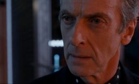
Just recently saw Kill The Moon, and I saw this particular image (on right). I've read the image policy and I'm pretty sure the image fits that.
And, to me, it looks like a better one! Anyone else got any thoughts?
Guyus24 (talk) 09:42, September 8, 2015 (UTC)
- It's kinda awkward.... OS25 (talk to me, baby.) 13:30, September 8, 2015 (UTC)
- First of all, the cropping is exactly what we want for infoboxes. However, the image itself is a bit dark. Infobox images have to be visible by viewers using any kind of device, including small cell phone screens. Shambala108 ☎ 14:37, September 8, 2015 (UTC)
- I kinda like it. The darker image tone fits his darker demeanour.BananaClownMan ☎ 14:42, September 8, 2015 (UTC)

