Title sequence
A title sequence is that part of a programme which typically gives the series title, theme music, and serial or episode name. It may also provide the names of the principal actors involved, as well as that of the writer.
Doctor Who
Historically, the title sequence has been of great interest to Doctor Who fans, especially when it has been overhauled, as at the beginning of a new actor's tenure as the Doctor, or simply when a producer decided to do so. Changes to the title sequence can be rigorously scrutinised by fans, who may be interested in such minutiae as the font used in the title cards or even relatively minor variations in the theme music.
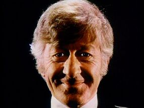
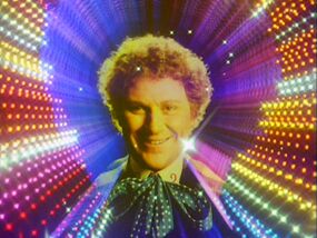
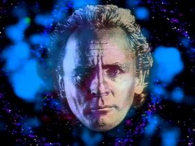
The 1963 - 1967 version of the programme titles did not feature an image of The Doctor, but from 1967-1989 the title sequence included a shot of the current Doctor's head floating either through space or the time vortex. However, the presence of the head — or in the case of Season 11, the body —of the Doctor during the Troughton, Pertwee and Tom Baker eras rendered the title sequences more abstract. John Nathan-Turner's radical redesign of the title sequence completely eliminated the time vortex, and replaced it with a representation of space that was never seen in that way within the body of episodes — mainly because the visual effect of space was far more expensive than the production team could afford on a weekly basis.
By contrast, the title sequences used during the Hartnell era, the McGann telemovie, and the whole of the BBC Wales era, were not abstractions, but showed the time vortex in a way that was used within the body of stories themselves. (TV: An Unearthly Child, Doctor Who, Utopia, The Pandorica Opens).
The 1996 TV movie eliminated the use of the Doctor's face in the title sequence (although it did use an extreme close-up of the Master's eyes instead), instead introducing the practice of crediting the lead actors over the opening theme -- something that was never done in the 1963-89 series. This same general format was retained when Doctor Who returned to television in 2005, although some fans bemoaned the loss of the Doctor's face from the sequence and created their own for video sharing services such as YouTube.
1963-67
The first title sequence consisted of a simple "howlround" effect over the stark original arrangement of the Doctor Who theme. The logo was mixed into the image in such a way that the title momentarily looks like DOCTOR OWO or DOCTOR QHO. The logo then moves into the distance as the sequence cross-fades into the first scene of the episode. The title and writer of the episode is superimposed over this scene, except TV: The War Machines and The Tenth Planet experimented with specialised title cards for the episodes. The original title sequence was filmed by Bernard Lodge, Hugh Sheppard and Norman Taylor.
1967-69
A more active howlround effect is employed in the second title sequence,. This is the first to truly illustrate the time vortex effect. The Doctor's face is now incorporated into the sequence: a closeup of a smiling Patrick Troughton which breaks apart to reveal a redesigned logo. Like its predecessor, it moves towards the back of the image. For the most part, the howlround effect continued as the episode title, episode number and writer appeared superimposed over the image, though some stories such as TV: The War Games placed the titles over specialised footage. A modified arrangement of the Doctor Who Theme accompanied this version.
1970-73
A shift to colour production and a change to a new Doctor resulted in a new title sequence being commissioned. Although similar to the 1967-69 version, only now given a red hue, a more tunnel-like howlround is employed. Now, instead of moving away from the camera, the logo moves towards it, along with the episode title and writer. A new image of Jon Pertwee replaced that of Troughton. Some variants were attempted during the 1970 season: TV: The Ambassadors of Death experimented with interrupting the title sequence with a scene from the episode, while TV: Inferno employed a one-off use of volcano footage as the backdrop to the episode title and writer credit. Otherwise, from here on in, the episode title and writer and episode number would be consistently featured as part of the opening titles. In 1972 a revision was made, incorporating animation of the Doctor moving his hands over his head and a revised version of the theme music. This version was never officially employed, but did accidentally go out on an international print of TV: Carnival of Monsters. One modification to the theme that became permanent was the use of a melodic sting (a repeating musical phrase) that gave the opening sequence a definite conclusion; before it simply cross faded into the first scene of the episode.
1974
Bernard Lodge created a striking new version of the title sequence for Pertwee's final season. A slit-screen effect was used to render stars shooring through space and the sequence begins with a close-up of Pertwee's face which pulls back to reveal a full-length image of the actor. He then becomes an outline, which shows the time vortex, heading towards the camera and completely vanishing. The show's iconic diamond logo was introduced with this version.
1974-80
Effectively identical to the 1974 sequence, only this time it opens with an image of the TARDIS going through the vortex, followed by a closeup of Tom Baker's face, which moves towards the camera, fading away to show the time vortex. Used for six seasons, this version of the opening was used longer than any title sequence to date.
1980-81
John Nathan-Turner commissioned a radical reimagining of the title sequence in 1980. Delia Derbyshire's arrangement of the Doctor Who theme was retired and a new Peter Howell rendition was introduced. The diamond logo was retired for a neon-tube-styled branding. To go with these new elements, Lodge's howlround and slit screen were also retired and a new starfield influenced by Star Wars was introduced. A new image of Tom Baker forms out of the stars in this version, the face moving towards the camera.
1982-84
The exact same title sequence as that used in 1980-81, except with Peter Davison's face used now instead of Baker's and extra stars filled the right side of shape. In addition a "venetian blinds" effect is added to introduce Davison's image. The reason behind the new "venetian blind" effect was because, unlike Baker, Davison had a more normal hair style, thus the shape the stars would form is less interesting.
1984-86
On the foundation starfield of the 1980-84 title sequence, a new one was constructed. Added prism effects added colour to the image, and the logo was modified slightly, given a curved appearance with added colour. For the first time, animation is added to the Doctor's image in an official title sequence; he now goes from a sombre expression to a smile. According to commentary on the DVD release of TV: The Twin Dilemma, this sequence was produced so it had subtle differences from episode to episode. The Howell version of the Doctor Who theme was replaced by a new version by Dominic Glynn for the 1986 season, but the title sequence remained unchanged.
1987-89; 1993
For new Doctor Sylvester McCoy, a completely new title sequence was commissioned. Now computer animated, it begins with an image of a galaxy, followed by what appear to be rocks falling towards it. The TARDIS appears and rotates and the Doctor's face appears. For reasons unknown, McCoy was covered with gold/silver makeup for the photo session, which now has three expressions for the Doctor (sombre, then a wink, then a smile). The series title (the logo once again redesigned) now appears at the very end of the sequence, with the episode title and writer appearing on screen at the same time as the logo. The episode number, in a return to the old style, is now superimposed over the first scene of the episode. The 1993 special mini-episode TV: Dimensions in Time used a shorter version of this sequence with a new rendition of the theme; the Doctor's face is not featured in this version.
1996
An extended opening sequence opened the TV movie, commencing with a view of Skaro and a sequence showing the Master being executed by the Daleks (with Paul McGann, as the Eighth Doctor, narrating). A close-up of the Master's eyes follows,. At this point a new, slower rendition of the theme kicks in. Beginning with the "middle eight" this time, the sequence shows the Doctor Who logo (based upon the one used from 1970 to 1973) flying through space. The camera follows it from behind for a while before it disappears and, in a time vortex-like sequence, the names of the lead actors appear on screen (a first for the TV franchise, with both McGann and McCoy receiving screen credit, although McCoy is billed fourth), after which the TARDIS is shown heading towards Earth.
2005-2010
The revival of Doctor Who in 2005 saw the introduction of many new elements, including a new horizontal logo (the better to capitalise on widescreen production) and a new theme arrangement by Murray Gold. A fully CG-realised time vortex is featured in this much faster-paced opening. It begins with the viewer hurtling down the tunnel, only to find the TARDIS coming up it towards the screen. It briefly pauses and rotates in the foreground, before hurtling down another part of the vortex as the lead actors' names appear, followed by the series logo. The episode title and writer credits follow as the sequence leads into the first scene of the episode. In the revival, additional production credits (producer, director, and occasionally guest stars) play out over the opening scenes as well, US-style.
Several modifications were made to the sequence, including minor cosmetic alterations to the logo, and a new Gold arrangement of the theme introduced in 2007. The actor credits changed as needed, with the credits for TV: The Stolen Earth and Journey's End featuring a large number of actor names. An animated variant, featuring the same time vortex image but with an animated TARDIS, was created for the animated storylines produced during the Tennant era.
2010-Present
A new logo, a new theme arrangement (again by Gold), a new production regime and a new Doctor resulted in a reinvention of the opening credits. Although still a time vortex, now the design resembles a storm cloud, with lightning effects accompanying the names that appear on screen after the initial appearance of the TARDIS. After the names appear, the TARDIS appears from the background, becomes the "DW" element of the series logo. It reforms as the TARDIS and flies around the vortex as the episode title and writer credit appear on screen. A slight modification to the logo is evident in the version broadcast beginning in 2011. It now incorporates the BBC logo. Occasionally a longer version of the opening, showing the vortex from a distance as the camera moves towards it, has been seen, as in the 2011 mini-episode Space. The version aired with TV: A Good Man Goes to War includes a unique variant in the sound mix as the TARDIS sound is heard.
For Series 7, the title sequence has been changed. The font for the lead actors has been changed and unlike previously where the names zoomed in past the camera, the text now evaporates. The Doctor Who logo has also changed, where it recieves a texture that changes to reflect an element of the following episode (eg: in the first episode, it had a look similar to that of the side of a dalek). The TARDIS logo also appears after the "Doctor Who" logo disappears, where it eventually turns into the real TARDIS travelling through the time vortex. The font used to introduce the title of the episode has also been changed, and rather than just covering the bottom of the screen, it is now centralised; however, the black colouration makes it hard to see against the red backround. The time vortex itself in its blue state has also been given a yellow tint while the TARDIS windows eminate brighter light and the sharpness of the picture has been listened, giving it a dream-like appearance.
Torchwood
This short intro started with the word Torchwood on the wall of the Torchwood hub and consisted of red lines and the red coloured word Torchwood in various shapes, sizes, fonts and order on a black background and ended with simply the word Torchwood in the middle. Meanwhile, the actor credits appeared quickly and subtly in the background. The episode and writer credits appear superimposed over the opening scenes of the episode.
For the 2009 miniseries Children of Earth no title sequence was used other than a very brief reference to the theme music, and the Torchwood: Children of Earth logo appearing black letters on white background. The actor and writer credits play out over the opening scenes of the episode.
2011's Torchwood: Miracle Day, the fourth series of Torchwood, had its title sequence completely reinvented for this series. It consists of a plain white background with a thin red electrocardiogram line travelling from the left of the screen to the right of the screen. The actor names (John Barrowman, Eve Myles, Mekhi Phifer, Alexa Havins, Kai Owen & Bill Pullman) then appear onscreen in bold black letters as each new red lines moves across the screen. Once the names finish displaying, the red heart rate lines become faster as they change angle and move into the background, whilst this happens the word 'Torchwood' moves onto the screen from the right and centres itself as the red lines slow down. Another small red line then travels across the bottom of the screen and the words 'Miracle Day' appear below the Torchwood logo in bold red letters. The theme music for this title sequence is a slowed down, quiet arrangement of the original Torchwood opening theme music, and has extra beeping noises along with hospital sound effects in the background.
The Sarah Jane Adventures
This title bore some resemblance to the 2005-2010 Doctor Who titles, but with letters instead of the Time Vortex effect. Elisabeth Sladen is the only cast member to be credited in the opening and the only actor in the franchise to receive a "Starring..." credit. The sequence remained unchanged during the five seasons that aired on CBBC. As a result, it was the only Doctor Who franchise series to complete its run without changing its title sequence.
K9 and Company
This title sequence start with green blueprints of K9 and consisted of repeated footage of K9 and Sarah Jane Smith. Elisabeth Sladen receives her screen credit over footage of her character, rather than over a photo as was the case with the Doctors. The title sequence is also unique for incorporating K9's voice into the theme music, making it the only franchise theme to have "lyrics".
K9
This title had a science theme, starting with graphics of a DNA double helix and the structure of an atom. It then has graphics of K9 Mark 2 being built up and his body labelled.


