Talk:Twelfth Doctor
Preparations
Does anyone else feel the Preparations section is a little too meta? Apparatjik ☎ 04:18, July 9, 2015 (UTC)
I really feel like this section should go. King of Dunkshire ☎ 20:55, October 22, 2015 (UTC)
- I would say that all "foreshadowing" and "preparations" sections need to go. They're very out of place, and are closer to 'Legacy' sections then 'biography' sections. OS25 (talk to me, baby.) 02:21, October 23, 2015 (UTC)
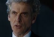
New Image
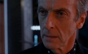
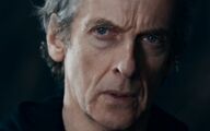
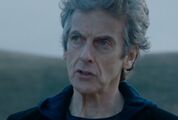
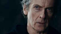
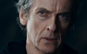
Just recently saw Kill The Moon, and I saw this particular image (on right). I've read the image policy and I'm pretty sure the image fits that.
And, to me, it looks like a better one! Anyone else got any thoughts?
Guyus24 (talk) 09:42, September 8, 2015 (UTC)
- It's kinda awkward.... OS25 (talk to me, baby.) 13:30, September 8, 2015 (UTC)
- First of all, the cropping is exactly what we want for infoboxes. However, the image itself is a bit dark. Infobox images have to be visible by viewers using any kind of device, including small cell phone screens. Shambala108 ☎ 14:37, September 8, 2015 (UTC)
- I kinda like it. The darker image tone fits his darker demeanour.BananaClownMan ☎ 14:42, September 8, 2015 (UTC)
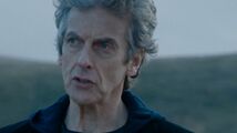
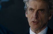
How's this picture for an alternative? Taken from The Woman Who Lived. --TARDIS2468 ☎ 23:15, October 25, 2015 (UTC)
- How about this one?BananaClownMan ☎ 19:25, December 19, 2015 (UTC)
- It certainly looks adequate but it's a tad wide and dark on one side. Perhaps if there was one in Under the Lake as that had quite a few bright areas? Snivystorm ☎ 20:25, December 19, 2015 (UTC)
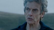
- What about this pic ? he basically looks like that currently (season 9, christmas, 10) the currently pic is from season 8
- and he just changed so much because of his hair, i find it logically
Abmwm330 ☎ 12:21, August 23, 2016 (UTC)
- Well, first of all, we don't really care how recent an image is; it just has to conform to our guidelines.
- Second, your image is not cropped closely enough. Yes, I know the current image is also not cropped enough, but at this point we need to replace it with one that fits our guidelines, not another one that doesn't. Please read through Tardis:Guide to images and maybe you can crop your image to the proper degree and bring it back here for consideration. Also, please see Tardis:Image use policy for how to properly name image files. Thanks! Shambala108 ☎ 14:15, August 23, 2016 (UTC)
What do you say about this picture ? Abmwm330 ☎ 11:42, July 30, 2017 (UTC)
Ghost
On the basis that the other people turned into ghosts in TV: Under the Lake says Human/Tivolian and Ghost I have put this on the Twelfth Doctor's infobox as well.--90.221.128.67talk to me 10:08, October 10, 2015 (UTC)
Hell Bent punch
Am I right in saying this is first time the Doctor has ever on screen assaulted anyone? I know the 9th Doctor certisnky got in to s few fights but they were more on self defence. This must be the first time he's ever attacked anyone physically, in new who anyway? Snivystorm ☎ 20:51, December 7, 2015 (UTC)
Voord Victorious
This section effectively re tells the exact same information as above but from the alternate Doctor's viewpoint especially in the second paragraph. Is it not better for the Alternate 12th Doctor to have his own page, or at least a section that doesn't feel like it's trying to both telling a story and fil a biography? Snivystorm ☎ 21:47, December 17, 2015 (UTC)
Love and the Doctor
I know full well that I'm opening up a pandora's box of debate here, but if we're going to talk about love with regards to River Song, that comes off as very "River shippish" and unbalanced as there is little discussion regarding the Doctor's feelings towards Clara which are unambiguous, particularly in the Face the Raven, Heaven Sent and Hell Bent. I'm trying to figure a way to word this that doesn't go into speculation, though I contest speculation regarding River is already present in this article. 68.146.52.234talk to me 19:30, January 4, 2016 (UTC)
The Doctor speaking to the dial in Heaven Sent
I do not understand the rationale of adding and readding the part of this section beginning with "the Doctor, knowing the Time Lords could save Clara..." based on the facts in Heaven Sent and Hell Bent:
- With the Veil collapsing in on itself, the Doctor arrived on Gallifrey and, after telling a nearby boy to inform "someone important" in the Capitol of his arrival, (TV: Heaven Sent) the Doctor, knowing the Time Lords could save Clara, (TV: Hell Bent) addressed the confession dial, saying to whomever was listening that he was the Hybrid, (TV: Heaven Sent) so he would have something to bargain with them. (TV: Hell Bent)
1. "The Hybrid... is me" at the end of Heaven Sent, at least from the Doctor's perspective, seems to be referring to Me, or Ashildr, and 2. it seems to me that no-one actually was listening to him at that climax considering various scenes in Hell Bent regarding the Doctor's knowledge of the Hybrid (he purports to know what the Hybrid is, but he reveals that without saying before breaking through the azbantium wall and leaving the dial. I struggle to understand the exact importance of the cliffhanger or who, if anyone, could have heard it, given Hell Bent's dialogue.)
- Rassilon: We needed to know. You have information about the Hybrid, a danger to all of us. If you'd told us what you knew, you could have walked out of there.
and
- Twelfth Doctor: If you wanted to know about the Hybrid, why didn't you just ask me?
- The General: If the Hybrid is a threat to the people of this world, why don't you just tell us?
- Twelfth Doctor: What do you know already?
- The General: The Hybrid is a legendary--
- Twelfth Doctor: No.
- The General: The Hybrid is a creature, thought to be crossbred from two warrior races.
- Twelfth Doctor: Which races?
- The General: The Daleks and the Time Lords, it is supposed.
- Twelfth Doctor: Oh, must be well hard, then.
- The General: Unstoppable, according to the stories.
- Twelfth Doctor: If they're just stories, why are you so worried?
- The General: Some Matrix prophecies suggest--
- Twelfth Doctor: No.
- The General: Many prophecies suggest--
- Twelfth Doctor: No.
- The General: All Matrix prophecies concur that this creature will one day stand in the ruins of Gallifrey. It will unravel the Web of Time, and destroy a billion billion hearts to heal its own.
- Twelfth Doctor: What colour is it?
- The General: I don't know.
- Twelfth Doctor: These prophecies, they never tell you anything useful, do they?
and
- Clara: OK, uhh, hang on. Wait, what? Did I miss something?
- Twelfth Doctor: Well, we're several billion years in the future and the universe is pretty much over, so, yeah, quite a lot.
- The General: Young lady. Miss Oswald. I'm afraid we only have a very few minutes with you.
- Clara: Who's he?
- The General: According to the Doctor, you can tell us something about the creature known as the Hybrid.
- ...
- The General: Doctor, we have to explain.
- Clara: Doctor, what is going on?
- The General: Although you are currently conscious and aware, in fact, you died billions of years ago.
- Clara: Doctor.
- The General: We have extracted you at the very end of your time stream to request your help. Once we're finished here, you will be returned to your final moments. Your death is an established historical event and cannot be altered. I'm sorry.
and
- Ashildr: You remember now, though, don't you? Tell me, Doctor. Who is the Hybrid? Who threatens all of time and space?
- Twelfth Doctor: Oh, but that's easy. That's very, very easy. The Hybrid is you.
So, I'm afraid I can't see in any way how either the Doctor saying the Hybrid was him, or him merely claiming it, was what caused the bargaining and escape from Gallifrey.
User:BananaClownMan mentions in an edit reason that the Doctor mentions Heaven Sent's cliffhanger to Clara in the Cloisters,[1] but that's not true at all, unless it's referring to the diamond wall shortly before:
- Clara: How long has it been for you since you last saw me?
- Twelfth Doctor: Oh, I'm not sure.
- Clara: How long?
- Twelfth Doctor: I was stuck in a place. They--
- Clara: They? What? Who? Who are we talking about?
- Twelfth Doctor: They wanted something from me. Information. It really doesn't matter.
- ...
- The General: Open up. We're going in. We'll stick to the perimeter, no more than three paces from the lift. Do not enter the Cloisters.
- Twelfth Doctor: Twenty feet of pure diamond. Harder than diamond. But you'll break through anything, given time.
- Clara: How much time?
- The General: Miss Oswald.
- Clara: Stay back.
- The General: I'm sorry, but we have to find a way to extract you--
- Clara: I said stay back! The Hybrid, what is it? What's so important you would fight so long?
- Twelfth Doctor: It doesn't matter what the Hybrid is. It only matters that I convinced them that I knew. Otherwise, they'd have kicked me out, and I'd have nothing left to bargain with.
- Clara: What were you bargaining for?
- Twelfth Doctor: What do you think? You. I had to find a way to save you. I knew it had to be the Time Lords. They cost you your life on Trap Street, Clara, and I was gonna make them bring you back. I just had to hang on in there for a bit.
- Clara: How long?
- Twelfth Doctor: It was fine.
- Clara: One question, and you will answer. How long was the Doctor trapped inside the confession dial?
- Ohila: We think four and a half billion years.
- The General: He could have left any time he wanted. He just had to say what he knew. The dial would have released him.
And again, combined with stuff like the General not knowing the Hybrid's colour and so forth, the Doctor says, prior to leaving the dial in Heaven Sent, he knows what the Hybrid is. BananaClownMan gives the edit reason: "The hanging on for a bit refers to him waiting in the barn. He tells the dial he is the Hybrid, and themn waits for the Time Lords to come for him so he can turn the tables and save Clara,"[2] even though right after saying that he was having to hang on in there to bargain with them, Clara asks Ohila "How long was the Doctor trapped inside the confession dial?" Also, in Heaven Sent, he tells a boy to go to the city and tell "somebody important" he's back, and the "you could have walked out of there", "they'd have kicked me out" and "he could have left any time he wanted" in Hell Bent is also clearly referring to the four and a half billion years in the dial, and not the waiting in the barn. I'm sorry, but there's so many caveats to assume the Time Lords could still hear him outside the confession dial saying "the Hybrid... is me", which again, more likely means Ashildr, that they probably didn't. -- Tybort (talk page) 02:36, April 13, 2016 (UTC)
- All this is quite persuading, if not for the following line for the Heaven Sent cliffhanger you haven't addressed; "You can probably still hear me, so just between ourselves, you've got the prophecy wrong." Your argument stems from the idea the Time Lords were still listening after he escaped, the Doctor himself states there is a possibility they can't.BananaClownMan ☎ 12:41, April 13, 2016 (UTC)
- Look, User:Tybort, I'm going to level with you here; I have no love for the Heaven Sent cliffhanger, or Hell Bent either, and I have a lot on my plate with University finals in the near future. So, you win, I guess. I will no longer edit that part of the timeline, or argue with you about it.BananaClownMan ☎ 17:21, April 29, 2016 (UTC)
Nail biting
The article mentions that the Doctor has a habit of tapping his fingers to his teeth, but if you look at a couple of moments, such as just before he shouts "The universe is over" in Hell Bent it's pretty obvious he's biting his nails. Maybe this should be added as another character trait? 68.146.233.86talk to me 16:24, June 5, 2016 (UTC)
- If he does it somewhat regularly, it could be added. If it's just one story, it could be a one-time thing and is not worth adding as a character trait. Shambala108 ☎ 21:52, June 5, 2016 (UTC)
Protection
We have an unregistered user who keeps messing with this page and removing River as this Doctor's wife. This page needs to be protected to prevent this.--WarGrowlmon18 ☎ 01:35, June 9, 2016 (UTC)
Said user just erased the first message under this heading before I reverted it.--WarGrowlmon18 ☎ 18:38, June 9, 2016 (UTC)
5.3 Factual correction
If you're going to list Twelve has a spouse then you need to list all his wives from his very first one as First Doctor. It was Eleven that married River, not Twelve. Twelve has not married anyone in this incarnation. – The preceding unsigned comment was added by 108.171.131.189 (talk).
- River is referred to as his wife in Husbands of River Song. And sign your posts.--WarGrowlmon18 ☎ 19:05, June 9, 2016 (UTC)
- I have to agree with WarGrowl. The episode clearly indicates that the Doctor was still married to River because River - in her time line - had not yet died. The River the Eleventh Doctor met in "The Name of the Doctor" is referred to as his ex-wife because that River was dead. And if one subscribes to the Twelve/Clara romantic relationship idea (which has been endorsed in multiple televised and cinema-screened interviews by Jenna Coleman, Peter Capaldi and Steven Moffat), keep in mind that THORS clearly indicates that River married several people while still married to the Doctor. So it all evens out (and there's no indication of Clara and the Doctor ever having wed, anyway). So it is perfectly correct to say the Twelfth Doctor was still married. 23skidoo ☎ 14:34, August 31, 2016 (UTC)
Garfield
There's a reference to the Twelfth Doctor liking Garfield books. We need a source for this as there's no reference to Garfield in any televised episode and this wiki's article on Garfield makes no mention of any Twelfth Doctor stories (i.e. novels, audios) referencing the books. We know he liked Where's Wally which I added. 23skidoo ☎ 14:34, August 31, 2016 (UTC)
- He's fondness for Garfield is mentioned in The Blood Cell, which was already sourced with his liking of books.BananaClownMan ☎ 15:16, August 31, 2016 (UTC)
5.3 Factual correction
The Doctor is considered a polygamist since he has several wives. – The preceding unsigned comment was added by 45.55.36.65 (talk).
New image (post Series 10)
I'm here to make an image proposition, is this one any better? HolmestoHomes ☎ 19:25, January 15, 2017 (UTC)
New image
I think this picture totally captures the doctors attitude and dark demeanor I believe this follows the image policy and looks amazing. – The preceding unsigned comment was added by Quicksilver999 (talk • contribs) .
- Hmm, perhaps, but the gaping mouth is somewhat off putting and it lacks a neutral expression. Plus, this Doctor isn't always 'dark'. The other one is also too bright so detracts from the focus on the Doctor. Snivystorm ☎ 11:34, May 14, 2017 (UTC)
Yea, I think the images I pulled are a bit too dark. On that note, I've come to the conclusion that we should hold off this discussion entirely until Series 10 is completed, and potentially until after the Christmas special. OS25 (Talk) 18:58, May 14, 2017 (UTC)
- Agreed. Snivystorm ☎ 19:03, May 14, 2017 (UTC)
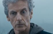
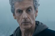
Alright, since the series is over, I'm going to start a gallery below and I suggest anyone who wants to pitch a new infobox image put it in said gallery. I would suggest putting off arguing over which one is the "best" until we have ten or so. OS25 (Talk) 23:24, July 2, 2017 (UTC)
- Good idea. I went ahead and added the current image so the candidates know what they are up against. Snivystorm ☎ 23:52, July 2, 2017 (UTC)
- Added a few more images (#7, #8 and #9). I realise that number 9 may be a bit controversial, but when deciding for an image for the Tenth Doctor it was decided that the "brainy specs" were a key part of his Doctor. Here, I feel that the sonic sunglasses have been a key element of the Twelfth Doctor era, so I added the option. Currently, I would say #2 and #8 are my favourites. Let's keep them coming. 66 Seconds ☎ 02:02, July 3, 2017 (UTC)
- Just adding the Tardis:Guide to images to help with out guidelines. Snivystorm ☎ 08:18, July 3, 2017 (UTC)
Since we have past #10, I'm going to give my opinions so far. For me, options #10, 3 and 8 are my top three; the rest are too dark and closeup for my liking. Option #6 I'm afraid isn't the TV Doctor, so not the most accurate portrayal to recognise him. #4 is used for the Shadow World Doctor, so it is already taken. I get what you're saying about #9 but the fact that it blocks his eyes (which we see more of than the device) is just too distracting and distracts too much from the image for me. #3 is probably the only one that really rivals the current image for me, looking the most like it; if only his mouth was shut. Overall, it's #3 for me so far if we end up changing it. Snivystorm ☎ 15:07, July 3, 2017 (UTC)
- I get what you're saying about them being too close up. I'll recrop 7, 8 and 11 and zoom them out a little. I also agree that 6 and 4 are my least favourites for the same reasons. 66 Seconds ☎ 16:46, July 3, 2017 (UTC)
- Alrighty. We'll reconsider those images once adjusted. I have also added #12, which I think feel is on par with #3: it faces the article, is bright and focuses well enough on the Doctor without being overt and the eyes are a tad clearer too. Snivystorm ☎ 17:25, July 3, 2017 (UTC)
Okay. I played around with the cropping on images 7, 8, 10 and 11. I know you originally said you liked 10, so if you preferred the other version please feel free to revert it to the former image. I'm also adding another image. 66 Seconds ☎ 22:50, July 3, 2017 (UTC)
- I wanted to quickly clarify that #6 was once a joke image which simply read "That's all I have" as the description (this was before more people started adding them). Someone evidently added the description "#6" while adding more images. It is by no means a real option. OS25 (Talk) 22:53, July 3, 2017 (UTC)
- Anyways, I'm currently thinking that #12 is the best in terms of lighting and cropping. A cropped it a TAB bit more to really make it fit the ideal limitations.
- Images 4 (which is, as pointed out, an imitation Doctor anyways) and 9 are right-out for being too dark. I actually kinda like how 8 sits more than any of the other images, but that slight shadow on the Doctor's cheek makes it hard to pick. What we need is something as close as 2, bright as 12, and in-character as 11. OS25 (Talk) 23:00, July 3, 2017 (UTC)
Based on Tardis:Guide to images, #2 is cropped the way we prefer for infobox images of characters (see especially Fifth Doctor, Ace and Ian Chesterton for comparison). Some of the others (#3, 8, 10, 12) are ok, but are not quite as closely cropped as we would like. #4 and 5 are a bit too dark for viewing on mobile devices. As for #9, I get the point comparing it to Ten's picture, but if we can't see the Doctor's eyes, I don't think this one is a good one. Shambala108 ☎ 23:18, July 3, 2017 (UTC)
- Given the adjustments, I now find #12 and 8 as our best options; yeah #8 is a tad dark but look at the Eleventh Doctor's infobox image, no problems there. I'm with OttelSpy25 in regards to #12., plus 12 this series has grown lighter in attitude and more kind-hearted, which the image reflects - note contrast to the current. Perhaps if we crop them a tad, they'll be ready for round 2? #7, 3 and 11 would be good options too with each being particularly clear; 11 especially due to being in character, though it may be too similar to the current image, having coming from the same episode? Overall, #12 is my preferred pick. Snivystorm ☎ 00:01, July 4, 2017 (UTC)
- As I noted at Talk:Nardole, it's about more than just cropping the image. Some shots are meant to show a variety of things -- backgrounds, other characters, etc -- and some shots are just supposed to show the character's faces. There's a difference between how shots 2 and 12 were taken, and thus 2 represents a quality that all other images fail to posses. OS25 (Talk) 00:11, July 4, 2017 (UTC)
- Maybe more so #8 then, as the background isn't distracting given it is black and it provides a clear shot of his face like #2 - except has the scar/blood from his fight with the Master, a tad distracting? If only there was some way to fuse #2, 11 and 12 together. it appears that we're all agreeing #2, 8 and 12 are the best choices so far. Snivystorm ☎ 08:17, July 4, 2017 (UTC)
Round 2
Okay, given the above discussion, I've narrowed down the candidates to the ones present. Feel free to discuss further. I kept #8 as well as there were no objections. Snivystorm ☎ 11:32, July 4, 2017 (UTC)
- I've re-cropped the images based on Shambala's advice. At this point I like all of the images but I have to say I really like 2 - despite it being a little dark, I think it suits the Twelfth Doctor. I'll keep adding possible images when I find them to contend with those which have made it through. 66 Seconds ☎ 11:59, July 4, 2017 (UTC)
- Good idea. I like #1 but it's just that slight blood spec on his forehead (#2 is arguably superior as it lacks such but retains the images qualities) it's just feels really distracting. The lighting of #1 and 2 isn't a massive issue, as stated earlier there are vastly darker images that we use as infobox images so that one isn't too bad. I still feel #3 is the best of the group, given it is bright, looks at the article and has a kind of 12th Doctor charm he has gradually developed as his era progressed. Snivystorm ☎ 12:05, July 4, 2017 (UTC)
- Just noticed the new set of images. #7 and 14 looked pretty good, matching the same reasons why I like option #3 yet their more neutral in appearance, likely making them more favourable among the general viewer. #14 is also cropped nicely and pretty bright as well, providing the quality of #1 with the brightness of #3. While I personally prefer #7, 14 matches the general advice for infobox images the best. Snivystorm ☎ 15:27, July 4, 2017 (UTC)
I also really like 14, now more so than 2. My main problem with 7 is that the background is brighter than the face, so stands out more than the Doctor. I also like 8 for the expression, and the clarity of the Doctor's facial features against the background. On 17, the contrast is too low. I'm also not keen on 5, due to the projection of text on the face. While 15 is clear and fits general advice, I find that it is overshadowed by the fact that this is taken from when the Doctor shot the General. 66 Seconds ☎ 16:01, July 4, 2017 (UTC)
- Agreed, though I still prefer #7 to #8 just due to his more neutral expression. Looks like #2 and 14 are our best bet with #7 and #8 on the fence. Ideally, we need more opinions for a better overview of the General concensus.Snivystorm ☎ 17:43, July 4, 2017 (UTC)
- You're gonna have this problem a lot with the latest Moffat seasons, but the tonal lighting does make a few of these harder to choose. In particular, the fact that Capaldi's face sort of blends into the background in #14 ruins it a tad. If this wasn't the case, I would say that was a winner. This also sort-of effects #s 6 and 7.
- Image 5 is right out, because the projection effect makes it look like the Doctor is wearing a breathing mask or something. The inclusion of Clara lightly in the background on image 9 is both brilliant and questionable. Clara was the most important character to the Doctor before her exit, and the blurriness could represent her memory being someone non-intact. However, I think most people would agree that with series 10, Capaldi out-lived this element. A final note for those hunting for images is that it's best to find ones where the background isn't too complex -- if I'm staring at whatever's behind Capaldi and thinking "What is that? A waste bin?" then it isn't best for the infobox.
- Given that the blood splatter on #1 bothered so many people, I've gone ahead and simply cropped it out. Now it's even closer to the face! Again, sadly I have no idea when this will be visible on the actual wiki. Over all, good work on finding a new set of images that offer much more promise! OS25 (Talk) 17:56, July 4, 2017 (UTC)
- Wow, I didn't even see Clara there in #9 before, that is pretty cool, as you said, beautiful symbolism. However, given what's been said, #2 seems to have edged over the rest given how it's black background means no distractions and just complete focus on the Doctor. Good job removing the blood from #1 though I'd still say #2 edges out on it; contrast caused by the light on the face is just a tiny bit worse to me than #2's but I'm nitpicking - either of them would be great images for the infoboxes now. Overall though, #2 is looking like our winner - no one's found anything truly wrong with it yet the other images don't share. Snivystorm ☎ 18:11, July 4, 2017 (UTC)
- Perhaps, but then (to me at least) it is more or less the same face in #14, he is just looking towards the reader rather than the article. Snivystorm ☎ 18:34, July 4, 2017 (UTC)
- Unless the order is different on my device, I'm afraid I'm not seeing it; options #12 and 15 scream more rage than #14 does to me. Plus, it's not like this Doctor has always been defined by his anger; yeah he's not as light hearted as Ten or Eleven were but he was rarely a blood thirsty killer (bar Hell Bent). Snivystorm ☎ 18:58, July 4, 2017 (UTC)
- The point is that image #2 really doesn't fit the mold at all. It's an awkward face that doesn't really show much about the character, and it's honestly a little too mixed in lighting to work at all. Even if it's not bad, it's not better than many of our other options.
- I prefer #9 to 8; given the Clara symbolism mentioned earlier. #1 and 3 I can get behind as well, given earlier discussion. I still like #2 and 7 though, despite their problems. Snivystorm ☎ 21:07, July 4, 2017 (UTC)
- However, as I said before, I think that it's best to avoid labeling 12 as the CLALA Doctor. I would prefer not to use the Clara pick.
It's alright, I was just reinforcing my support for them in case, ensure they weren't complete write offs. I get what you're saying about Clara, but that's there because we know it's there; the quality of the image is not really detracted by that, it just adds a hidden meaning we happened to notice. So that leaves us with #1, 3 and 8. Personally, I feel #3 and 8 best #1 as they both face the article, are brighter (therefore clearer) and don't fee like a squashed as #1 does; I get we prefer highly cropped images but the way it sits in the middle comes across as too much for me. If more support comes for it, ill gladly take #9. If not, #3 gets my vote Snivystorm ☎ 23:50, July 4, 2017 (UTC)
- Commenting on the new images just added: I quite like 19 and 23. 23 has unique lighting, but it's not too distracting and you can still SEE Capaldi's face. 19 is a super-nice character shot. OS25 (Talk) 00:08, July 5, 2017 (UTC)
Round 3
- Doctor.who.2005.s10e12.720p.ip.web-dl.aac2.0.h.264-btw-1.m4v.00 49 48 04.Still011.jpg
- 28
- To help make comparisons easier, I've moved all the ones that we're currently comparing to the bottom, as well as any others that might still make the cut. If there's one that I didn't move that you really like, you can put it in the batch as well -- no biggie. It was just getting hard to compare them all with images like #5 still present.
- Now that I can look at the best ones in a row, I think that I honestly can say that #14, despite the odd tint, is the best image that we currently have open for an option. Everything else about it is so perfect, it's a really great shot. OS25 (Talk) 00:13, July 5, 2017 (UTC)
- I agree. For me 14 is the best image. I find the tint doesn't distract from the Doctor, and Capaldi's face is still clear despite it. I hope nobody minds but I re-added 2. I think the light and shade really works for the Twelfth Doctor, and we already have a precedent with the Eleventh Doctor. My current order of winners would be as follows: 14, 2, 9, 18, 8, 3, 23, 1, 19, 12. This may change though. 66 Seconds ☎ 00:54, July 5, 2017 (UTC)
- Brilliant idea! Putting the images from best to worst!
I did some thinking, and realised that the problem is that none of the images that we have selected are bright enough to replace the current one properly, and few of them are close enough. Thus I booted up The Doctor Falls (which has some lovely outside shots) and I selected a few shots from there which I think would work in an infobox. I want to go for a series 10 images because long-haired Capaldi is honestly the most photogenic. I think most of these are better than any image selected so far, to be honest. OS25 (Talk) 03:57, July 5, 2017 (UTC)
- I agree that we should use a Series 10 image. I took the liberty of transferring these one into a third round as well given earlier discussion. Of the new images, I quite like #19 and 28, he just looks really in character, plus his photogenic hair is really visible. If I had to rank my top five, they'd be: #14, #19, #2, #28, and #3. #9 deserves an honourable mention. Snivystorm ☎ 08:28, July 5, 2017 (UTC)
- I also like 28, in fact I'd go as far as to say that it's my number one pick right now.
- How do you mean "off"? I also just want to note that the Ninth Doctor's infobox has the Dalek in the background too, bringing with it all its association and symbolism, so #9 can't really detract due to symbolism, only elevate. Snivystorm ☎ 13:41, July 5, 2017 (UTC)
- My votes go out to #8, #19, #23, #26 and #28.BananaClownMan ☎ 13:27, July 5, 2017 (UTC)
- Reckon it is worth us making a tally of which images are getting the most votes? Snivystorm ☎ 13:41, July 5, 2017 (UTC)
I'm going to go ahead and close this discussion now. Instead of narrowing the choices down, more and more are being added, which will only prolong the discussion. Given that the three users that have mostly been participating, User:OttselSpy25, User:Snivystorm and User:66 Seconds, all agree on #14 as their first choice, that's the one we're going to use as the Twelfth Doctor infobox image.
Please note that this image is not to be changed without further discussion, and, following the precedent set at Tenth Doctor, there will be no new discussion for at least 6 months. Shambala108 ☎ 14:19, July 5, 2017 (UTC)
- I can't protest too much, because the new infobox image looks very nice and all, but I should note that the discussion about the Tenth Doctor's infobox image took over a month, while this has been going on less than a week. I will also note that while I stated that #14 was the best of the original batch, but I have since added several bright images that more naturally fit the agenda and I had out-right stated that #23 was now my choice. But still, infobox looks better, so I can't complain much. OS25 (Talk) 18:52, July 5, 2017 (UTC)
- Ah well, what's done is done. I'm happy with the choice. Reckon this should be archived now? Snivystorm ☎ 19:15, July 5, 2017 (UTC)
- I'm loathe to do this, but -- after discussions with other admin -- I've gotta modify Shambala108's closure.
- See, if the precedent to this conversation be the Tenth Doctor discussion -- and it is -- then we need to recognise what that precedent is:
- Something concluded well after transmission of the final episode of that incarnation. The Tenth Doctor decision happened in 2012, not after transmission of The Waters of Mars.
- Something that took several weeks of decision-making. By contrast, this has been entirely rushed through -- and over what was, for Americans and Canadians, a holiday weekend.
- There are other distinctions that could be noted, but those are the two biggies. It's honestly fine if this discussion endures for a while to find an image.
- So, I'm restoring the original image, and extending this discussion until 4 August 2017. Personally, I think that if we followed precedent, we should wait until the Blu-ray release of the 2017 Christmas special to have this discussion.
- But I appreciate that there is some community enthusiasm for shopping for a new, more bouffant version of Twelve. Therefore, whatever is decided in early August will be temporary. A new round of this discussion must be held after the Blu-ray release of the 2017 Christmas special, at which time we'll re-adjudicate. This gives the community plenty of time to weigh in on what is one of our most important images, given the extreme popularity of this page.
- Any user should feel free to add more images here, according to this new timeline:
- Until about 4 August, the image will return to File:TwelfthDoctorDeepBreath.jpg, and you can add more images to this talk page for consideration.
- On or about 4 August 2017, a new image will be selected, which will survive on the article until early 2018.
- After the HD version of the Christmas special comes out on disc, another round of discussion will occur. So that means you can continue submitting images between 5 August 2017 and the time of the Blu-ray release of the Christmas special. A new image will be selected in early 2018, at which point the selection will be regarded as effectively permanent.
- Also, there's been some suggestion that the infobox image needs to be from series 10. That's absolutely not the case. You can't have a consensus to ignore two-thirds of a main character's appearances. Of course, an image from S10 might emerge as the winner, but the Third Doctor of The Silurians is every bit as representative of the character as an image from The Time Warrior, and blue-suited Ten is as much Ten as brown-suited Ten. So, as you're looking for images, look across the whole era.
- Finally, a word about color-correcting images. That's really not allowed by our rules. The only case in which we go for some manipulation is with comics. If you have an image from a really old comic, and the paper is fading, you can correct the paper back to a true white of #FFFFFF. This isn't seen as "correction" so much as restoration to the original. I've already deleted OS25's admitted color correction of image #14, but if any participants to this conversation have added other images that have been color corrected, please remove them from this page and tag them for deletion.
czechout<staff /> ☎ ✍ 19:38: Wed 05 Jul 2017
- I just wanted to note that I was aware that colour corrected images were most likely banned, and I only uploaded my image to illustrate why tinted shots are problematic. It was more to point out the problem with those shots, rather than to be an actual choice.
- Now that we have a good amount of time, I suggest that instead of voting and tallying said votes, we try to figure out which images we do not approve of as we move forwards, thus making the selection more clean and the aim for which images we are going after more obvious.
- Keep in mind that what we have on this page aren't the final choices, so (as far as I can see) it's not really a matter of choosing which of these images has the most positives. Rather, we should identify what negatives should be avoided, and we should avoid those for which those issues apply.
- For instance, I think that the background of #8 is far too distracting. What is that? A TV set? A monitor? Furthermore I think that images like #2 should be avoided, because even the brightest parts of the image come across as grey. Most importantly, I disapprove of faces like that in #12, which honestly just don't represent the character very accurately. OS25 (Talk) 19:50, July 5, 2017 (UTC)
- Alrighty, we are back on. So if I got this right, we cutting down what images we want to avoid now, given we have a whole month to choose. In that case, I support OttelSpy25's reasoning above plus I'm not a fan of #18 (the upwards position is a little distracting) #24 (Twelve looks rather pale) and #25 (that slight black smudge in the upper left hand corner is really off putting). Snivystorm ☎ 20:00, July 5, 2017 (UTC)
- Okay. I agree with OttelSpy25 that #12 should be removed for the expression, and I also agree with Snivystorm that I'm not a fan of #24 and #25 for the same reasons as stated above. I'm personally not keen on #19 as I feel there isn't a high enough contrast between the foreground and the background.
- Of the new images, I like #26 and #27 the most, although I think that #26 needs to be cropped more to follow the guidelines in Tardis:Guide to images. Taking into account OttelSpy25's reasoning on #8, my top 4 would now be #14, #9, #26 (if cropped tighter) and #2. Although we can remove images which we all agree to be unworthy, I don't think we need to be too hasty in removing images which prove popular with some of us and unpopular with others. As CzechOut said, we have a month to go. We should probably wait for a broader consensus before making rash decisions. 66 Seconds ☎ 22:02, July 5, 2017 (UTC)
- I concur. We don't want to stoop to hideous rashness. Given what 66 Seconds just mentioned, I'm adjusting my top five slightly also: it is now (in no order) #14, 28, 3, 9 and 26 (if it is cropped to the appropriate standard). I also don't really like the sudden light change on #23; it causes the black to stand out more than the face, rather than vice versa. Snivystorm ☎ 22:40, July 5, 2017 (UTC)
- I agree that we have no need to be rash here, but I also think that we don't need to presume that all we have so far is all the options that we will have by the end. What we should be doing is going through Capaldi's three-or-so seasons and searching for images that meet our standards.
- What we've agreed on so-far is that we want bright images cropped well which portray Capaldi's role reasonably. We need to avoid tinted shots due to how they disrupt the view of the character's face, and we want to stay away from distracting backgrounds. It's best to go for close-ups before anything else.
- Based on our agreements here, I think the only images currently in the running's are 1, 3, 8, 9, 14, 18, 19, 23, 26, 27, and 28.
- Yeah, I'm good with that. I reckon #9 is also superior to #8 given how it's background is not as distracting as the latter and symbolism mentioned before boosts it. I also like #19 over #18 given previous comment on the angle and then #27 over #19 given the better lighting. Snivystorm ☎ 23:54, July 5, 2017 (UTC)
So I think we should start another "round" as people gather images so that we can start discussing the new ones without trying to remember which of the old ones are still around. I think it's important to focus on hunting for new images for a time, while only moving the images so far that meet our standards.
Wanted to know what people thought of SOTO's 29 and 30, since it makes the most sense to only move one of those over. Personally I think 30c is the best 30 variant, and 29c is the best 29.
The numbers that we currently are agreeing on moving into round four are 1, 9, 14, 23, 26, 27, 28, 29, and 30. OS25 (Talk) 08:24, July 6, 2017 (UTC)
- Agreed, the "C" variants have no distracting faces and are cropped the best for focus on the character. I'm down for round 4. Snivystorm ☎ 08:28, July 6, 2017 (UTC)
Round 4
- Doctor.who.2005.s10e12.720p.ip.web-dl.aac2.0.h.264-btw-1.m4v.00 49 48 04.Still011.jpg
- 7
Ah new images. In regards to them, the only one I actual like is #11; #10 with the hat has similar problems to the sunglasses one - not exactly a prominent trait of his character - #11 is kinda dark and it's clear he is bending down, and #13 is an inferior version to #12 as the black corner is more noticeable, therefore distracting. In terms of the previous candidates, #8 isn't really the best crop for focus on the face compared to #1, 2 and 3 in particular. Minor question, how come we changed the format of the gallery from Round 3 onwards? Snivystorm ☎ 20:49, July 6, 2017 (UTC)
- Why did we stop giving them new numbers every time? I don't know, I just think it made it more confusing to constantly change the numbers. However, if you want to change all the numbers to 1-13 (as you are the only person who has used the numbers this round, and thus only you can change how you refer to the images) be my guest.
- I agree with all of your points, but I still want to encourage people to find and upload more images. Try hunting in scenes that feature reaction shots, scenes with only two characters are often the best moments for shots as close to the camera as the first few images. OS25 (Talk) 21:25, July 6, 2017 (UTC)
- Alrighty, I have adjusted the gallery. Yeah, the more images the merrier. There is probably some good images to get from the scenes with Davros in Witch's Familiar, the Zygon Speech and Heaven Sent episode. I sadly struggle to gather the images, unless using BBC Iplayer and getting them from there is acceptable? Also, right now only #5 is distinctively bright. The ones past #7 are comparatively much darker. Snivystorm ☎ 21:51, July 6, 2017 (UTC)
- Out of this selection, I personally feel that 19, 20, 21, 22 and 25 are too dark for the infobox. Out of the brightest images (5 and 18), I prefer the expression of 5 and it lacks the background distractions present in 18. Though not entirely dark, I feel that some of the images are too drab, notably 8 and 9. Comparably, 14 is a similar but better version of both 12 and 13. Out of these, my current order from best would be 3, 17, 2, 5, 6, 14, 4... 66 Seconds ☎ 15:53, July 11, 2017 (UTC)
- I thought we had decided against #16 and #17? Regardless, as stated above, the majority of the images are far too dark or aren't cropped enough. #2 3, 5 and 7 I feel are more preferable; brighter, better cropped, reasons stated earlier etc. I'm guessing IPlayer isn't allowed then? Also, #18 is just a more inferior version of #3 from earlier rounds. Snivystorm ☎ 16:05, July 11, 2017 (UTC)
- 17 is not the same image from earlier. I updated the file (and renamed it) with a higher quality, better lit, less "grey" shot from the same few seconds. Take a look at that image a bit larger than it can be represented in the gallery, and you'll see what I mean. (Remember that the infobox image will be 250px in the infobox, but much larger still on mobile devices. – The preceding unsigned comment was added by SOTO (talk • contribs) .
- Ah, alrighty then; if we're allowing it back in, then I'm in support of it as well, given reasons I stated way back. Snivystorm ☎ 17:37, July 11, 2017 (UTC)
As we approach 50 images of this round, it's likely time that we start whittling away at the current choices again. I would agree that #s 10, 11, and 13 aren't really fitting. Also I think it's fine to remove 21 and 22.
- 18 is too bright, causing none of Capaldi's unique features to stand out. With 12, it's more than just the shape of the head that the reader need to immediately see.
On a side note, I think it's important that we start talking about odd faces. I think that some of these images need to be disqualified just for having a frame unfit for the infobox. Early on I am not a fan of #4, which has a face that would be more fitting in an episode of It's Always Sunny. Obviously #11 applies to this as well, so does 8 and 36. OS25🤙☎️ 08:28, July 13, 2017 (UTC)
Agreed. There are a ton of images here that we really should cut down, #40 is really distracting, it looks like his back is haunches or something. Part from maybe #25, none the images feel like they top my personal top #5 that I mentioned before (#2, 3, 7, 5, and 17). Snivystorm ☎ 09:56, July 13, 2017 (UTC)
- Agreed, although none of the images posted are bad per se. I encourage more people to post images that they discover.
- So far, these are the images that we are suggesting moving onto round 5:
- 0, 1, 2, 3, 5, 6, 7, 9, 12, 14, 15, 17, 19, 20, 23, 24, 25, 26, 28, 31, 32, 33, 35, 38, 41, 42, 43
- I say we tried to whittle these down to around 15 or so (right now there are 25).
- First off I want to eliminate any images that again feature odd lighting or tinting. This would meant that 15, 25, 27, 30, and 37 are out.
- There are some images that have no clear faults, yet honestly just don't stand up to many of the other images selected. These would be 42, 35, 26, and 19.
- I think that 9, 12, and 14 are out for not being proper-close-ups. 1 is probably a little bit too-close, and I don't think it's been properly considered in a while. Same for 41. OS25🤙☎️ 12:01, July 13, 2017 (UTC)
- Personally I don't think #2 would be a good pic for the infobox. It just seems exactly like the current image, and in that I think it barely conveys anything about Capaldi at all. #3 is still a turn-off to me because of the colour. I totally believe that 7 is the best image that we have here. OS25🤙☎️ 12:06, July 13, 2017 (UTC)
- Yeah, there are just too many images, I am struggling to keep track of them all. They aren't bad, they just don't come off as superior to the earlier choices. The kaon eith of the others are either too dark, not cropped enough or make faces thst just don't fit. #25, #38 and #43 are the only new ones I'd consider contesting with my top five. #2 is not quite like the current image, it is cropped better for a start. #3 is bad colour wise, but it is still thr best crop and face I feel. #7 and #5 are the only stand out ones like you said. Snivystorm ☎ 12:23, July 13, 2017 (UTC)
- Fair play. I still feel it is better than most of the new images though. Snivystorm ☎ 12:32, July 13, 2017 (UTC)
Round 5
- Doctor.who.2005.s10e12.720p.ip.web-dl.aac2.0.h.264-btw-1.m4v.00 49 48 04.Still011.jpg
- 5
Round 5 begins. Snivystorm ☎ 14:12, July 15, 2017 (UTC)
- Alright, we're around 5 days from it being the day where the best image is picked. Thus I suggest that we widdle this lot down to the images that we would actually consider for the infobox.
- The Hell Bent images have been very useful, and in fact have given us some of our best shots of Capaldi. Because of them, I would like to argue that image #2 is now finally out of the race. Images #2 and #14 are practically the same, except that image #2 has terrible lighting and bad colours.
- Otherwise the images that I believe should continue on into our "final" round are: Images 1, 5, 6, 7, 14, and 18. For this final round, we should move to not transition #0, just for the sake of openness. Just to speed up the process, I'm going to move these images to round 6. If anyone has any images that they feel have been left out without good measure, simply add them again with a note. OS25🤙☎️ 12:42, July 30, 2017 (UTC)
Round 6
- Doctor.who.2005.s10e12.720p.ip.web-dl.aac2.0.h.264-btw-1.m4v.00 49 48 04.Still011.jpg
- 2
On the topic of which of these images is most suitable, I am currently swinging heavily towards image #5. It has everything we want: natural lighting that isn't obstructive to representing Capaldi's face, an expression that is somewhat characteristic for how you might imagine him on screen, and a lack of tinting that would obstruct the view of the image. OS25🤙☎️ 12:47, July 30, 2017 (UTC)
- Suprised that this has died off, given that tomorrow is the final day before judgement.
- Just to play along, I'll list my personal picks of the above images from best to worst: 5, 2, 4, 3, 6, 1. OS25🤙☎️ 23:09, August 2, 2017 (UTC)
Last call
Hey hey everyone :) Thanks to those who have continued to look for a good pic. Today was the original day for everyone to give their opinions about the best pic to illustrate Twelve -- at least until his final instalment. However, as is my traditional practice on these big discussions, I'm going to give a little bit more time for additional remarks. Let's give everyone the weekend, just in case there are those amongst us who are only able to edit on Saturdays and Sundays. I'll be back sometime on the overnight between Sunday and Monday to wrap this puppy up!
czechout<staff /> ☎ ✍ 15:26: Fri 04 Aug 2017
- I want to say that, out of round 6, the only image which I would out-right totally reject as the infobox image is #1. I think it gives a painfully limited depiction of 12, and really just isn't a great look. OS25OttselSpy25 19:43, August 6, 2017 (UTC)
- Going to leave this open for at least a little bit longer. This conversation is pretty much the Snivvy/OS25 show and I'm hoping for a little bit more. Please, guys: you've had more than your chance. Let's see if anyone else has opinions to offer.
czechout<staff /> ☎ ✍ 16:53: Tue 08 Aug 2017- Also, I'd note that the "whittling down" of images is pretty much artificial, made by the two main participants. It should be noted that all images posted to this page are still in the running, so if you see an image anywhere on this page that you like, speak up.
czechout<staff /> ☎ ✍ 16:56: Tue 08 Aug 2017- Looking at the images from round 6, my personal top choice would be tied between #3 and #5, with #4 being a close second, as #4 has the Doctor's eyes looking too far towards the left. I feel like Twelve's expression in #2 seems slightly flustered, which doesn't really fit as a depiction of his actual personality. Also, though it might seem like nitpicking, a tiny little bit of his scar can still be seen in #2.
- Also, I'd note that the "whittling down" of images is pretty much artificial, made by the two main participants. It should be noted that all images posted to this page are still in the running, so if you see an image anywhere on this page that you like, speak up.
- Going to leave this open for at least a little bit longer. This conversation is pretty much the Snivvy/OS25 show and I'm hoping for a little bit more. Please, guys: you've had more than your chance. Let's see if anyone else has opinions to offer.
- On a slightly related note, does anyone else think the picture of Twelve at Template:Docpic should be changed as well? I feel like we've seen his 'attack eyebrows' from his The Day of the Doctor cameo for more than enough. Gokyr586 (talk) 03:42, August 9, 2017 (UTC)
Three-year arc
Is content in this article any worth noting on the page: http://io9.gizmodo.com/doctor-whos-season-finale-wrapped-up-a-three-year-long-1796592385? --DCLM ☎ 21:22, July 3, 2017 (UTC)
- Perhaps, but where do we put it? Snivystorm ☎ 21:33, July 3, 2017 (UTC)
