Talk:Eleventh Doctor: Difference between revisions
No edit summary Tags: Mobile edit Mobile web edit 2017 source edit |
|||
| Line 61: | Line 61: | ||
: Agreed. I'm in favour of this change. [[User:BlueSupergiant|BlueSupergiant]] [[User talk:BlueSupergiant|<span title="Talk to me">☎</span>]] 00:16, 19 September 2023 (UTC) | : Agreed. I'm in favour of this change. [[User:BlueSupergiant|BlueSupergiant]] [[User talk:BlueSupergiant|<span title="Talk to me">☎</span>]] 00:16, 19 September 2023 (UTC) | ||
: Yes please! [[Special:Contributions/68.33.189.71|68.33.189.71]]<sup>[[User talk:68.33.189.71#top|talk to me]]</sup> 00:51, 19 September 2023 (UTC) | |||
Revision as of 00:51, 19 September 2023
Main Image Change
I want to change the main image for the Eleventh Doctor's page. Can I do that? I've uploaded the image that I would use. King of the Sandmen ☎ 14:25, 7 May 2021 (UTC)
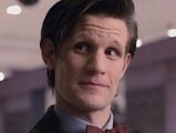
User:King of the Sandmen's proposal (#2).
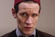
With fez, from TV: Day of the Doctor. (#6)
"Knowingsmile" from TV: Day of the Doctor. (#7)
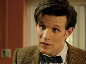
Kind, genial smile in TV: Vincent and the Doctor. (#8)
- There has to be a discussion first with big pages like this, and an admin has to give a final ruling. I (not an admin) like the new picture better (it shows the Doctor's distinctive hairstyle better and there is no mood lighting), but it will probably have to be cropped a bit. LauraBatham ☎ 14:32, 7 May 2021 (UTC)
- Yes — discussion is needed before anybody (even an admin) can change the infobox image of one of the TV Doctors. But I think in this case it is a discussion worth having. The current image runs contrary to T:GTI's best practices, which advise one to avoid overly stark/unnatural lighting. King's proposal is much better, but does need to be cropped severely.
- I've created a gallery presenting two potential crops. Although the tightest is the one that policy would recommend by default, I think it's worth discussing, in a special case like the Eleventh Doctor, whether it's worth settling for the slightly wider (but still acceptable) crop of #3, which allows us to see a bit of the iconic bow tie.
- Thoughts? Scrooge MacDuck ☎ 14:44, 7 May 2021 (UTC)
- I agree. Image #3 seems like the more preferable option. LauraBatham ☎ 14:51, 7 May 2021 (UTC)
- Same. I like the cropped one with the bow tie. King of the Sandmen ☎ 14:53, 7 May 2021 (UTC)
- Good, good! That being said, I don't want this to be just a choice between the overly contrasted current image and the Closing Time one. It's not often we change a TV Doctor's infobox image, so I figured I'd put a few more options on the table. I've added four new images. Where possible I've done the same thing of cropping them widely enough to retain the bowtie, but of course, any of those could be cropped more tightly if we want. Personally I'd be partial to #8, which I think best embodies the "spirit" of the Eleventh Doctor, and has a nice contrast between the face and the background. But any of those would, I think, be acceptable, and all of them would be superior to the current image. Scrooge MacDuck ☎ 15:08, 7 May 2021 (UTC)
- While I also like #8, I think it might be a bit too goofy (particularly 11's eyes). I'd say #7 would be my pick, as I think it sums up 11 throughout his tenure best. King of the Sandmen ☎ 15:21, 7 May 2021 (UTC)
- I personally like #8 most as it has a clear view of his face, a close crop, good lighting and shows the bow tie. My second choice would be #5 which has a clear view of his face, a close crop, good lighting and (in my opinion) better hair. However, #5 doesn't show the bowtie. It's also not from a standard episode which, while fine by me, may be confusing to newer users wondering where the image is from. I'm also quite partial to #6 as it shows the fez although this does hide his hair. Bongo50 (aka Bongolium500) ☎ 15:31, 7 May 2021 (UTC)
- 5>7>8>6>4/3 Number 8 is lovely, but it's from Series 5 and his hair and hwatnot don't really cement themselves until the beginning of Series 6. #5 gives us a good compromise in terms of look, he's got his Series 6-7A outfit on (which is a perfected version of Series 5's outfit) and his hair is the lok he has from Series 6 forward. NoNotTheMemes ☎ 17:06, 7 May 2021 (UTC)
- I still like #3, but #7 is also pretty good. I don't really like #6, purely because it hides his hair and exaggerates his forehead, and while #5 is good, it seems a little blurry.LauraBatham ☎ 02:26, 8 May 2021 (UTC)
I just need to point out that none of these images are cropped enough, with the exception of the current page image (and maybe #4). Please see our guidelines at Tardis:Guide to images for what we're looking for in an infobox image before posting any more choices thanks. Shambala108 ☎ 03:04, 8 May 2021 (UTC)
- I reckon we could probably crop #7 and #8 a bit more and they would still be okay. Though we would unfortunately lose the bowtie. LauraBatham ☎ 03:09, 8 May 2021 (UTC)
- I've added two cropped images to the gallery. Are they acceptable? Though I couldn't find any option to add a copyright licence when adding them to the gallery, so they may need to be reuploaded with the applicable "BBC screenshot" licence. LauraBatham ☎ 03:24, 8 May 2021 (UTC)
- @Shambala108: please read the discussion. I'm aware that some of the images could be closer-cropped. However, I have made the executive admin decision that the overwhelming and obvious need to include the bow tie in an image meant to represent the whole of the Eleventh Doctor may warrant this small exception to our rules, assuming the community can build a consensus around it.
- @User:LauraBatham: it is imperative that images have licenses upon upload. I have gone back and added them, which, for the record, can always be done after the fact by going to the file's page and editing the description manually. Scrooge MacDuck ☎ 07:38, 8 May 2021 (UTC)
- Thanks for that Scrooge. I did think of adding it after, but I couldn't see how to do it. Now, looking at what you've done, I can see that there is a screenshot template that I was previously unaware of. LauraBatham ☎ 08:26, 8 May 2021 (UTC)
- I've added another option (and this time added the licence) which I think manages to show enough of the hair and the bow tie while (hopefully) still being cropped enough. LauraBatham ☎ 08:57, 8 May 2021 (UTC)
- Indeed, very attractive proposal. I want to be clear that while I think an exception to the "very tight cropping" rule for the bowtie's sake would be acceptable, an option that manages to still crop closely while showing the bowtie woule be better. Scrooge MacDuck ☎ 15:16, 8 May 2021 (UTC)
- I've added another option (and this time added the licence) which I think manages to show enough of the hair and the bow tie while (hopefully) still being cropped enough. LauraBatham ☎ 08:57, 8 May 2021 (UTC)
Minor revisit
Following the changes to T:GTI, etc, can I suggest the same image as before, but less tightly cropped? This image also contains Eleven's hair and bowtie which are important.
00:01, 19 September 2023 (UTC)
- Agreed. I'm in favour of this change. BlueSupergiant ☎ 00:16, 19 September 2023 (UTC)
- Yes please! 68.33.189.71talk to me 00:51, 19 September 2023 (UTC)


