Talk:Borusa/Archive 1: Difference between revisions
No edit summary |
m (Rassilon moved page Talk:Borusa/Archive 1 to Talk:Fuldanquin Borusa of Rassilon/Archive 1) |
(No difference)
| |
Revision as of 01:43, 27 June 2024
| This page is an archive. Please do not make any edits here. Edit the active conversation only. |
Main image
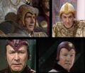
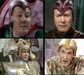
Again, we're having a bit of a struggle for what the main image should be. Unlike the one at the Master, we know which incarnations to include, which are all of them. User:Skittles the hog thinks his image is better and should be included instead of mine, claiming my image was not "creative". Was it creative? I moved some of the images around. Still not creative? Not enough for Skittles? I'm adding this talk page because I don't want an edit war. These are the two images I and him wanted:
The one I (BroadcastCorp) wanted:
The one he (Skittles the hog) wanted:
Choose which one you think is better. And tell your opinion on what the main image should be. BroadcastCorp (talk | contribs) 07:45, September 2, 2011 (UTC)
- Please ignore the comments he made about my supposed "allegations", they are untrue. I never said my image was better, but that it wasn't a complete rip-off the images at the Master and River Song. Not only have you continued to upload this, but then went on to create yet another image in the same style that can be seen at Rassilon. As for "[moving] some of the images around", you haven't, not really. It's the same basic design. This is the third time I've had to say it but: making images of identical design makes them boring and devalues the existing images.--Skittles the hog - talk 07:51, September 2, 2011 (UTC)
Ignore this and ignore that, have you any idea know what discussion is. You listen to people. You read the discussion to know what to say next. Now, the "same basic design", yes, I believe you, I did move the images around slightly, but it really shows their importance. The biggest and prime image shows the latest incarnation. The second biggest shows the first incarnation. And the two little boxes show the others. That can help people know which is which. Yours is just a bit disproportioned that's all. We've both got the same images. So instead of this being a main image discussion, it's the main image layout discussion. You see? BroadcastCorp (talk | contribs) 07:57, September 2, 2011 (UTC)
- Nope. This is about the actual main image. I can't see any reason why we can't put the image (on the right) in while we wait for a better one.--Skittles the hog - talk 08:07, September 2, 2011 (UTC)
Ah, I take it your silence means your creating an image.--Skittles the hog - talk 08:17, September 2, 2011 (UTC)
- Was there anything particularly wrong with the image that was there? Prior to your...edit summary/talk page discussions? Given that the Master and River Song images follow not a similar layout, but a similarly influenced creative direction isn't it fine to have a 4x4 layout as was followed with the image that was on the article? --Tangerineduel / talk 08:28, September 2, 2011 (UTC)
Well, here's a slightly tidier version, but to answer your question, no. There is nothing wrong with the 4x4 design.
I really don't think we should be emulating design choices when such a basic one works fine. The incarnations are in order here so that's even better.--Skittles the hog - talk 08:44, September 2, 2011 (UTC) --Skittles the hog - talk 08:44, September 2, 2011 (UTC)


