Overhauling image policies
Opening post
So I felt I might be the best person to write an OP for this, since T:GTI was partially made in response to my own images uploaded to the wiki. Back in 2012, I use to upload images from VHS rips on YouTube of various oddities, and these ended up all over the site. Eventually, the head admin User:CzechOut made the page and featured several of my images as "bad examples" of images, and featured a bunch of better pictures to show better examples.
Alongside this, we also have T:IUP, which is a less flashy list of basic rules about use. GTI and IUP are so similar that we should consider merging them into one simple guide. But more importantly, along side this, we need to question two things. Should this new guide be written from scratch, and how many of these decade-old-rules don't hold up anymore?
The main point of this debate is to state that A) these guides should be combined, B) the writing needs to be updated and newer images need to be found, and C) many of the rules in both T:GTI and T:IUP should be changed or retired.
Before we start this, there's also a third page for image rules, T:ICC. I think this should be updated but not merged. Having one rule list that goes into detail and another that is a "cheat sheet" works for me!
Main strife
Widescreen images
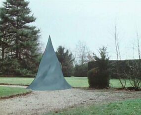
This was the favored practice of admins a decade ago, but isn't so in-vogue today. Basically the idea was that by cropping the top and bottom of images to look "widescreen" instead of 4:3, it would made the focus of the images more clear.
To me, this seems like something that might have seemed cool in 2011, but is just odd in 2023. It's my belief that since over 65% of televised Doctor Who stories were broadcast in 4:3, it should not be our official policy that we have to cut out details on the top and bottom just to make it look more slick. The cropping on our files, in my opinion, should correlate to whatever looks best and gives an accurate view of the story itself.
BACK UP YOU'RE TOO CLOSE!!!
Next, I wanted to bring up another policy that I think makes the site actively worse.
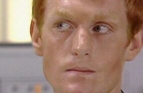
It was the opinion of CzechOut and others when making these guides that the SINGLE MOST IMPORTANT FEATURE ON THE HUMAN BODY... was the eyes. It was very important that any reader on any platform be able to immediately see the eyes. This was so true that it was suggested that cropping the hairline and chin of infobox photos was for the best.
I think this looks horrible, and is a photo technique used by no one else on the planet. Look at the infobox image for Vislor Turlough. It looks bad, it doesn't accurately show what Turlough looks like, and indeed even a hard-core fan might need a moment to recognize the actor. According to the framing, the most important detail is the lack of eyebrows and the pale skin. Maybe it's Matt Smith? If I could just see his chin and hair, maybe the distinction would be more obvious. :/
The eyes are not always the most important feature, and it should not be our official policy that infobox images shouldn't show an actor's chin or hairline.
When it comes to what is important in an infobox image, it really should be a case-by-case basis. Like, Fourth Doctor should have the hair and scarf in the image. Ninth Doctor has the Dalek in the background for obvious thematic reasons. Rarely is the most important thing the eyes, nor is it typically the same across every image.
TURN LEFT
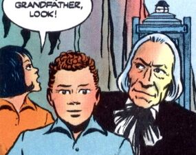
Okay, so this is a big one that might initially appear a little blasphemous. I've taken some graphic design courses since I started on this wiki, and I have never had someone repeat to me the rule about all images facing inside of the design. Like, I've never never never never had someone tell me "the person's face must never face away from the book's spine because then the reader will remember that reality exists and they'll close the book." Never.
So I do think it would be a good idea for this being our official preferred policy to be retired.
Colour Comics

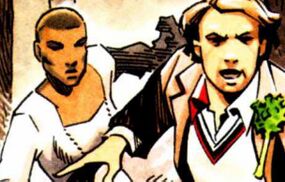
According to our official policies, this image is actually banned.
So this has been one of my big disagreements over the past decade with this guide. If you're out of the loop, I'm talking about: "No colourisation allowed". So why is this disagreeable to me?
Well, let me put it like this. A few years ago, on a forum which sadly wasn't archived at all, we had a mini-debate about SPECIAL EDITIONS! (The Five Doctors, Dalek Invasion of Earth, a bunch of stuff on The Collection, etc) And it was the concluding opinion of CzechOut (again, to my memory, since that era is gone) that it didn't matter. We, as a wiki, should count all episode editions as valid, and we should use whichever image looks best at a thumbnail level.

If this is the case, why do we ban the use of colourized comics? If a colour comic, published officially, looks better at a thumbnail size that the black-and-white original, I think that's what should be used. This is also an impractical rule due to how obscure some first edition comics are.
For instance, I (as an American) collect old back-issues of TV Comic. Let me tell you that these issues are so rare and hard to get that it isn't even funny. And the reprints featured in Doctor Who Classic Comics are gorgeous and much easier to get a hold of, but according to our own rules they aren't good enough. If you don't have a hyper-obscure first-edition copy of some comic from 1965, you're out of luck because the reprint is banned.
Basically, I think this one needs thrown out immediatley.
Separate rules for out-of-universe images

This has come up recently in the edit history of the image used on Rafe Wallbank. Basically, some editors on this wiki believe that images used on out-of-universe pages should have separate rules from those on in-universe pages. That is, the basic standard for cropping and framing, and what sort of images we use.
I am inclined to agree with this position. Looking at Rafe's page, it is a little silly that he's framed like one of the main Doctors, and cropping it just hides extra details in the photo.
One Image Per Section
This is a rule I don't think used to be here, and I personally think it's not needed. This made sense back when we were combining of all of the Master's pages into one, meaning the page was the length of War and Peace and was likely to blue screen your laptop
Since then, bandwith standards have increased around the world, and I haven't had a problem with the site in ages. Most loading issues I used to have were more about there being too many ads, which isn't even something we can control!
So I think we should replace this with the more practical and easy-to-remember maximum of "one picture per paragraph." I think most editors can see when a section is too bloated with images just by looking at it, so really it's just a thing of case-by-case discretion.
Allowing promotional images

So I thought I would include this one, since it's a rule we changed years ago, and I think it's generally been for the worse.
Basically, for characters/stories/moments who didn't otherwise have illustrations (stuff from audio/prose mostly) we used to allow promotional artwork, mainly the miniature comics printed in Doctor Who Magazine. But years ago, we had another debate in another unarchived forum, and one of the admins came to the decision that because "advertisements are not stories," we would discontinue this policy.
I think this has been a mistake, as do others, and I'd like to make this part of our official policy once-more.
To be more precise, I think it would make complete sense for the Wiki to cover promotional images from DWM previews, slideshow-y BF video trailers, and so on, which are essentially illustrations that happen to be released separately from the story they illustrate. Sure, they're not exactly "part" of the audio story, but neither are images cropped the cover, or illustrations from the booklet, and we already allow these without trouble, considering them an accessory to the story.
Tabbed galleries in infoboxes
Since we are now adapting the use of Tabbed galleries in multi-incarnation characters like The Master or The Doctor.
It's been suggested by User:Scrooge MacDuck that we could also use this for other uses, such as non-regeneration recasts. The obvious example is that First Doctor could have a main image for William Hartnell, then you click on the other tabs and there's also images for Richard Hurndall and David Bradley.
I can think of a ton of uses for this right away. Maybe Oswin Oswald could have a tab featuring her as a human, and another as her as a chained-up Dalek. Maybe Hob could have a pre/post Erdrich horror tab system. etc.
Galleries
Since this already covers a lot, I thought I'd thrown in another quick recommendation we have in TARDIS:Temporary forums that is quite popular.
By User:MrThermomanPreacher and with 13 supporters:
The usage of galleries on in-universe articles in the same vein as Memory Alpha (example).
MrThermomanPreacher ☎]]
I'm old enough to remember that we did use to do this. I don't really go one way or the other about this, but I do think this would make the site a lot more appealing and approachable to more casual fans.
One suggestion I've heard just today is that we could have a /Gallery subpage system. Similar to how we have things like Ninth Doctor/Appearances and Death's Head/Appearances. This could be a really cool way to bring in newer editors who love to contribute but don't want to just write essays all day.
File Size limit
Finally, comes the big one. File size limit. This has long been a struggle on this wiki, as we are requested to stick to a file size limit of 100kb, while also being asked to post images above 250px wide. Having to use third party software to compress images is a major pain and is not user-friendly.
At the end of the day, Fandom has a file size limit of 10MB. So if the company investing money into us don't have a 100kb file size limit, neither should we.
Conclusions
I believe that A) we should probably start our image guides from scratch, B) we should consider new sensibilities based on what's best for fresh-faced readers, and C) many of the rule changes above should be taken.
OS25🤙☎️ 22:27, 21 February 2023 (UTC)
Discussion
Largely uninterested in this, don't do much with images. Will read what's going on though. With that said, my opening positions are this:
- I slightly prefer images looking towards the main body of the page but don't think it should be mandated if the other image is better. List it in the policy as something explicitly to be considered as a reason to choose an image but not disqualifying? imo.
- Don't really care about the IU/OOU issue, but I think it's a bit silly that the issue came about given that Rafe Wallbank intended his unedited picture to be used. (I also think that 1 month blocks are, in general, excessive unless repeated after the user has recently been blocked. But that's a larger concern I have with blocking policy here.)
- Unsure about promo images for audio, slightly lean towards? Complicated feelings.
- I'd like to see examples of galleries before I comment, the examples linked at MA don't have clear analogues here.
- File size limit absolutely needs to be upped, but idk if going all the way to the fandom limit is the best idea. (Of course, given how many ads they stick here, we could make sure we drain em for all they're worth.)
Najawin ☎ 23:29, 21 February 2023 (UTC)
- I support this proposal, but I would add an addendum regarding filetypes. Promotional photographs and screengrabs should be exclusively .JPEG files and illustrations can be either .PNG or .JPEG. If we're implementing galleries, we ought to have a standard of some sort. NoNotTheMemes ☎ 23:35, 21 February 2023 (UTC)
- Brilliant work OttselSpy. I completely agree with all of this. It’s something that needs to be changed. The sooner the better. The wiki will be all the better for it. Although, one thing you did not mention was the rule of strictly JPGs. While we should not go crazy and wildly just allow any file type, I think it would do nicely if we’d allow PNGs to be used as well. It is a pain to have to go through a third party just to change what is arguably a completely fine file type, the PNG, to a JPG just because the wiki rules require it. It’s an outdated system. Danniesen ☎ 23:40, 21 February 2023 (UTC)
A quick correction to what's in my post. I say above that the minimum width of an on-site image is 250px, but I forgot that it's actually 420 now! Which is even worse considering the file size limit. OS25🤙☎️ 23:59, 21 February 2023 (UTC)
- Eh, it’s fine. No one can keep up with everything going on here. Danniesen ☎ 00:04, 22 February 2023 (UTC)
- I think I support all the proposed changes. I admit that I'm not as enthusiastic about some as I am about others, but I have no objection to any of them.Time God Eon ☎ 00:17, 22 February 2023 (UTC)
I support all of these proposed changes. Quite frankly, our image policies are a mess, and are in desperate need of modernization. Pluto2☎ 02:12, 22 February 2023 (UTC)
- I too support all of the proposed changes, including the filetype loosening and especially the cropping and widescreen and
[[/Gallery]]subpages and colour comics and ... well, and all of it! Great opening post OttselSpy, can't wait to see this omnibus of much-needed fixes pass through! – n8 (☎) 02:19, 22 February 2023 (UTC)


