Talk:The Doctor/Archive 5
| This page is an archive. Please do not make any edits here. Edit the active conversation only. |
Infobox image: the final chapter[[edit source]]
There is discontent about the image used in the infobox. As we search for a new solution, it's important to remember what's already been ruled out.
Things to avoid in the design[[edit source]]
The following proposed solutions have, as is reflected both in archives of this page, and at talk:The Master, already been ruled out by the community:
- Collages which contain all 11 Doctors
- Collages which grossly violate T:ICC
- Collages which don't clearly show their smallest images at 250px width. (This is mostly why an 11-up design doesn't work; no matter how you design it, some of the images are going to be miniscule when viewed in situ in the infobox.)
Symbolism or rotation?[[edit source]]
Given that a redesign of the latest collage image (again, seen at top right), would simply be an exercise in moving the squares around, there's no point in offering a new collage. It won't be demonstrably better than that which already exists. It'll just be a variation on the same.
Thus, as Archive 4 makes clear, we've moved on to a new question: do we have a symbolic representation of the Doctor, or do we rotate the images in some way?
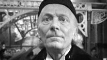














Tangerineduel has suggested symbolism might be the way to go. He's advanced the notion of using the Doctor's calling card seen briefly in Remembrance of the Daleks. There may be other images which equally represent the Doctor; I've only half-jokingly suggested that better symbolism might be a closeup on a question mark collar.
Another thought is that we can just rotate the images. At present, the incarnation shown is chosen randomly, which means that you get a different Doctor on (most) every page load. (Reload this page to try it out.) I'm looking into a javascript trick to simply rotate through different pics, so that you don't have to reload the page to get a different image.
Note, too, that it doesn't have to be these eleven images. It doesn't even have to be just 11 images. It could be 121 images, so we see a lot of "moods" of the Doctor. But it should be an equal number of images for each incarnation.
The choice[[edit source]]
Our choice now is between:
- Keeping the collage
- Going to something that symbolises the Doctor, but doesn't actually show any incarnation's face
- Rotating between full-sized images of each incarnation
Discussion[[edit source]]
Discuss the choice, below.
czechout<staff /> ☎ ✍ 19:00: Mon 03 Sep 2012
- Would a specific dislike of one option go under that header as well? d ●•· 19:07, September 3, 2012 (UTC)
- Well, the headings of the following sections are labelled, "I like <whatever>" — not "I hate <whatever>". It had been intended that you would clearly indicate the choice you preferred, so that we'd get a clear indication of preference. For that reason, I'm removing your remarks under "collage", since you prefer rotation.
czechout<staff /> ☎ ✍ 01:19: Tue 04 Sep 2012
- Well, the headings of the following sections are labelled, "I like <whatever>" — not "I hate <whatever>". It had been intended that you would clearly indicate the choice you preferred, so that we'd get a clear indication of preference. For that reason, I'm removing your remarks under "collage", since you prefer rotation.
I like the collage[[edit source]]
- I support the idea of a collage consisting of Hartnell, Smith, plus a Doctor representing 1966-1989, 1989-2005 and 2005-2010 respectively, but I'm not sure whether to keep Eccleston or change it to Tennant. -- Tybort (talk page) 19:43, September 3, 2012 (UTC)
- Just leave it as it is. For the millionth time. We do not need to change the image. It is fine as it is. I am getting very, very tired of people whining and moaning about the main images for the Doctor, the Master, Cybermen, Silurians, Daleks etc. What's next? Borusa? Romana? K9? I'm all in favour of having a discussion, but it is only needed once. If, after the discussion, you don't like an article image, tough. There are thousands of pages on this wiki that have no images on them and needs images - these are much, much more important than a pointless discussion about a page that already has a main image. I am really tempted to close this discussion, since, as I stated before, there are many articles that need images, and User:CzechOut will agree, placing images on them is much more important than reviving a inactive discussion. Rant over. MM/Want to talk? 22:58, September 3, 2012 (UTC)
- I see no problem with the current image. It's clear, shows the Doctor has more than one face and isn't cluttered as the result of some base desire to see equal treatment. I'm really not a fan of the rotation as I can't see what purpose it serves. The user has to sit there watching the images change when they could just look at a select collage. We shouldn't implement it simply to appease those who are complaining, that's just insulting to the whole idea of a debating. I don't think we should use the rotation just to show off some fancy coding either as such novelties soon wear off. Just leave it as it is and if this discussion should climb out of the pit again, we should simply redirect them here and then take no further part in it.--Skittles the hog - talk 08:26, September 4, 2012 (UTC)
*I don't dislike the collage. I like it better than the rotating images. The collage at least represents a single idea of the Doctor. The collage of images doesn't represent a single united idea. We've had images of the various incarnations on the article before and removed them, we don't need to return to that. --Tangerineduel / talk 13:16, September 4, 2012 (UTC)
- I'm withdrawing my choice, see below in symbolism. --Tangerineduel / talk 07:21, September 14, 2012 (UTC)
- I support the collage. Personally, there is nothing wrong with it. Now show me the Master's main image and we'll have a proplem, but this one... It's okay. Prefered to othe rchoices. OS25 (talk to me, baby.) 11:19, September 5, 2012 (UTC)
I like the symbolism[[edit source]]
- As I've maintained the article isn't about the individual incarnations of the Doctor but rather his character as represented from the start to the present. So something abstract that represents instead of showing the Doctor is what is needed here. --Tangerineduel / talk 13:11, September 4, 2012 (UTC)
:As CzechOut has requested I "pick" one solution, rather than discuss the choice. Take this this statement as my preference but the collage as my selection of a solution. --Tangerineduel / talk 05:40, September 5, 2012 (UTC)
- Now that I've had some time to look and consider both proposals, they both have their positives and negatives. They're both a compromise, but I still feel that the article is about the concept of the Doctor rather than the various incarnations as individuals. --Tangerineduel / talk 07:21, September 14, 2012 (UTC)
I like the rotation[[edit source]]
- I support rotation. The Doctor is not a symbol, but a man. And as a character, like any other character on this wiki, he is best depicted by seeing his actual face. The rotation solves the issue of leaving any Doctors out unnecessarily, while allowing the image to be large enough (obviously) to tell who you're looking at. If possible, a rotating caption reading "[actor] as the [nth] Doctor" would be ideal. The current collage (possibly with Tennant instead of Eccleston) would be my second choice, provided it's cleaned up a bit. d ●•· 19:07, September 3, 2012 (UTC)
- I don't particularly understand why the collage isn't good enough, but I think rotation will finally put an end to this discussion, so I support that method. Yes, it needs tweaking, and what's in place now is the band-aid of random display. But, in principle, if a bit of javascript can rotate through pics labelled "First Doctor", "Second Doctor", etc., I don't think anyone will be able to reasonably complain. And that's really all I care about. Ending this discussion in such a way that we can easily accommodate future Doctors.
czechout<staff /> ☎ ✍ 01:29: Tue 04 Sep 2012
- if we can't have all the doctors in one image, then rotation is the next best thing. i greatly object to leaving any doctors out as that would be like saying they are less important than the others which is simply not true. so, rotation it is for me. Imamadmad ☎ 07:32, September 4, 2012 (UTC)
- Imamadmad has a point. We treat all stories, whether television, audio, comic, etc, equally on this wiki, there is no preference. Including only some images of a character seems to show a preference. No matter how reasonable the choices included may seem to us, someone is always going to want "their" Doctor included and will change the picture and this debate will start up all over again. Shambala108 ☎ 14:54, September 4, 2012 (UTC)
- I agree. Rotation has the possibility of representing all rather than some Doctors. Would creating an animated .gif be a possible solution? And if so, do they display in infoboxes? That would be ideal. Memnarc ☎ 23:27, September 4, 2012 (UTC)
- That would be PERFECT. Unfortunately, I think that there is a rule here forbidding the use of GIFs. Maybe find a way for the main image to shift at even intervals, like slideshow images? Dr. Anonymous1 ☎ 23:47, September 4, 2012 (UTC)
- Just come across this discussion, and I prefer the idea of the images rotating randomly through a few for each Doctor. Tardis1963 talk 10:39, September 14, 2012 (UTC)
I like the idea of removing the infobox[[edit source]]
There is another, slightly more extreme solution to the discussion of a "primary image" for the article and that's to get rid of the infobox altogether.
The infobox is there to basically summarise the article, as we've seen with previous discussions having the actor field in there didn't work for the article. Currently the infobox isn't doing very much, it's stating what's said in the first sentence, giving the first appearance and lists of Aliases and Appearances.
So, let's get rid of the the whole infobox. This would solve the question of the image above, instead we'd have images that would actually illustrate the content of the article. --Tangerineduel / talk 15:28, September 4, 2012 (UTC)
- TD, you're muddying the water. Please pick one solution, and remove your remarks from the others. You've got comments under three different options, and it's unclear what's your preferred course of action.
czechout<staff /> ☎ ✍ 21:06: Tue 04 Sep 2012- Also, there's the real question of what other images you would have on the article. As things stand, the infobox is the only illustration on the entire article. You say, "we'd have images that would actually illustrate the content of the article" — but what illustrations would you have that wouldn't just migrate this "image fight" to the body of the article? I mean, are you proposing only symbolic illustration throughout the article? Do we want to police that? Unless you've got clear ideas for non-controversial illustration of the article, I'm thinking it's better to mandate that there be only one "illustration area" in the article, that it be in the infobox, and that its contents be firmly decided by this one, final discussion on the matter.
czechout<staff /> ☎ ✍ 21:20: Tue 04 Sep 2012
- Also, there's the real question of what other images you would have on the article. As things stand, the infobox is the only illustration on the entire article. You say, "we'd have images that would actually illustrate the content of the article" — but what illustrations would you have that wouldn't just migrate this "image fight" to the body of the article? I mean, are you proposing only symbolic illustration throughout the article? Do we want to police that? Unless you've got clear ideas for non-controversial illustration of the article, I'm thinking it's better to mandate that there be only one "illustration area" in the article, that it be in the infobox, and that its contents be firmly decided by this one, final discussion on the matter.
I personally think that we should NOT get rid of the infobox, under any circumstances; I advise that we choose between the three remaining options, taking into account the pro's and con's of each:
- Keep the collage, but hold another vote on which incarnations we should include (not based on which are the "greatest", but rather which ones are best representative of the Doctor overall). It should be limited to only a handful, maybe the same number as the Master's collage has. You say people will complain about our current choices, but have they so far?
- Randomly rotate the image every so often; this IS a good idea, and it more or less gives everyone what they want. The only problem is, it's highly inconvenient for the poor fellow who has been charged with replacing the image.
- Keep the infobox, but remove the picture or replace it with a symbolic representation; this idea is a good one, but there is one MAJOR problem: To be fair, we have to do this exact same thing to every other Time Lord article whose subject has regenerated at least once.
Incidentally, why DO we have the rule against including all incarnations of the Doctor? I see no apparent reasons why this is so. Dr. Anonymous1 ☎ 22:56, September 4, 2012 (UTC)
Oh, never mind about what I said was the downside of "option two"; I see what you actually meant. However, there's one other problem with that solution: a casual visitor who doesn't know much about the Doctor may mistake that for his "main appearance", if you know what I mean. Dr. Anonymous1 ☎ 23:04, September 4, 2012 (UTC)
- but if you have a bit of coding which changes the picture every 2-5 seconds the visitor can easily see that there is more than one version of the doctor without leaving any out. if we go with this, i suggest we scroll through from the most recent doctor to the oldest and then looping back again, so newer whovians who might not know what the older doctors look like can understand easier. Imamadmad ☎ 11:36, September 5, 2012 (UTC)
- Oh, sorry, I just wanted to quote Attack of the Cybermen... Yeah, the collage is still the best choice. OS25 (talk to me, baby.) 14:36, September 5, 2012 (UTC)
I definitely like Imamadmad's idea; if this is possible, we should DEFINITELY go with that; it has all of the advantages of the collage and rotation idea, but lacks the drawbacks inherent to both ideas. If this is not possible, though, I'd go with collage.. Maybe. But first, we need to be sure that the aforementioned coding exists. Dr. Anonymous1 ☎ 15:32, September 8, 2012 (UTC)
- Again this discussion seems to have just petered out, which is a plus for the supporters of the transition. Obviously this is annoying to others, as I for one hate the thing. Are we just supposed to leave it up until a compromise is found? The only reason people seem to support the transition is in the belief that it will be this compromise. Personally, I think not, but unless anyone else is able to waft this fire, it looks like it'll win by default.--Skittles the hog - talk 18:57, September 13, 2012 (UTC)
Conclusion[[edit source]]
I'm gonna take exception with Skittles' characterisation of this discussion. It looks to me like — after a long and wide-ranging debate — there has finally emerged a strong consensus for a course of action.
Tangerineduel has backed a horse no one else wants to ride — while nevertheless removing his stronger opposition to rotation. Tybort, Skittles, Mini-mitch and OS25 are declaratively in favor of the previous collage.
The remaining seven have expressed a preference for rotation with captions. That means we have 7:5:1 vote in this current round. However, when you add in the thoughts at talk:the Doctor/Archive 3, you find that Deb1701 and GuitarMan666 were the first to propose rotation. There are also several, and I'm not gonna count 'em all here, who strongly argued for using all 11 Doctors in some capacity. It seems reasonable to believe that, since they were directly opposing a collage with a limited number of Doctors, they would side with the rotationists.
It is therefore the result of this discussion that we will change the infobox image to one which:
- rotates all eleven Doctors
- can easily accept images for future Doctors
- features pictures that have captions saying "First Doctor", "Second Doctor", etc.
It may take me a few days to get around to it, as there are several other projects bubbling away.
This discussion, opened in March 2011, is now totally, firmly closed. And I mean until the end of time.
czechout<staff /> ☎ ✍ 00:30: Mon 17 Sep 2012
- Note that this discussion has no bearing whatsoever on the one at talk:The Master, because the Master's incarnations cannot be as easily captioned as the Doctor's. Thus, a collage there is the only practical possibility.


