Talk:Bernice Summerfield: Difference between revisions
OttselSpy25 (talk | contribs) Tag: sourceedit |
OttselSpy25 (talk | contribs) Tag: sourceedit |
||
| Line 158: | Line 158: | ||
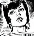
: * Five I agree is very flawed. I would go with 6. 7 is just just captures the character too poorly and is furthermore from a scene where she is being hypnotized. [[User:OttselSpy25|OS25]] ([[User Talk:OttselSpy25|talk to me, baby.]]) 16:34, November 10, 2015 (UTC) | : * Five I agree is very flawed. I would go with 6. 7 is just just captures the character too poorly and is furthermore from a scene where she is being hypnotized. [[User:OttselSpy25|OS25]] ([[User Talk:OttselSpy25|talk to me, baby.]]) 16:34, November 10, 2015 (UTC) | ||
: * Seven is the best of these in terms of pure layout, but it also has a distinctive historical advantage. This is the original look of the character. And there's nothing in the cropping to indicate that she's being hypnotised; you're projecting your knowledge of the comic's storyline onto the image, OS25. The average reader wouldn't do that at all. {{user:CzechOut/Sig}}{{User:CzechOut/TimeFormat}} 21:09: Thu 12 Nov 2015</span> | : * Seven is the best of these in terms of pure layout, but it also has a distinctive historical advantage. This is the original look of the character. And there's nothing in the cropping to indicate that she's being hypnotised; you're projecting your knowledge of the comic's storyline onto the image, OS25. The average reader wouldn't do that at all. {{user:CzechOut/Sig}}{{User:CzechOut/TimeFormat}} 21:09: Thu 12 Nov 2015</span> | ||
:: Well it could be argued that since the later was illustrated by [[Lee Sullivan]], who actually designed the "original Bernie look" you talk about and made most of the covers featuring her. If anyone should know what she should look like it's him, and not (at least as I would argue) the artists for our current image. Furthermore I think that the image taken from the comic far more accurately captures her character than the doe-eyed hypnotism pic, where she does look stoned out of her mind and totally outside of her character design which, yes, Lee Sullivan created. [[User:OttselSpy25|OS25]] ([[User Talk:OttselSpy25|talk to me, baby.]]) 22:07, November 12, 2015 (UTC) | :: Well it could be argued that since the later was illustrated by [[Lee Sullivan]], who actually designed the "[[:File:Bernice_Original_Sketches.jpg|original Bernie look]]" you talk about and made most of the covers featuring her. If anyone should know what she should look like it's him, and not (at least as I would argue) the artists for our current image. Furthermore I think that the image taken from the comic far more accurately captures her character than the doe-eyed puffy-faced hypnotism pic, where she does look stoned out of her mind and totally outside of her character design which, yes, Lee Sullivan created. [[User:OttselSpy25|OS25]] ([[User Talk:OttselSpy25|talk to me, baby.]]) 22:07, November 12, 2015 (UTC) | ||
Revision as of 11:54, 13 November 2015
Timeline question
Where's this idea...
- This section alludes to a timeline in which Bernice Summerfield travelled with the Doctor. Due to the intervention of Irving Braxiatel, who she met later, this timeline may no longer exist.
...from?
Bernice alludes explictly to her time with the Doctor in her most recent novella collection and both of her two most recent audios refer frankly to the events of that time.
Whatever changes have been made to Benny's life, this doesn't seem to be one of them. --Richard Jones 20:36, 15 May 2008 (UTC)
- No idea (have removed it anyways). She also refers to the Doctor by name and Heaven in Death and the Daleks (and there's plenty of references back and forth throughout all the novels and audios). --Tangerineduel 06:21, 16 May 2008 (UTC)
- Thanks so much! A case could be made that references like the Death and the Daleks one happened before Brax's time-tweaks but that fact that she still remembers the Doctor in The Wake, which is for now the end of the EvilBrax arc, is absolute proof that Benny's time with the Doctor is still intact. --Richard Jones 21:07, 16 May 2008 (UTC)
Benny's age when her dad disappeared / when her mother died Impossible to pin down, is my thesis. Benny's always maintained that Isaac disappeared when she was 7. We know that Claire was alive at the time (The Evacuation of..., in which Isaac has been gone for not more than six months, and Claire has just died; Return of the Living Dad, in which Isaac is unaware of Claire's fate). Benny has sometimes said that she was orphaned at seven (in Return of the Living Dad and Love and War), but in The Extinction Event she states that she was eight when her mother died.
I think that the best reconciliation is that Claire Summerfield's death ocurred after Benny's eighth birthday, but not long afterwards. From grown-up Benny's point of view, there's not much difference between being (say) 7.9 years old versus being (say) 8.0 years old; Benny may not have really started thinking of herself as an eight-year-old yet. Nightsky 20:16, 2 September 2008 (UTC)
What are YOU doing this weekend?
Benny married Jason in the village of Cheldon Bonniface, England, on 24th April 2010. The wedding was attended by a host of guests from all space and time. (PROSE: Happy Endings). Anyone up for a party this weekend?ReTardis 17:10, April 22, 2010 (UTC)ReTardis
Dead and Buried?
Shouldn't we have a page for the upcoming animation and add some info on this page?
Image
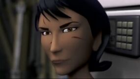
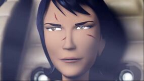
Since Irving Braxiatel's profile picture is taken from Dead and Buried, I propose the same be done for Benny's picture. It's the closest either character has ever come to being onscreen. Slughorn42 ☎ 13:31, August 11, 2014 (UTC)
- The image you uploaded before was deleted for not having a license, but even so, it violates Tardis:Guide to images. We prefer infobox images to be closeups of the character's face. If you can find a closeup, you can post it here for consideration. Shambala108 ☎ 15:18, August 11, 2014 (UTC)
- I think it's about time Benny's infobox image was updated as well. How about one of these two images? I'm partial to the first, but its perhaps a bit too dark. P&P talk contribs 17:29, August 11, 2014 (UTC)
- I prefer the second one. Slughorn42 ☎ 18:19, August 11, 2014 (UTC)
- I think it's about time Benny's infobox image was updated as well. How about one of these two images? I'm partial to the first, but its perhaps a bit too dark. P&P talk contribs 17:29, August 11, 2014 (UTC)
- I've reverted back to the original while the discussion is ongoing. Policy dictates that we don't make changes until the discussion is concluded. Shambala108 ☎ 19:34, August 11, 2014 (UTC)
- It's been almost a month, can we move forward on this? P&P talk contribs 16:22, September 1, 2014 (UTC)
- I agree with this as it represents the character more to the actor than a 20ish year old picture. also Peter Summerfield's and Bev Tarrants pages also use dead an buried images. Personally I would prefer an image of Lisa Bowerman, but since we have a more in universe picture than the covers of the CDs, we should use the second picture, as I believe this is the policy regarding images taken from visula epps rather than covers of cds. Adric♥Nyssa∩Talk? 17:18, September 1, 2014 (UTC)
- It's been almost a month, can we move forward on this? P&P talk contribs 16:22, September 1, 2014 (UTC)
I know that somewhere on this wiki is User:CzechOut's rationale for the current image. I haven't been able to find it, so I suggest one of you ask him directly on his talk page to visit this discussion. In the meantime, the original image stays. Shambala108 ☎ 02:13, September 2, 2014 (UTC)
- In point of fact there probably isn't a place where I advocated the use of this current image. Basically the infobox here was changed quite some time ago by User:OttselSpy25, who correctly noted that a promotional image was inappropriate. It had previously borne that hoary old image of Bowerman in a hastily-bought fedora up against a tree somewhere close to the BF studios. This, of course, violated T:IUI, and OS25 logically went back to some of the original source material for an in-universe image.
- All that I did was to replace it with another image from the stories of that era that had her in a better closeup.
- Personally, I vote to keep that image, because the character has more of a comic history than a video one. The video has turned out to be a flash in the pan, really, whereas there is a kind of "Benny era" in DWM comics — one that is, I think, longer than the Martha and Donna eras combined. May be wrong on the details of that comparison, but I'm at least approximately right.
- What I'm saying is that she was legitimately a comics companion of the Seventh Doctor in the pages of DWM, and that's what the infobox honours now, and what I personally would like to see it continue to do. I'm completely unmoved by the logic that "if Brax has an image from the video, so, too, must Benny". Benny has a much longer history than Brax, so she has more from which to choose. Besides, in the entirety of DWU fiction, Benny is far more important than Brax. We, as a wiki, have a greater duty of care to ensure that we are using imagery that educates and surprises our readers. We should be stressing the inequality of Brax and Benny, because the video gives a highly mistaken impression of the two characters' relative importance. Having a comic image up of Benny says, "Hey this character is about more than what you think, if you're only going off a 10 minute video."
- Besides, guys, the solution is perfectly obvious. Just add the whole video of File:Bernice Summerfield Dead and Buried to this infobox, and that way we get both the comic image and the latter day animation.
czechout<staff /> ☎ ✍ 19:58: Tue 02 Sep 2014
- Besides, guys, the solution is perfectly obvious. Just add the whole video of File:Bernice Summerfield Dead and Buried to this infobox, and that way we get both the comic image and the latter day animation.
- Benny has appeared in 8 comic stories, but almost a hundred novels. If we want the infobox image to really represent her history, how about this one from one of the VNAs? It's from one of the illustrations in Lucifer Rising. It looks less "cartoony" than the Pureblood one, and its looking left. P&P talk contribs 17:08, September 3, 2014 (UTC)
- I wouldn't be in favour of that image because it's a unique, atypical look. She has dreadlocks in exactly one story, and this is the only image of that phase that exists. And "looking left" is not an absolute requirement. Nice if you can get it, but far better to get a high quality, representative, closeup image of the character. Ironically, DWM 199, which contains the Lucifer Rising prelude, also contains an episode of Emperor of the Daleks, a Benny comic, and she is much closer to the image in the current picture: short hair, big earrings. I honestly think that File:Benny Lucifer Rising.jpg is the most un-representative image that could be chosen for the infobox. That said, I think it needs to go on the page, with an explanation that, for a brief time, she had dreads. (So if you're the uploader, thanks for finding this helpful image!)
- As for your numerical comparisons, there may be more prose stories than comic ones, but there are many more comic images of her. And of course we exclude covers in this search, because we only resort to covers when there are no other possibilities.
- Stlll, for the first decade of the character's existence — mostly, but not exclusively, the pre-Bowerman era — she was drawn as depicted in DWM. I mean, she's pretty well consistent from her introductory Love and War cover through to the cover for Parasite and even into the first part of the audio era. Heck, the cover for the audio Oh No It Isn't! is practically ripped from the pages of DWM!
- So, look, I know that if you come to this character here in the 2010s, Lisa Bowerman looms larges in your mind, and you're just not going to like this DWM-centric approach to the character. But the bulk of the in-universe, visual representation of this character really is driven by 1990s DWM. And for the infobox not to reflect that is to give a mistaken impression about the character to our readers.
czechout<staff /> ☎ ✍ 17:25: Thu 04 Sep 2014
- So, look, I know that if you come to this character here in the 2010s, Lisa Bowerman looms larges in your mind, and you're just not going to like this DWM-centric approach to the character. But the bulk of the in-universe, visual representation of this character really is driven by 1990s DWM. And for the infobox not to reflect that is to give a mistaken impression about the character to our readers.
So, now that Benny has been in live action, should we put a picture from Transmission from Mars in the infobox? (video link removed by admin per Tardis:Video policy) – The preceding unsigned comment was added by Icecreamdif (talk • contribs) .
- Based on CzechOut's comments above, it doesn't sound like this one video merits inclusion in the infobox. If it's only one video, then Benny is still visually depicted far more in the comics, per CzechOut's argument. Shambala108 ☎ 01:44, June 13, 2015 (UTC)
Makes sense.69.143.223.170talk to me 02:25, June 23, 2015 (UTC)
Image revisited
The most logical image to use would be an illustration from the Prelude short stories, which tie into the novels and are where Benny first appeared. Summerfield is a novel character before anything else, and I'm against using an image from the comics because they rarely capture the likeness of the character at all. Also, Summerfield had few comic appearances, and appeared more in almost every other medium. I've suggested the right image, as it captures her "adventurous spirit" and what not, unlike the doey faced main pic we have right now which makes her look like she just did some kind of hard drugs. T:GTI makes it clear that personality in images comes before all else, and I can certainly say that this image gets that down more than any comic image could even try to. OS25 (talk to me, baby.) 22:30, September 8, 2015 (UTC)
- Never the less, I will start hunting through DWM comics to try and find an image other than this from the magazine that resembles the character in any way. OS25 (talk to me, baby.) 22:39, September 8, 2015 (UTC)
- Arguably, we should use an image from Emperor of the Daleks!, as that was the only story with her in DWM with art by the man who designed her, Lee Sullivan. The problem with this (and the "use DWM images" argument) is that there are very few close-ups of her alone within the comics. So when you get an artist who can competently capture her there's few few frames that come close to being fit for info-box... OS25 (talk to me, baby.) 00:02, September 9, 2015 (UTC)
- (I added a heading to separate this discussion from the previous one, as they deal with different issues.)
- First, Tardis:Guide to images never states that personality comes before all else. With regard to the issue in question, the key phrase is "Where possible, you should go with the an extremely tight cropping of a person's face." Since it is possible to have a tight cropping of Benny, that is what we require.
- Second, of the images you've proposed, only "Younger and Wiser 1" comes close to being cropped tightly enough, though an argument could be made for "Emperor of the Daleks 1". The other images could be placed elsewhere on the article, but they will not be considered for the infobox. Please note that the debate over Ten's image established just how tightly we want images cropped. Shambala108 ☎ 02:41, September 9, 2015 (UTC)
- Yes it does.
- "But this particular sly expression conveys the character's central duplicity, and thus overrides other concerns."
- Second off, when I say that there aren't a lot of strong choices from the comics, I'm not opening declaring that every image I chose was a perfect fit. Yet every image here is far superior to the one we use now because none of these capture the character under a state of mind not usually occupied by the character (in the one we're using right now I believe that she's being hypnotized) and all of these are drawn by artists who got far closer to what the character was meant to look like. We wouldn't use a TVC comic drawing of Sarah-Jane in an infobox, now would we? OS25 (talk to me, baby.) 13:59, September 9, 2015 (UTC)
- Hold on a moment. Your quote comes from the Eyes section, when describing whether an image should be left-looking. The issue with your Benny images comes from the Tight focus section, which says, "Where possible, you should go with the an extremely tight cropping of a person's face." There are multiple images of Benny, so it absolutely is possible to get a tight cropping. Also note in the tight focus section that the right image of Four is rejected as being not tight enough focus, even though it does a great job of showcasing his personality. So personality does not outweigh tight cropping. Shambala108 ☎ 03:19, September 11, 2015 (UTC)
If there are no objections, I'm going to be changing the info box pic to File:DWM 305 Bernice 7 1.jpg in a couple days. In fits all the criteria that was layed out in favor of the current pic, bit it actually looks like Bernice. Plus the inclusion of colour which is arguably not a bad thing. OS25 (talk to me, baby.) 18:41, September 10, 2015 (UTC)
- I object. I don't think it's a good idea to have large speech bubbles in character infobox images. If the character is a minor one and we don't have a choice, OK. But as I mentioned above, we have plenty of images of Benny. Find one as tightly cropped as the current one, preferably without any speech bubbles, and post it here for consideration. Shambala108 ☎ 03:19, September 11, 2015 (UTC)
This work for you? OS25 (talk to me, baby.) 19:19, September 11, 2015 (UTC)
- I reverted the addition of that image to the page because there has been little discussion on this — just you and I — and it was an issue of interest just last year. Let's give it some time for others to add their input. Shambala108 ☎ 03:07, September 15, 2015 (UTC)
It's super frustrating that we have such limited discussion on this site now. This is meant to be, like, the most popular Wikia site right? Or at least up there. Barely anyone edits, and no one contributes to discussions anymore. At best you'll get two people and one admin who just pops in every once to tell people to play nice.
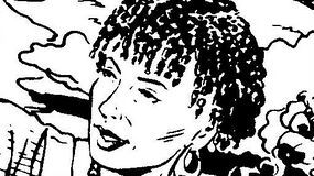
For anyone who finds this discussion in the next ten years, here are the options to replace the current image: OS25 (talk to me, baby.) 18:28, October 16, 2015 (UTC)
I say either the last Word or younger and wiser 2 if we have to change the image as I don't see why it needs to be changed it fits the bill. personally I would like an image of Lisa Bowerman playing her from Transmission from Mars but that will never happen. Anyone object to me adding that to the bulk of the article. Adric♥Nyssa∩Talk? 18:38, October 16, 2015 (UTC)
- Unless someone wants to make the argument that the story isn't a narrative or something then there's no issue adding the image. The reason that the current image doesn't work is that it's not a great image. That artist's depiction of Bernice is like TV Comic's illustrations of Elisabeth Sladen -- very loose and not acceptable for a main profile pic. OS25 (talk to me, baby.) 00:56, October 17, 2015 (UTC)
- I would need to know more about the Transmission from Mars image before allowing it. Is it in-universe or a cover image?
- I think it's time to accept that many of our long-time admins (and our newest one) don't have the time to participate much on the wiki any more. And many of the newer fans are here for NuWho. So it's mostly just the few of us who've been here a while that care about the non-televised Who.
- I've renamed the images in the gallery (and added the current one) to make it a little easier for us to specify which ones we prefer.
- I'm going to state my opinion of each image, per Tardis:Guide to images.
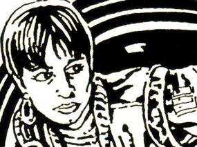
- 1,2,3 are not tightly cropped and I think should be removed from consideration. 4 is ok, but is very similar to 7. I like 5 but there is too much white space. 6 is ok, and is in color, but is looking to the left, and my personal preference is to avoid speech bubbles in the infobox. 7 is tightly cropped but not looking left (which, please note, is preferred by policy but not required).
- If I had to vote for one, I'd probably go with 5 as being the closest. AdricLovesNyssa has stated a preference for 6 or 5. OttselSpy25's vote is apparently for 6. So far that's two votes for 5 and two votes for 6. Shambala108 ☎ 03:27, October 17, 2015 (UTC)
- If I'm allowed a vote, I'd say 6 as, as you've said, 5 has far too much white space and I think it'd be cool to have a colour picture of her for a change. If I don't get a say, then ignore me hehe. TheFartyDoctor Talk 03:41, October 17, 2015 (UTC)
- Well, actually I'm also okay with 5, but I do prefer 6 a bit more as it's a bit more what the character's meant to look like. OS25 (talk to me, baby.) 13:04, October 17, 2015 (UTC)
- If I'm allowed a vote, I'd say 6 as, as you've said, 5 has far too much white space and I think it'd be cool to have a colour picture of her for a change. If I don't get a say, then ignore me hehe. TheFartyDoctor Talk 03:41, October 17, 2015 (UTC)
- I would like 6 better if it didn't have a speech bubble. Can it be edited out? Shambala108 ☎ 15:13, October 31, 2015 (UTC)
6 looks like she's having a stroke.--Skittles the hog - talk 15:26, October 31, 2015 (UTC)
In 7 she is having a stroke, that's actually what's happening in the comic. Anyways, I can try and edit it out, but that's a lot more complex with colour comics than b&w ones. OS25 (talk to me, baby.) 03:01, November 1, 2015 (UTC)
There, a little crude but I did my best. OS25 (talk to me, baby.) 03:19, November 1, 2015 (UTC)
Last round, hopefully
Ok, I've narrowed the choices down to three, and I'm including them here. If you have a particular favorite, please say so here, and we'll see if we can get some kind of consensus. I've left the original numbers for convenience.
I don't really have a strong favorite, but I'll state the pros and cons of each one.
- 5 — looks left, but has too much shadow and too much white space
- 6 — in color, but not looking left (which, as I've stated before, is preferred but not required)
- 7 — tightly cropped, but also not looking left.
Shambala108 ☎ 16:23, November 10, 2015 (UTC)
- * Five I agree is very flawed. I would go with 6. 7 is just just captures the character too poorly and is furthermore from a scene where she is being hypnotized. OS25 (talk to me, baby.) 16:34, November 10, 2015 (UTC)
- * Seven is the best of these in terms of pure layout, but it also has a distinctive historical advantage. This is the original look of the character. And there's nothing in the cropping to indicate that she's being hypnotised; you're projecting your knowledge of the comic's storyline onto the image, OS25. The average reader wouldn't do that at all.
czechout<staff /> ☎ ✍ 21:09: Thu 12 Nov 2015- Well it could be argued that since the later was illustrated by Lee Sullivan, who actually designed the "original Bernie look" you talk about and made most of the covers featuring her. If anyone should know what she should look like it's him, and not (at least as I would argue) the artists for our current image. Furthermore I think that the image taken from the comic far more accurately captures her character than the doe-eyed puffy-faced hypnotism pic, where she does look stoned out of her mind and totally outside of her character design which, yes, Lee Sullivan created. OS25 (talk to me, baby.) 22:07, November 12, 2015 (UTC)
