Doctor Who logo: Difference between revisions
m (Robot: Automated text replacement (-Doctor Who annual +''Doctor Who'' annual)) |
m (enforcing T:CLEAN CODE) |
||
| Line 1: | Line 1: | ||
{{real world}} | {{real world}} | ||
Over the decades, numerous logos have been used for the ''[[Doctor Who]]'' series and associated merchandise. | Over the decades, numerous logos have been used for the ''[[Doctor Who]]'' series and associated merchandise. | ||
==Television== | == Television == | ||
===[[1960s]]=== | === [[1960s]] === | ||
====Logo one==== | ==== Logo one ==== | ||
[[ | [[File:Title-1a.jpg|200px|thumb|right|Logo One]] Used from 1963-1967, [[Season 1]] - [[Season 4]] | ||
The first logo was simply the words "DOCTOR WHO" written in block capital sans serif white text against a black background. The relative weight and size of the two words were arranged to keep both the same width, with emphasis placed on the word "WHO" by use of a heavier, more elongated typeface than that used for "DOCTOR". It is associated with [[William Hartnell]]'s tenure as the [[First Doctor]], but remained in use for [[Patrick Troughton]]'s first few stories up through ''[[The Moonbase]]''. | The first logo was simply the words "DOCTOR WHO" written in block capital sans serif white text against a black background. The relative weight and size of the two words were arranged to keep both the same width, with emphasis placed on the word "WHO" by use of a heavier, more elongated typeface than that used for "DOCTOR". It is associated with [[William Hartnell]]'s tenure as the [[First Doctor]], but remained in use for [[Patrick Troughton]]'s first few stories up through ''[[The Moonbase]]''. | ||
Logo One saw some use on merchandising such as ''[[Doctor Who annual|''Doctor Who'' annual]]'' and the [[Doctor Who - Frederick Muller|Frederick Muller]] novelisations, the latter utilising a variant of the logo in which the WHO is shown fuzzy and distorted. Much later, in the 1980s, [[Marvel Comics]] combined Logo One with elements of Logo Four for its ''[[Doctor Who (1984)|Doctor Who]]'' comic book. | Logo One saw some use on merchandising such as ''[[Doctor Who annual|''Doctor Who'' annual]]'' and the [[Doctor Who - Frederick Muller|Frederick Muller]] novelisations, the latter utilising a variant of the logo in which the WHO is shown fuzzy and distorted. Much later, in the 1980s, [[Marvel Comics]] combined Logo One with elements of Logo Four for its ''[[Doctor Who (1984)|Doctor Who]]'' comic book. | ||
====Logo two==== | ==== Logo two ==== | ||
[[ | [[File:Title-2a.jpg|200px|thumb|right|Logo Two]] Used from 1967–1969, [[Season 4]] - [[Season 6]] | ||
This logo made its first appearance with ''[[The Macra Terror]]''. Simple block capital lettering was used again, but presented in a more uniform serif typeface, removing the differential emphasis to the two words. A completely new "howlaround" pattern was created and [[Patrick Troughton]]'s face was added for the first time. Initially it used the same music as the previous logo, but starting from Episode 2 of ''[[The Faceless Ones]]'', a new arrangement of the theme replaced the old one. | This logo made its first appearance with ''[[The Macra Terror]]''. Simple block capital lettering was used again, but presented in a more uniform serif typeface, removing the differential emphasis to the two words. A completely new "howlaround" pattern was created and [[Patrick Troughton]]'s face was added for the first time. Initially it used the same music as the previous logo, but starting from Episode 2 of ''[[The Faceless Ones]]'', a new arrangement of the theme replaced the old one. | ||
Logo Two does not appear to have been widely used on merchandising, though it did appear on the record release ''[[Doctor Who: Variations on a Theme]]'' years later. | Logo Two does not appear to have been widely used on merchandising, though it did appear on the record release ''[[Doctor Who: Variations on a Theme]]'' years later. | ||
===[[1970s]]=== | === [[1970s]] === | ||
====Logo three==== | ==== Logo three ==== | ||
[[ | [[File:Title-3a.jpg|200px|thumb|right|Logo Three]] Used from 1970–1973, [[Season 7]] - [[Season 10]] | ||
This logo marks the beginning of a modern [[Wikipedia:Brand#Visual_Brand_Identity|visual identity]] for the programme, being much more of a distinct [[Wikipedia:logotype|logotype]] than previous versions. Instead of following classical serif or sans serif forms, the lettering in this version has been uniquely styled for the programme. As with Logo One the relative sizing and placement of the words "DOCTOR" and "WHO" foregrounds "WHO" in a trait which would remain through all future logos until the series' revival in 2005. | This logo marks the beginning of a modern [[Wikipedia:Brand#Visual_Brand_Identity|visual identity]] for the programme, being much more of a distinct [[Wikipedia:logotype|logotype]] than previous versions. Instead of following classical serif or sans serif forms, the lettering in this version has been uniquely styled for the programme. As with Logo One the relative sizing and placement of the words "DOCTOR" and "WHO" foregrounds "WHO" in a trait which would remain through all future logos until the series' revival in 2005. | ||
Primarily associated with [[Jon Pertwee]]'s time as the [[Third Doctor]], this logo was also used as the basis for Logo Eight in [[1996]] for ''[[Doctor Who: The TV Movie]]''. While the title sequence was shown in colour in order to achieve an effect similar to the previous sequence, it was originally designed in black and white. | Primarily associated with [[Jon Pertwee]]'s time as the [[Third Doctor]], this logo was also used as the basis for Logo Eight in [[1996]] for ''[[Doctor Who: The TV Movie]]''. While the title sequence was shown in colour in order to achieve an effect similar to the previous sequence, it was originally designed in black and white. | ||
<br clear=all/> | <br clear=all/> | ||
====Logo four==== | ==== Logo four ==== | ||
[[ | [[File:Title-4a.jpg|200px|thumb|right|Logo Four]] Used from 1973–1980, 1999, [[Season 11]] - [[Season 17]] | ||
Known informally as the "diamond logo" and commonly associated with [[Tom Baker]]'s time as the [[Fourth Doctor]], Logo Four was actually introduced during Jon Pertwee's time as the Third Doctor for his [[Season 11|final season]]. Although known as the diamond logo, in fact the diamond-shaped background was often omitted when the logo was used on books and other merchandise. In addition, while generally displayed on screen with a bluish tint (as displayed at right), on merchandise different colours were used for the lettering and background. | Known informally as the "diamond logo" and commonly associated with [[Tom Baker]]'s time as the [[Fourth Doctor]], Logo Four was actually introduced during Jon Pertwee's time as the Third Doctor for his [[Season 11|final season]]. Although known as the diamond logo, in fact the diamond-shaped background was often omitted when the logo was used on books and other merchandise. In addition, while generally displayed on screen with a bluish tint (as displayed at right), on merchandise different colours were used for the lettering and background. | ||
| Line 29: | Line 29: | ||
The non-diamond Target Books variant of this logo has the distinction of being the first and only series logo to be acknowledged in an in-universe context. The audio drama [[BFA]]: ''[[The Kingmaker]]'' includes references to a series of books, ''[[Doctor Who Discovers]]'' (an in-joke reference to a [[Doctor Who Discovers (real world)|real-world series of books]] of the same title. The cover art for the audio incorporates the cover of one of these books, including Logo Four. | The non-diamond Target Books variant of this logo has the distinction of being the first and only series logo to be acknowledged in an in-universe context. The audio drama [[BFA]]: ''[[The Kingmaker]]'' includes references to a series of books, ''[[Doctor Who Discovers]]'' (an in-joke reference to a [[Doctor Who Discovers (real world)|real-world series of books]] of the same title. The cover art for the audio incorporates the cover of one of these books, including Logo Four. | ||
===[[1980s]]=== | === [[1980s]] === | ||
====Logo five==== | ==== Logo five ==== | ||
[[ | [[File:Title-5a.jpg|200px|thumb|right|Logo Five]] Used from 1980–1984, [[Season 18]] - [[Season 21]] | ||
Introduced in the final season of Tom Baker's era, this revamp of the logo complemented the new title sequence of a "star field", as well as the first non-[[Delia Derbyshire]] arrangement of the theme, replacing the arrangement in place since 1967. It was used throughout [[Peter Davison]]'s time as the [[Fifth Doctor]]. This logo is known colloquially as the "neon sign" or "neon tube" logo. | Introduced in the final season of Tom Baker's era, this revamp of the logo complemented the new title sequence of a "star field", as well as the first non-[[Delia Derbyshire]] arrangement of the theme, replacing the arrangement in place since 1967. It was used throughout [[Peter Davison]]'s time as the [[Fifth Doctor]]. This logo is known colloquially as the "neon sign" or "neon tube" logo. | ||
<br clear=all/> | <br clear=all/> | ||
====Logo six==== | ==== Logo six ==== | ||
[[ | [[File:Title-6a.jpg|200px|thumb|right|Logo Six]] Used from 1984-1986. [[Season 21]] - [[Season 23]] | ||
Introduced as [[Colin Baker]] took the role of the [[Sixth Doctor]], the previous logo was maintained, but was tinted purple along with the rest of the title sequence giving it a more colourful hue. It also takes on a slightly curved appearance. This version of the logo was almost exclusively used on TV, with merchandising and books from the Colin Baker era using Logo Five. If Logos Five and Six are considered the same logo, the "neon-sign" logo becomes the only logo to be used for three different Doctors. | Introduced as [[Colin Baker]] took the role of the [[Sixth Doctor]], the previous logo was maintained, but was tinted purple along with the rest of the title sequence giving it a more colourful hue. It also takes on a slightly curved appearance. This version of the logo was almost exclusively used on TV, with merchandising and books from the Colin Baker era using Logo Five. If Logos Five and Six are considered the same logo, the "neon-sign" logo becomes the only logo to be used for three different Doctors. | ||
====Logo seven==== | ==== Logo seven ==== | ||
[[ | [[File:Title-7a.jpg|200px|thumb|right|Logo Seven]] Used from 1987–1989, 1993, [[Season 24]] - [[Season 26]] | ||
For [[Sylvester McCoy]]'s [[Seventh Doctor]], a new title sequence was produced using computer-generated imagery, with the new logo being a three-dimensionally animated part of the title sequence. Following the TV series' end in 1989 this logo would continue to be used for the [[Virgin New Adventures]] novels and other merchandise including ''[[Doctor Who Magazine]]'' until the early 1990s when it was replaced on most products (except the New Adventures books) by the more famous Logo Four. It was also used for BBC Video's "Years" series of retrospective VHS releases in the early 1990s, and for the 1993 special ''[[Dimensions in Time]]'', which remains its final TV use. | For [[Sylvester McCoy]]'s [[Seventh Doctor]], a new title sequence was produced using computer-generated imagery, with the new logo being a three-dimensionally animated part of the title sequence. Following the TV series' end in 1989 this logo would continue to be used for the [[Virgin New Adventures]] novels and other merchandise including ''[[Doctor Who Magazine]]'' until the early 1990s when it was replaced on most products (except the New Adventures books) by the more famous Logo Four. It was also used for BBC Video's "Years" series of retrospective VHS releases in the early 1990s, and for the 1993 special ''[[Dimensions in Time]]'', which remains its final TV use. | ||
<br clear=all/> | <br clear=all/> | ||
===[[1990s]]=== | === [[1990s]] === | ||
====Logo eight==== | ==== Logo eight ==== | ||
[[ | [[File:Eighth Doctor Logo.jpg|200px|thumb|right|Logo Eight]] Used in 1996, on ''[[Doctor Who: The TV Movie]]'' | ||
This logo was used for ''[[Doctor Who: The TV Movie]]'', with [[Paul McGann]] as the [[Eighth Doctor]] and is essentially a modified version of Logo Three. Colouring is changed and a metallic texture has been applied. Some letters are slightly reshaped from those in the early-70s version (most noticeably C, T, R, and W) and - unlike Logo Three - it is presented as a solid three-dimensional object in space (echoing Logo Seven). During the TV Movie's credits, the logo is briefly viewed from the rear. | This logo was used for ''[[Doctor Who: The TV Movie]]'', with [[Paul McGann]] as the [[Eighth Doctor]] and is essentially a modified version of Logo Three. Colouring is changed and a metallic texture has been applied. Some letters are slightly reshaped from those in the early-70s version (most noticeably C, T, R, and W) and - unlike Logo Three - it is presented as a solid three-dimensional object in space (echoing Logo Seven). During the TV Movie's credits, the logo is briefly viewed from the rear. | ||
| Line 54: | Line 54: | ||
In 2009, the Canadian ''Doctor Who'' Information Network news page reported that BBC Video was considering replacing Logo Eight with the new Logo Eleven on its classic-series DVD releases. As of early 2011, there has been no indication of such a change happening and cover art released for DVD and audio releases into mid-May continue to show Logo Eight. | In 2009, the Canadian ''Doctor Who'' Information Network news page reported that BBC Video was considering replacing Logo Eight with the new Logo Eleven on its classic-series DVD releases. As of early 2011, there has been no indication of such a change happening and cover art released for DVD and audio releases into mid-May continue to show Logo Eight. | ||
===[[2000s]]=== | === [[2000s]] === | ||
====Logo nine==== | ==== Logo nine ==== | ||
[[ | [[File:Doctor-who-logo-nine.jpg|200px|thumb|right|Logo Nine]] Used from 2005-2006, [[Series 1 (Doctor Who)|Series 1]] - [[Series 2 (Doctor Who)|Series 2]] | ||
For the first time the two words of the title are presented horizontally rather than vertically, and the new design was initially controversial with some fans. This logo was used for [[Christopher Eccleston]]'s tenure as the [[Ninth Doctor]] and the first series with [[David Tennant]] as the [[Tenth Doctor]]. Logo Nine variant appears to only be used for TV broadcasts. Book releases and other merchandise, such as toys, used Logo Ten even before its use in [[Series 3 (Doctor Who)|Series 3]] up until the [[2009 Specials]]. | For the first time the two words of the title are presented horizontally rather than vertically, and the new design was initially controversial with some fans. This logo was used for [[Christopher Eccleston]]'s tenure as the [[Ninth Doctor]] and the first series with [[David Tennant]] as the [[Tenth Doctor]]. Logo Nine variant appears to only be used for TV broadcasts. Book releases and other merchandise, such as toys, used Logo Ten even before its use in [[Series 3 (Doctor Who)|Series 3]] up until the [[2009 Specials]]. | ||
A variant of this logo, without the colour background, was used by ''[[Doctor Who Magazine]]'' from 2005 to 2008, and also for its ongoing series of Special issues up to 2010. | A variant of this logo, without the colour background, was used by ''[[Doctor Who Magazine]]'' from 2005 to 2008, and also for its ongoing series of Special issues up to 2010. | ||
====Logo ten==== | ==== Logo ten ==== | ||
[[ | [[File:Doctor-who-logo-ten.jpg|thumb|200px|right|Logo Ten]] Used from 2007-2010, [[Series 3 (Doctor Who)|Series 3]] - [[2009 Specials]] | ||
This logo was a "cleaner" version of the Doctor Who logo originally designed in 2005 and featured in the 'Coming Soon' trailer. This logo is also an animated component within the title sequence moving three dimensionally during the credits. The lettering is considerably more squat than that used in Logo Nine. Introduced in ''[[The Runaway Bride]]'' as the new logo within the title sequence, this has become the logo for [[David Tennant]]'s tenure as the [[Tenth Doctor]]. Variations of this logo have also been used for various merchandising and promotions (including ''[[Doctor Who Magazine]]'', BBC trailers, the [[BBC Tenth Doctor Adventures]] book line, comic books, and in a modified form in the supplementary series ''[[Doctor Who Confidential]]''. Variations include changing the shield to off-white or grey, with black lettering, a more flat gold or olive colouring for the shield, and occasional dark colouring of the shield with white lettering. | This logo was a "cleaner" version of the Doctor Who logo originally designed in 2005 and featured in the 'Coming Soon' trailer. This logo is also an animated component within the title sequence moving three dimensionally during the credits. The lettering is considerably more squat than that used in Logo Nine. Introduced in ''[[The Runaway Bride]]'' as the new logo within the title sequence, this has become the logo for [[David Tennant]]'s tenure as the [[Tenth Doctor]]. Variations of this logo have also been used for various merchandising and promotions (including ''[[Doctor Who Magazine]]'', BBC trailers, the [[BBC Tenth Doctor Adventures]] book line, comic books, and in a modified form in the supplementary series ''[[Doctor Who Confidential]]''. Variations include changing the shield to off-white or grey, with black lettering, a more flat gold or olive colouring for the shield, and occasional dark colouring of the shield with white lettering. | ||
| Line 71: | Line 71: | ||
The logo was not completely phased out right away, however, as several pieces of merchandise, including Tenth Doctor audios from [[BBC Audio]], a [[Quick Reads]] novel and the American ''[[Doctor Who Ongoing]]'' comic book series continued to use the logo into April 2010. | The logo was not completely phased out right away, however, as several pieces of merchandise, including Tenth Doctor audios from [[BBC Audio]], a [[Quick Reads]] novel and the American ''[[Doctor Who Ongoing]]'' comic book series continued to use the logo into April 2010. | ||
===[[2010s]]=== | === [[2010s]] === | ||
====Logo eleven==== | ==== Logo eleven ==== | ||
[[ | [[File:Doctor-who-logo-eleven.jpg|thumb|200px|right|Logo Eleven]] Used in 2010, [[Series 5 (Doctor Who)|Series 5]] | ||
The BBC unveiled the latest version of the logo on [[6 October]] [[2009]] to coincide with the start of the [[Matt Smith]] era of the series in 2010. Unlike any previous visual identity, Logo Ten comprises two distinct elements which can be presented in different arrangements for different purposes: the words "DOCTOR" and "WHO" comprise one element with a "DW" icon motif representing the shape of the TARDIS making up the second element. | The BBC unveiled the latest version of the logo on [[6 October]] [[2009]] to coincide with the start of the [[Matt Smith]] era of the series in 2010. Unlike any previous visual identity, Logo Ten comprises two distinct elements which can be presented in different arrangements for different purposes: the words "DOCTOR" and "WHO" comprise one element with a "DW" icon motif representing the shape of the TARDIS making up the second element. | ||
| Line 90: | Line 90: | ||
The DW/TARDIS icon element has also been used by the BBC in promotions for the series, often without any other wording. For example episode trailers released online by the BBC, which end simply with the DW icon. | The DW/TARDIS icon element has also been used by the BBC in promotions for the series, often without any other wording. For example episode trailers released online by the BBC, which end simply with the DW icon. | ||
====Logo twelve==== | ==== Logo twelve ==== | ||
[[File:Doctor-who-logo-twelve.jpg|thumb|200px|right|Logo Twelve]] Used from 2011-, [[Series 6 (Doctor Who)|Series 6]] onwards | [[File:Doctor-who-logo-twelve.jpg|thumb|200px|right|Logo Twelve]] Used from 2011-, [[Series 6 (Doctor Who)|Series 6]] onwards | ||
Beginning with ''[[The Impossible Astronaut]]'', a slightly updated version of the logo was used. The logo now has added lens flare, a brighter light on the lamp, and the BBC logo is added under 'Who'. Doing so removed the need for the BBC logo to appear by itself (sometimes accompanied by animation) at other points in the episode, which had garnered criticism. It also has a purple tinge on the top left hand area of the text | Beginning with ''[[The Impossible Astronaut]]'', a slightly updated version of the logo was used. The logo now has added lens flare, a brighter light on the lamp, and the BBC logo is added under 'Who'. Doing so removed the need for the BBC logo to appear by itself (sometimes accompanied by animation) at other points in the episode, which had garnered criticism. It also has a purple tinge on the top left hand area of the text | ||
==Other logos== | == Other logos == | ||
===US broadcasters variant promotional logos=== | === US broadcasters variant promotional logos === | ||
====Sci-Fi Channel (2006-2009)==== | ==== Sci-Fi Channel (2006-2009) ==== | ||
[[ | [[File:SciFiLogo.jpg|thumb|200px|Sci Fi Channel promotional logo]] | ||
For promoting its broadcasts of ''Doctor Who'' starting in 2006, the American [[Sci Fi Channel (United States)|Sci Fi Channel]] network created a unique logo. In basic shape and form the logo resembles a mix of Logos Two and Three/Eight (and is very similar to that used by [[Target Books]] novelisations between 1973 and 1975), however the O is modified to include the silhouette of a man. As such, the logo resembles that of the 1960s spy series ''The Man from U.N.C.L.E.'' | For promoting its broadcasts of ''Doctor Who'' starting in 2006, the American [[Sci Fi Channel (United States)|Sci Fi Channel]] network created a unique logo. In basic shape and form the logo resembles a mix of Logos Two and Three/Eight (and is very similar to that used by [[Target Books]] novelisations between 1973 and 1975), however the O is modified to include the silhouette of a man. As such, the logo resembles that of the 1960s spy series ''The Man from U.N.C.L.E.'' | ||
The logo has been used on television ads, print, and on Sci Fi's website, but has otherwise never been used within the programme itself. | The logo has been used on television ads, print, and on Sci Fi's website, but has otherwise never been used within the programme itself. | ||
====BBC America (2011)==== | ==== BBC America (2011) ==== | ||
[[ | [[File:BBCAmLogo2011.jpg|thumb|200px|BBC America promotional logo]] | ||
[[BBC America]] introduced another variant logo for its print and billboard promotions of Series 6 in 2011. A radical departure from the otherwise-ubiquitous Logo Eleven, the BBC America variant is virtually identical to the logo version used by the Sci-Fi Channel, except it omits the graphic element showing a man within the "O" in Who. As with the Sci-Fi logo, there is no indication of the logo having been used in any broadcast form. | [[BBC America]] introduced another variant logo for its print and billboard promotions of Series 6 in 2011. A radical departure from the otherwise-ubiquitous Logo Eleven, the BBC America variant is virtually identical to the logo version used by the Sci-Fi Channel, except it omits the graphic element showing a man within the "O" in Who. As with the Sci-Fi logo, there is no indication of the logo having been used in any broadcast form. | ||
| Line 109: | Line 109: | ||
Prior to 2011, BBC America used either Logo Ten or Logo Eleven in its promotions for the series. | Prior to 2011, BBC America used either Logo Ten or Logo Eleven in its promotions for the series. | ||
==Multiple logos== | == Multiple logos == | ||
[[File:Doctor_Who_Logo_without_BBC.jpg|thumb|Non-broadcast version of Logo Eleven intended for advertising.]] | [[File:Doctor_Who_Logo_without_BBC.jpg|thumb|Non-broadcast version of Logo Eleven intended for advertising.]] | ||
During 2010, no less than four Doctor Who logos have been utilised in officially licensed capacities: Logo Eleven for the TV series as of the start of Series 5, plus associated merchandise; Logo Ten for the final David Tennant episode, plus several remnant merchandising connections (including a novella, comic books, audios, DVD/Blu-Ray releases and a soundtrack), that continued as late as October 2010; Logo Eight for Big Finish and classic-series BBC Audio releases and BBC Video classic-series DVD releases; and Logo Four for BBC Audio's ongoing series of Fourth Doctor audio adventures. | During 2010, no less than four Doctor Who logos have been utilised in officially licensed capacities: Logo Eleven for the TV series as of the start of Series 5, plus associated merchandise; Logo Ten for the final David Tennant episode, plus several remnant merchandising connections (including a novella, comic books, audios, DVD/Blu-Ray releases and a soundtrack), that continued as late as October 2010; Logo Eight for Big Finish and classic-series BBC Audio releases and BBC Video classic-series DVD releases; and Logo Four for BBC Audio's ongoing series of Fourth Doctor audio adventures. | ||
<br clear=all/> | <br clear=all/> | ||
==Logo gallery== | == Logo gallery == | ||
===Official on-screen logos=== | === Official on-screen logos === | ||
<gallery hideaddbutton="true" captionalign="left"> | <gallery hideaddbutton="true" captionalign="left"> | ||
file:Title-1a.jpg|Logo One, 1963-1967 | file:Title-1a.jpg|Logo One, 1963-1967 | ||
| Line 131: | Line 131: | ||
</gallery> | </gallery> | ||
===''[[Doctor Who Confidential]]''=== | === ''[[Doctor Who Confidential]]'' === | ||
<gallery hideaddbutton="true" captionalign="left"> | <gallery hideaddbutton="true" captionalign="left"> | ||
file:DWCLogo2005.jpg|2005-2010 | file:DWCLogo2005.jpg|2005-2010 | ||
| Line 138: | Line 138: | ||
</gallery> | </gallery> | ||
===Variants in other media=== | === Variants in other media === | ||
====Logo three/eight variants==== | ==== Logo three/eight variants ==== | ||
<gallery hideaddbutton="true" captionalign="left"> | <gallery hideaddbutton="true" captionalign="left"> | ||
DW DVD menu logo.jpg|DVD Menu logo, 1999-Present | DW DVD menu logo.jpg|DVD Menu logo, 1999-Present | ||
| Line 147: | Line 147: | ||
</gallery> | </gallery> | ||
====Logo four variants==== | ==== Logo four variants ==== | ||
<gallery hideaddbutton="true" captionalign="left"> | <gallery hideaddbutton="true" captionalign="left"> | ||
file:Virgin diamond logo.jpg|[[Virgin Missing Adventures]] logo, 1994-1997 | file:Virgin diamond logo.jpg|[[Virgin Missing Adventures]] logo, 1994-1997 | ||
| Line 155: | Line 155: | ||
DWMlogo1991.jpg|''[[DWM]]'' logo, 1991-1999 | DWMlogo1991.jpg|''[[DWM]]'' logo, 1991-1999 | ||
</gallery> | </gallery> | ||
====Logo eight variants==== | ==== Logo eight variants ==== | ||
<gallery hideaddbutton="true" captionalign="left"> | <gallery hideaddbutton="true" captionalign="left"> | ||
Logo8doctor.jpg|Alternative Eighth Doctor logo, 1996- | Logo8doctor.jpg|Alternative Eighth Doctor logo, 1996- | ||
</gallery> | </gallery> | ||
====Logo nine variants==== | ==== Logo nine variants ==== | ||
<gallery hideaddbutton="true" captionalign="left"> | <gallery hideaddbutton="true" captionalign="left"> | ||
TotallyDoctorWhoLogo.jpg|''Totally Doctor Who'' logo, 2006-2007 | TotallyDoctorWhoLogo.jpg|''Totally Doctor Who'' logo, 2006-2007 | ||
</gallery> | </gallery> | ||
====Logo eleven variants==== | ==== Logo eleven variants ==== | ||
<gallery hideaddbutton="true" captionalign="left"> | <gallery hideaddbutton="true" captionalign="left"> | ||
Doctor Who Logo without BBC.jpg | Doctor Who Logo without BBC.jpg | ||
| Line 169: | Line 169: | ||
Adv title card.jpg|On-screen logo for [[The Adventure Games]], 2010-Present | Adv title card.jpg|On-screen logo for [[The Adventure Games]], 2010-Present | ||
</gallery> | </gallery> | ||
====Other variants==== | ==== Other variants ==== | ||
<gallery hideaddbutton="true" captionalign="left"> | <gallery hideaddbutton="true" captionalign="left"> | ||
file:TargetWhoLogo.jpg|[[Target Books]] logo, 1973-1975 | file:TargetWhoLogo.jpg|[[Target Books]] logo, 1973-1975 | ||
| Line 180: | Line 180: | ||
</gallery> | </gallery> | ||
==External links== | == External links == | ||
* [http://www.throup.org.uk/doctor_who.php The ''Doctor Who'' Logo Collection] | * [http://www.throup.org.uk/doctor_who.php The ''Doctor Who'' Logo Collection] | ||
* [[w:c:dwexpanded:Doctor Who Logo|Doctor Who Logo]] at [[w:c:dwexpanded:Doctor Who Expanded|Doctor Who Expanded]] | * [[w:c:dwexpanded:Doctor Who Logo|Doctor Who Logo]] at [[w:c:dwexpanded:Doctor Who Expanded|Doctor Who Expanded]] | ||
*[http://baby.cirtexhosting.com/~indeeco/indefinable/fonts5big.png Andrew Orton's Guide to Doctor Who Fonts v5.0] | * [http://baby.cirtexhosting.com/~indeeco/indefinable/fonts5big.png Andrew Orton's Guide to Doctor Who Fonts v5.0] | ||
==Footnotes== | == Footnotes == | ||
{{reflist}} | {{reflist}} | ||
[[Category:Production information]] | [[Category:Production information]] | ||
Revision as of 00:41, 4 November 2011
Over the decades, numerous logos have been used for the Doctor Who series and associated merchandise.
Television
1960s
Logo one
Used from 1963-1967, Season 1 - Season 4
The first logo was simply the words "DOCTOR WHO" written in block capital sans serif white text against a black background. The relative weight and size of the two words were arranged to keep both the same width, with emphasis placed on the word "WHO" by use of a heavier, more elongated typeface than that used for "DOCTOR". It is associated with William Hartnell's tenure as the First Doctor, but remained in use for Patrick Troughton's first few stories up through The Moonbase.
Logo One saw some use on merchandising such as Doctor Who annual and the Frederick Muller novelisations, the latter utilising a variant of the logo in which the WHO is shown fuzzy and distorted. Much later, in the 1980s, Marvel Comics combined Logo One with elements of Logo Four for its Doctor Who comic book.
Logo two
Used from 1967–1969, Season 4 - Season 6
This logo made its first appearance with The Macra Terror. Simple block capital lettering was used again, but presented in a more uniform serif typeface, removing the differential emphasis to the two words. A completely new "howlaround" pattern was created and Patrick Troughton's face was added for the first time. Initially it used the same music as the previous logo, but starting from Episode 2 of The Faceless Ones, a new arrangement of the theme replaced the old one.
Logo Two does not appear to have been widely used on merchandising, though it did appear on the record release Doctor Who: Variations on a Theme years later.
1970s
Logo three
Used from 1970–1973, Season 7 - Season 10
This logo marks the beginning of a modern visual identity for the programme, being much more of a distinct logotype than previous versions. Instead of following classical serif or sans serif forms, the lettering in this version has been uniquely styled for the programme. As with Logo One the relative sizing and placement of the words "DOCTOR" and "WHO" foregrounds "WHO" in a trait which would remain through all future logos until the series' revival in 2005.
Primarily associated with Jon Pertwee's time as the Third Doctor, this logo was also used as the basis for Logo Eight in 1996 for Doctor Who: The TV Movie. While the title sequence was shown in colour in order to achieve an effect similar to the previous sequence, it was originally designed in black and white.
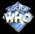
Logo four
Used from 1973–1980, 1999, Season 11 - Season 17
Known informally as the "diamond logo" and commonly associated with Tom Baker's time as the Fourth Doctor, Logo Four was actually introduced during Jon Pertwee's time as the Third Doctor for his final season. Although known as the diamond logo, in fact the diamond-shaped background was often omitted when the logo was used on books and other merchandise. In addition, while generally displayed on screen with a bluish tint (as displayed at right), on merchandise different colours were used for the lettering and background.
The logo returned to service in the 1980s and 1990s when it was used for video releases of the series (in lieu of Logos Five and Six), as well as for the Virgin Missing Adventures book line. It also ultimately replaced Logo Seven on most tie-in publications and merchandising, though not the Virgin New Adventures book series, in the two-three years immediately preceding the introduction of Logo Eight.
More recently, Logo Four returned to service in 2009 for use on BBC Audio's new series of Fourth Doctor adventures.
The non-diamond Target Books variant of this logo has the distinction of being the first and only series logo to be acknowledged in an in-universe context. The audio drama BFA: The Kingmaker includes references to a series of books, Doctor Who Discovers (an in-joke reference to a real-world series of books of the same title. The cover art for the audio incorporates the cover of one of these books, including Logo Four.
1980s
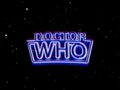
Logo five
Used from 1980–1984, Season 18 - Season 21
Introduced in the final season of Tom Baker's era, this revamp of the logo complemented the new title sequence of a "star field", as well as the first non-Delia Derbyshire arrangement of the theme, replacing the arrangement in place since 1967. It was used throughout Peter Davison's time as the Fifth Doctor. This logo is known colloquially as the "neon sign" or "neon tube" logo.
Logo six

Used from 1984-1986. Season 21 - Season 23
Introduced as Colin Baker took the role of the Sixth Doctor, the previous logo was maintained, but was tinted purple along with the rest of the title sequence giving it a more colourful hue. It also takes on a slightly curved appearance. This version of the logo was almost exclusively used on TV, with merchandising and books from the Colin Baker era using Logo Five. If Logos Five and Six are considered the same logo, the "neon-sign" logo becomes the only logo to be used for three different Doctors.
Logo seven
Used from 1987–1989, 1993, Season 24 - Season 26
For Sylvester McCoy's Seventh Doctor, a new title sequence was produced using computer-generated imagery, with the new logo being a three-dimensionally animated part of the title sequence. Following the TV series' end in 1989 this logo would continue to be used for the Virgin New Adventures novels and other merchandise including Doctor Who Magazine until the early 1990s when it was replaced on most products (except the New Adventures books) by the more famous Logo Four. It was also used for BBC Video's "Years" series of retrospective VHS releases in the early 1990s, and for the 1993 special Dimensions in Time, which remains its final TV use.
1990s
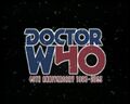
Logo eight
Used in 1996, on Doctor Who: The TV Movie
This logo was used for Doctor Who: The TV Movie, with Paul McGann as the Eighth Doctor and is essentially a modified version of Logo Three. Colouring is changed and a metallic texture has been applied. Some letters are slightly reshaped from those in the early-70s version (most noticeably C, T, R, and W) and - unlike Logo Three - it is presented as a solid three-dimensional object in space (echoing Logo Seven). During the TV Movie's credits, the logo is briefly viewed from the rear.
Following the TV Movie it was used as part of BBC Eighth Doctor Adventures: from The Eight Doctors to Autumn Mist it was silver, then from Interference - Book One onwards was blue. It was also used for the BBC Past Doctor Adventures novels (again starting off silver and then changing to blue).
During the 40th-anniversary year, 2003, a variation of this logo appeared on some merchandise: The "H" in "WHO" was modified to form a "4", creating "W40". This was used, for example, on classic series DVDs released in Australia during 2003.
Although it was replaced when the series was revived in 2005, this logo remains the franchise's official logo on merchandise such as books, DVDs, and audio releases (including the Big Finish Productions line) which relate to the first eight Doctors. The logo has now been in continuous use in one form or another since 1996, making it the longest-running logo.[1]
In 2009, the Canadian Doctor Who Information Network news page reported that BBC Video was considering replacing Logo Eight with the new Logo Eleven on its classic-series DVD releases. As of early 2011, there has been no indication of such a change happening and cover art released for DVD and audio releases into mid-May continue to show Logo Eight.
2000s
Logo nine
Used from 2005-2006, Series 1 - Series 2
For the first time the two words of the title are presented horizontally rather than vertically, and the new design was initially controversial with some fans. This logo was used for Christopher Eccleston's tenure as the Ninth Doctor and the first series with David Tennant as the Tenth Doctor. Logo Nine variant appears to only be used for TV broadcasts. Book releases and other merchandise, such as toys, used Logo Ten even before its use in Series 3 up until the 2009 Specials.
A variant of this logo, without the colour background, was used by Doctor Who Magazine from 2005 to 2008, and also for its ongoing series of Special issues up to 2010.
Logo ten
Used from 2007-2010, Series 3 - 2009 Specials
This logo was a "cleaner" version of the Doctor Who logo originally designed in 2005 and featured in the 'Coming Soon' trailer. This logo is also an animated component within the title sequence moving three dimensionally during the credits. The lettering is considerably more squat than that used in Logo Nine. Introduced in The Runaway Bride as the new logo within the title sequence, this has become the logo for David Tennant's tenure as the Tenth Doctor. Variations of this logo have also been used for various merchandising and promotions (including Doctor Who Magazine, BBC trailers, the BBC Tenth Doctor Adventures book line, comic books, and in a modified form in the supplementary series Doctor Who Confidential. Variations include changing the shield to off-white or grey, with black lettering, a more flat gold or olive colouring for the shield, and occasional dark colouring of the shield with white lettering.
Logo Ten was used in merchandise even when Logo Nine was still in use.
Logo Ten was used for the last time on television for DW: The End of Time: Part Two, broadcast on 2 January 2010. Soon after, the BBC began releasing promotional material for the Eleventh Doctor featuring a new logo (see below). Doctor Who Magazine used its version of the logo for the last time with Issue #416, published on 12 December 2009. The Doctor Who Adventures also changed in March 2010, in order to accompany the new Doctor and Logo change.
The logo was not completely phased out right away, however, as several pieces of merchandise, including Tenth Doctor audios from BBC Audio, a Quick Reads novel and the American Doctor Who Ongoing comic book series continued to use the logo into April 2010.
2010s
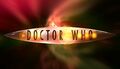
Logo eleven
Used in 2010, Series 5
The BBC unveiled the latest version of the logo on 6 October 2009 to coincide with the start of the Matt Smith era of the series in 2010. Unlike any previous visual identity, Logo Ten comprises two distinct elements which can be presented in different arrangements for different purposes: the words "DOCTOR" and "WHO" comprise one element with a "DW" icon motif representing the shape of the TARDIS making up the second element.
The first released arrangement of the logo had the words "DOCTOR" and "WHO" on two levels, forming a square-shaped logo, with the DW/TARDIS icon sitting alongside. The BBC Television logo was also included under this initial release.
A horizontal arrangement of the logo was shown later. The DW/TARDIS icon was positioned between the two words. This layout of the logo has been used on most Eleventh Doctor merchandise, including books, audios and magazines, as well as for Doctor Who Confidential.
A slightly different horizontal arrangement is used in the TV series itself (beginning with DW: The Eleventh Hour in April 2010). The words "DOCTOR" and "WHO" are again divided by the DW/TARDIS icon, but to incorporate the logo into the title sequence the icon is significantly larger in relation to the words (see illustration).
The DW/TARDIS icon rotates into place as the full logo appears, then as the logo leaves the screen the icon continues to rotate revealing the sides of the TARDIS in flight in its place.
Some fans have criticised the horizontal arrangement of Logo Eleven and Twelve, complaining that it suggests the show being renamed "Doctor DW Who", even though no such intent has been indicated by any reputable source.
The BBC began using Logo Eleven for promotional trailers and its website within days of the broadcast of The End of Time, and the horizontal version of the logo was adopted by Doctor Who Magazine beginning with issue #417, published on 7 January 2010 - making it the first piece of commercial merchandise released with the new logo, however its sister publication Doctor Who Adventures continued to use Logo Nine up to the end of March 2010. The two-level arrangement has yet to be used on any merchandise
The DW/TARDIS icon element has also been used by the BBC in promotions for the series, often without any other wording. For example episode trailers released online by the BBC, which end simply with the DW icon.
Logo twelve
Used from 2011-, Series 6 onwards
Beginning with The Impossible Astronaut, a slightly updated version of the logo was used. The logo now has added lens flare, a brighter light on the lamp, and the BBC logo is added under 'Who'. Doing so removed the need for the BBC logo to appear by itself (sometimes accompanied by animation) at other points in the episode, which had garnered criticism. It also has a purple tinge on the top left hand area of the text
Other logos
US broadcasters variant promotional logos
Sci-Fi Channel (2006-2009)

For promoting its broadcasts of Doctor Who starting in 2006, the American Sci Fi Channel network created a unique logo. In basic shape and form the logo resembles a mix of Logos Two and Three/Eight (and is very similar to that used by Target Books novelisations between 1973 and 1975), however the O is modified to include the silhouette of a man. As such, the logo resembles that of the 1960s spy series The Man from U.N.C.L.E.
The logo has been used on television ads, print, and on Sci Fi's website, but has otherwise never been used within the programme itself.
BBC America (2011)
BBC America introduced another variant logo for its print and billboard promotions of Series 6 in 2011. A radical departure from the otherwise-ubiquitous Logo Eleven, the BBC America variant is virtually identical to the logo version used by the Sci-Fi Channel, except it omits the graphic element showing a man within the "O" in Who. As with the Sci-Fi logo, there is no indication of the logo having been used in any broadcast form.
Prior to 2011, BBC America used either Logo Ten or Logo Eleven in its promotions for the series.
Multiple logos
During 2010, no less than four Doctor Who logos have been utilised in officially licensed capacities: Logo Eleven for the TV series as of the start of Series 5, plus associated merchandise; Logo Ten for the final David Tennant episode, plus several remnant merchandising connections (including a novella, comic books, audios, DVD/Blu-Ray releases and a soundtrack), that continued as late as October 2010; Logo Eight for Big Finish and classic-series BBC Audio releases and BBC Video classic-series DVD releases; and Logo Four for BBC Audio's ongoing series of Fourth Doctor audio adventures.
Logo gallery
Official on-screen logos
- Title-1a.jpg
Logo One, 1963-1967
- Title-2a.jpg
Logo Two, 1967-1969
- Title-3a.jpg
Logo Three, 1970-1973
- Title-4a.jpg
Logo Four, 1973-1980
- Title-5a.jpg
Logo Five, 1980-1984
Logo Six, 1984-1986
- Title-7a.jpg
Logo Seven, 1987-1989
- Eighth Doctor Logo.jpg
Logo Eight, 1996
Logo Nine, 2005-2006
- Doctor-who-logo-ten.jpg
Logo Ten, 2006-2010
- Doctor-who-logo-eleven.jpg
Logo Eleven, 2010
- Doctor-who-logo-twelve.jpg
Logo Twelve, 2011-
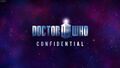
Doctor Who Confidential

2005-2010
- DWCLogo2010.png
2010
2011


Variants in other media
Logo three/eight variants

DVD Menu logo, 1999-Present
40th-Anniversary logo, 2003
- DWMlogo1999.jpg
DWM logo, 1999-2003
- DWMlogo2003.jpg
DWM logo, 2003-2005

Logo four variants
Virgin Missing Adventures logo, 1994-1997
30th-Anniversary logo, 1993
- DWMlogo1979.jpg
DWM logo, 1979-1980
- DWMlogo1980.jpg
DWM logo, 1980
- DWMlogo1991.jpg
DWM logo, 1991-1999

Logo eight variants
- Logo8doctor.jpg
Alternative Eighth Doctor logo, 1996-
Logo nine variants
- TotallyDoctorWhoLogo.jpg
Totally Doctor Who logo, 2006-2007
Logo eleven variants

Official logo for The Adventure Games, 2010-Present
On-screen logo for The Adventure Games, 2010-Present


Other variants
- TargetWhoLogo.jpg
Target Books logo, 1973-1975
Pinnacle Books logo, 1979
- WhoMarvelLogo.jpg
Marvel Comics US series logo, 1984-1985
- Garanciere.JPG
Éditions Garancière logo, 1987

Death Comes to Time webcast logo, 2002

Sci Fi Channel promo logo, 2006-2009
- BBCAmLogo2011.jpg
BBC America promo logo, 2011

External links
- The Doctor Who Logo Collection
- Doctor Who Logo at Doctor Who Expanded
- Andrew Orton's Guide to Doctor Who Fonts v5.0
Footnotes
- ↑ Although Logo Four has been used frequently since its introduction in 1973 and continued to be used on some merchandising such as comic books as recently as 2008, it has not been used without interruption.