Talk:Third Doctor: Difference between revisions
No edit summary Tag: 2017 source edit |
Tag: 2017 source edit |
||
| Line 124: | Line 124: | ||
: [[File:Third Doctor - The Time Warrior.jpg|thumb]] I wanna throw my hat into the ring. I like [[:File:3proposal (2).jpg|3proposal (2).jpg]], but if that doesn't work, we can use this other one I've uploaded. -- [[User:MattTheNerd42|MattTheNerd42]] [[User talk:MattTheNerd42|<span title="Talk to me">☎</span>]] 00:13, 16 August 2023 (UTC) | : [[File:Third Doctor - The Time Warrior.jpg|thumb]] I wanna throw my hat into the ring. I like [[:File:3proposal (2).jpg|3proposal (2).jpg]], but if that doesn't work, we can use this other one I've uploaded. -- [[User:MattTheNerd42|MattTheNerd42]] [[User talk:MattTheNerd42|<span title="Talk to me">☎</span>]] 00:13, 16 August 2023 (UTC) | ||
:: Thanks MattTheNerd! This is Jon Pertwee's fault for having such a good profile - it's hard to choose between them. My vote is still for '[[:File:3proposal (1).jpg|3proposal_(1).jpg]]'. For no reason other than yay anniversary, it would be nice to get some movement on this though - anyone else want to chime in? The current photo we have really needs a fresh update, regardless of which is chosen :) — [[User:FractalDoctor|Fractal Doctor]] [[User talk:FractalDoctor|<span title="Send a space-time telegraph">@</span>]] 18:22, 19 August 2023 (UTC) | |||
Revision as of 18:22, 19 August 2023
| Archives: #1 |
Vengeance of the Stones
Vengeance of the Stones was moved between Spearhead from Space and Doctor Who and the Silurians because "the Doctor says he has only had Bessie a short time" (even though the introduction of Yates and his promotion to captain and there being no Liz almost certainly places Vengeance between Inferno and Terror of the Autons). What time signature or chapter in Vengeance says this anyway? Because I can't find it. Also, the first episode of The Silurians pretty clearly states that that story is the first time the Doctor has got it working after getting the car, but that's neither here nor there. -- Tybort (talk page) 17:34, November 4, 2017 (UTC)
- Hmm. If you can't find it, then we must be dealing with a mistake on someone's part. I trust your judgment more than anyone else's on this subject, so I'll leave it to you to find where best this takes place on the timeline page. Thank you, and apologies for any time wated on this.BananaClownMan ☎ 18:31, November 4, 2017 (UTC)
- Someone's part? You wrote the edit. You're not supposed to use other people's writing about Doctor Who stories like fansites or reference guides to write articles. You're meant to use the stories themselves. See T:CITE DEF. And the timeline page and the Theory:Timey-wimey detector isn't an official authority on anything and is discouraged from being linked to on the mainspace. It's literally supposition. -- Tybort (talk page) 19:17, November 4, 2017 (UTC)
- Hmm. If you can't find it, then we must be dealing with a mistake on someone's part. I trust your judgment more than anyone else's on this subject, so I'll leave it to you to find where best this takes place on the timeline page. Thank you, and apologies for any time wated on this.BananaClownMan ☎ 18:31, November 4, 2017 (UTC)
- I think someone is trying to put together the different sources of information. There is also a confusion as in Call to Arms in that he spent most of his first year chasing up and down the UK looking for Silurian nests with Benton. There is also a Liz companion chronicle where she mentions Yates so there is some cross over. I'll see if I can find the reference. I've seen people put it before Silurians. Adric♥Nyssa∩Talk? 19:26, November 4, 2017 (UTC)
- Ok the reference is in Shadow of the Past which is set between Silurians and Ambassadors. Adric♥Nyssa∩Talk? 22:12, November 4, 2017 (UTC)
Image Change
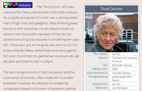
As today is what would have been Jon Pertwee's one hundredth birthday I thought it'd be a fitting time to return to the infobox image change discussion started in 2015. The proposition of this image by OS25 is what I think to be almost the perfect replacement. Does anyone want to voice their thoughts to end this years long silence? --Borisashton ☎ 15:11, July 7, 2019 (UTC)
- I’m actually kind of startled that the current image has stayed for so long when this replacement exists. Very firmly in support of the swap. – N8 ☎ 12:33, July 9, 2019 (UTC)
- I agree. The proposed replacement is a much better picture and, as far as I can tell, is well within the image policy. What are admin's thoughts? LauraBatham ☎ 12:56, July 9, 2019 (UTC)
- Why is it so startling? The original is not a bad image. However, this is one of the very very very rare cases when a new proposed image actually not only follows our requirements but is also better than the current image. Shambala108 ☎ 04:17, July 10, 2019 (UTC)
- It is kind of startling, especially when one considers the two images came from pretty much the same scene. Anyway, where to go from here then? --Borisashton ☎ 23:12, July 11, 2019 (UTC)
Just a couple of reminders: no change is to be made to the current image until this discussion is closed by an admin, and any/all images proposed must meet all our image guidelines. The most important ones for this discussion are Tardis:Image use policy and Tardis:Guide to images. Shambala108 ☎ 14:33, July 18, 2019 (UTC)
- Well, this has had more than a fair shake, small a conversation as it was. An admin even already agreed that the proposed new image "new proposed image actually not only follows our requirements but is also better than the current image".
- And it does — even setting aside the mild preference one might have for a 3/4 view rather than a side-view, the new picture has better definition; the current one is slightly grainy and is lit in a suboptimal way, such that Pertwee's hair blends in with the sky in the top left corner.
- In view of the evident consensus among those who cared to voice an opinion, I'm going to move forward with the proposed image change. --Scrooge MacDuck ☎ 23:09, November 14, 2020 (UTC)
- I am a fair bit late to this discussion, but, the claim above that this image satisfies Tardis:Guide to images is wrong.
- That policy states...
Where possible, you should go with the an extremely tight cropping of a person's face.
- ...and the forehead and chin are, by definition, part of the face; I'm not saying we should replace this image, but we should find this shot in Carnival of Monsters and get a crop of the face that doesn't cut off half of Three's face. Is that alright? 19:33, 13 February 2022 (UTC)
- As long as you follow the other requirement stated by the policy: "Much better infobox pic - face covers 60-75% of frame". Shambala108 ☎ 21:36, 13 February 2022 (UTC)
- The current image is the whole shot from Carnival of Monsters. There is maybe some slight cropping to make it more in line with the preferred width and height ratio, but that's about it. LauraBatham ☎ 23:25, 13 February 2022 (UTC)
- @Shambala108 and the exact image attached to that policy backs up my point about the forehead and chin. The face covering "60-70% of the frame includes the chin and forehead.
- @LauraBatham, yeah, I did notice this after I posted my initial response. Considering this, I don't think this image should've been the only contender for Three's infobox image, at the very least.
- A crop that is too far in on the face is as bad of an image that is too loosely cropped in on the face, in my opinion. And I'm sure you can understand what I mean here.
- As a resolution, as I don't want to just complain and not try to help fix the situation, perhaps I may suggest we turn to the blu-ray release of Spearhead from Space and upscaled archived footage of Three from the revival?
- I'm currently looking for some good candidates for Three's infobox image on YouTube. 00:48, 14 February 2022 (UTC)
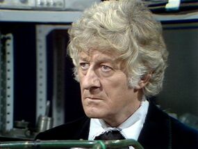
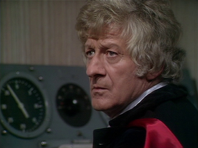
- Taking Epsilon's suggestion, there is a perfect choice from Spearhead from Space. I put forward this beautiful shot.
- Feel like we could move forward with any of these, there's literally no other story with shots of a higher quality that we will ever have access to. Praise be to Spearhead from Space, for she was shot on FILM. NoNotTheMemes ☎ 07:35, 16 March 2023 (UTC)
- #3 is the best, no contest. All three match our new rules about Image use. OS25🤙☎️ 07:51, 16 March 2023 (UTC)
- I disagree that #3 is the best, mainly because it looks like Pertwee is just in pain and looks awkward. Subjective, I know. I think that #2 works best, of those provided. Shame if we are limited to just Spearhead though, as I feel he doesn't hit his more iconic/definitive look until sometime later when his hair grows out. Again, subjective, I know. Fractal Doctor ☎ 12:42, 16 March 2023 (UTC)
- We're not really limited to Spearhead. That's just something someone said. I agree that if we hunt through more Pertwee episodes we'd find something more iconic. But if we're limited to these three, the third one is the only one that looks like a Third Doctor facial expression. OS25🤙☎️ 22:05, 16 March 2023 (UTC)
- Fair enough. I still think #2 is best, and portrays the 3rd Doctor's occasional attitude. I'll throw this curveball [update: see below, removed external link] into the mix too. I just think it's a well defined shot. Fractal Doctor ☎ 22:16, 16 March 2023 (UTC)
- 2 > 1 > Curveball > 3 NoNotTheMemes ☎ 05:41, 19 March 2023 (UTC)
- Thanks NoNotTheMemes! I'm mostly in favour of the 'curveball' I threw in, but we should go with a wider/majority vote. What are people thinking? Fractal Doctor ☎ 15:03, 19 March 2023 (UTC)
- Apologies to admins, I totally had a moment of forgetfulness when I linked to external hosting. So here is the image I propose could be used for the infobox [see right]
Fractal Doctor ☎ 19:20, 19 March 2023 (UTC)
- Ah, very good. What story is it from? Scrooge MacDuck ⊕ 19:21, 19 March 2023 (UTC)
- It's from The Sea Devils. Fractal Doctor ☎ 19:26, 19 March 2023 (UTC)
- Found the best possible image.
- I've flicked through lots of episode galleries and I've started to notice how often Pertwee is usually shot on the left of the screen (to us) looking right, making images harder to find. I'm yet to find anything I think is better. I agree my proposal could do with being a little closer-cropped though. Fractal Doctor ☎ 21:42, 21 March 2023 (UTC)
This one is from The Claws of Axos. Shows off the cape, but I feel it's too dark, especially compared to other suggestions. Fractal Doctor ☎ 21:48, 21 March 2023 (UTC)
Another, from Day of the Daleks. Fractal Doctor ☎ 15:38, 23 March 2023 (UTC)
- I would like to remind everyone that as of today, we no longer request images looking left for infobox images. So if you find a well-framed image of Pertwee looking right, please upload it and add it to the talk page. OS25🤙☎️ 18:36, 23 March 2023 (UTC)
- That's true, OS25. I was still trying to stick to the "looking/facing left" guideline to stay within the spirit of the Wiki and its decision that we should try and find something suitable like that before considering other options, but I've gathered a few more options (and some are right-facing) for people to look at:
Cheers, Fractal Doctor ☎ 19:04, 23 March 2023 (UTC)
- I like 3proposal (6), but overall 3proposal (10), or the final image, and 3proposal (1), or the first image, stand out as the best out of everything suggested so far. Right now, my gut feeling is 3proposal (1). OS25🤙☎️ 19:31, 23 March 2023 (UTC)
The first image in that gallery is from Invasion of the Dinosaurs. I feel it's the brightest, cleanest and clearest. I've mocked up what it could look like if chosen. Fractal Doctor ☎ 21:44, 23 March 2023 (UTC)
- Outing yourself as a light-mode user... ;)
- But I agree, it's the best image that's ever been suggested for this page. I say we keep looking until there's more consensus, but I'd be shocked to see something better than this. OS25🤙☎️ 21:59, 23 March 2023 (UTC)
Any movement on this? Fractal Doctor ☎ 14:54, 25 May 2023 (UTC)
- I wanna throw my hat into the ring. I like 3proposal (2).jpg, but if that doesn't work, we can use this other one I've uploaded. -- MattTheNerd42 ☎ 00:13, 16 August 2023 (UTC)
- Thanks MattTheNerd! This is Jon Pertwee's fault for having such a good profile - it's hard to choose between them. My vote is still for '3proposal_(1).jpg'. For no reason other than yay anniversary, it would be nice to get some movement on this though - anyone else want to chime in? The current photo we have really needs a fresh update, regardless of which is chosen :) — Fractal Doctor @ 18:22, 19 August 2023 (UTC)


