Forum:Updating the Tardis Wiki logo
If this thread's title doesn't specify it's spoilery, don't bring any up.
Introduction
I think this should be the new Tardis Wiki logo. OP over. OS25🤙☎️ 21:09, 7 May 2023 (UTC)
Okay, FINE, I'll write an actual OP.
So in our previous debate, now archived at Forum:Temporary forums/Updating the main page & theme, there was pretty strong consensus that the site's user base wants to replace the current Tardis Data Core logo. You can see our current design here:
This logo, ignoring a few color corrections, has been on the site since 16 January 2013, as you can see on the file history of File:Wiki-wordmark.png. At the time, different restrictions existed for the site. I believe at the time 250px across was the limit on the logo, for instance. A similar restriction existed for the actual shape of the design. I believe the current restrictions are 500px by 500px and a 1 MB limit. So it's fair to say that today this logo looks a little stretched and pixelated in a way that it doesn't really need to.
The general consensus in the mentioned forum was that we should update our logo to be more in-line with the RTD2 branding. This inspired me to pitch this as a possible upgrade, with new TARDIS art pending:
However, someone in the debate linked to the Russian version of the wiki, which has replaced their logo with the cut down "novel" version of the RTD2 diamond design. This has inspired many oohs and aahs, as it does look very nice.
And so I decided to find someone who could make a version of this that represented our website. Thus, we have this design:
Now, there are a few minor things worth discussing about this. First of all, adopting this design might mean the formal retirement of the name "TARDIS Data Core." Historically, our website was actually founded as the TARDIS Index File, which was apparently a mis-remembered combination of TARDIS information system and Index file. The name was later changed to TARDIS Data Core to correct there being no in-universe concept of a TARDIS Index File... Only for the BBC to then release TARDIS Index Files, making our abandoned name official.
Anyways, since January 2013 our name has been "Tardis Data Core"... But I honestly see fewer and fewer people use it these days. We're "Tardis Wiki", that's always how I see people describe us. It's a better name.
Worst case situation, we could modify the text next to the logo to hastily add the "official name" back in. Right now, reading the logo and banner together, it says "Tardis Data Core, the Doctor Who wiki." But we could easily change it to "Tardis Wiki, Tardis Data Core, the Doctor Who Wiki." Etc.
Personally, I think the logo reading "TARDIS Wiki" is more than fine, it's actually for the better.
And finally, I have also asked the artist who helped make this logo to draft up a version of the old TARDIS icon. This way, if people really are going to miss that TARDIS png, we can still keep it if we want to. The fun thing about this variant is we would still be able to do fun alternate versions, as I briefly pitched in the original forum.
So the basic questions now are:
- Do you like this logo concept?
- Do you want to go with one of the TARDIS variants?
- If you don't like any of the logo concepts, what ideas do you have?
Thanks for reading. OS25🤙☎️ 21:25, 7 May 2023 (UTC)
Discussion
I personally think that the new logo looks absolutely wonderful, and I don't really think that the Tardis variants are necessary. However, I do think that one or the other could work quite well for the favicon.ico (the little image that you see on the left of the header text in the tab/bookmark), as these generally need to be square, and the logo isn't. I think the Beep the Meep and Chistmassy Dalek variants look very nice as well, and would definitely support having them every once in a while (however, this would be a lot of effort, and it's perfectly understandable if people don't want to do this). So, the long and the short of it is, I support the new logo concept. Aquanafrahudy ☎ 19:22, 24 May 2023 (UTC)
- Support (without Tardis) Cousin Ettolrahc ☎ 19:38, 24 May 2023 (UTC)
- Wait no. support with first TardisCousin Ettolrahc ☎ 19:40, 24 May 2023 (UTC)
Honestly, I prefer the second one with the tardis myself. Overall I really love the new logo, and I think the last two would be fun to implement for some special occasions, it would be quite lively for the wiki. All in all, I support the new logo concept, and frankly, I would be happy with any of the options offered being picked as the logo. Liria10 ☎ 21:09, 24 May 2023 (UTC)
- Discussion OS25 is referencing is Thread:117468 at User:SOTO/Forum Archive/The Panopticon I. Tardis Data Core was actually a compromise between "Tardis Wiki" and "Tardis Index File". After reading the thread I find myself unpersuaded by the need for a compromise - TIF was simply a mistake and the people pushing for it seemed to be doing so for reasons of nostalgia. Czech's arguments in the thread were incredibly cogent - as far as FANDOM is concerned, we are Tardis, as is true for fandom. :P Najawin ☎ 22:27, 24 May 2023 (UTC)
I pulled up the old debate from January and my sentiments remain the same. I love this new logo concept. It's recognisable, adds some colour, and also ties in with the way DWM have utilised the official logo for their version. It also adds some relevancy, tying into the new era and I also just think it's long overdue a change (especially now that we've also tweaked the backgrounds and we're in the process of updating the front page to tie more into current Who). Plus, due to the way the new logo has been designed, it not only nods to the legacy of the programme (cos it riffs on the 70s one) but it also ties into its future too (RTD2+).
I like the version proposed here without any diamond surround, and I'd be more than happy to go for the one without any TARDIS next to it. I think it's neater without the TARDIS PNG. Having said that, if people prefer to keep the little TARDIS, I'm not against that. (Though maybe a little TARDIS could be used, as suggested prior, for the favicon.ico?) If people wanted to keep "Data Core", I'd suggest following how DWM have done their logo - simply add the grey rectangular box under the logo for that text to go into. But I think it's perfectly fine without - I refer to this as "TARDIS Wiki" all the time, and the vast majority of people I've seen talk about it also do the same. "Data Core" feels superfluous really; it's a cute touch but it's unnecessary. I also think adding that in would make the new proposed logo feel cluttered and clumsy. (As suggested, if people wanted to keep it, just add it in as a plain text tagline maybe?)
I was hugely in support of a logo update in the initial discussion, and I still am now. I love the new proposal; I think it'd really help freshen up the Wiki :) Fractal Doctor ☎ 13:03, 25 May 2023 (UTC)
I’d rather we use the line "Home of the Whoniverse", as that seem to be the tagline Bad Wolf is using. Danniesen ☎ 13:09, 25 May 2023 (UTC)
- Slight tangent maybe but I wonder if that'll become more of a 'thing'? Correct me if I'm wrong but we've only seen that on a wall in a Bad Wolf office, so far? I like it as a tagline though. Another alternative could be "The Worlds of Doctor Who" which has been used across some alt-media (Big Finish) stuff in a couple of variations. Fractal Doctor ☎ 13:12, 25 May 2023 (UTC)
Sorry to be negative, but I oppose this new design. I personally think it looks a bit cheap and bland. The existing one has more charm. TheGreatGabester ☎ 15:59, 25 May 2023 (UTC)
- I don't think I gave an opinion on the actual logo. I'm actually with TGG on the proposed Tardis logos. I don't like any of them. I like the Beep one, noncommittal on the Dalek one, and I'm sure we can get a Tardis one that works. I like the rest of the logo, the actual, you know, name part. But none of the ones suggested for the top of the site atm really work for me. Najawin ☎ 16:36, 25 May 2023 (UTC)
- Like the Stranger Things Wiki, I like that the one proposed for us integrates the Wiki name with the logo design/aesthetic. (Maybe it could be tried with the diamond shape, to give it a bit more character?) In any case, I think the versions with the TARDIS PNG stuck awkwardly to the left feel a bit cheap and "made in Paint" vibes (no disrespect; it just feels like it's been stuck on as an afterthought since the main logo is the "TARDIS WIKI" bit). [Also, we have a TARDIS as the favicon.ico anyway.] Fractal Doctor ☎ 16:48, 25 May 2023 (UTC)
- In my view, this new logo would look better if either a) it was made to be 100% flat, taking out the gradients, or b) it looked a lot more 3D and textured, like the actual current logo. Either could work, but this gradient-centric design is too much of an awkward middle ground. I also have some minor nitpicks of the letter placement, there’s a lot that could be improved there. I might have a go at creating my own version, in Photoshop. TheGreatGabester ☎ 17:17, 25 May 2023 (UTC)
- That's fair, and I'd be interested in seeing the logo as suggested in the OP but 'flat'. More textured could work, but would it make the logo look too busy? Another completely different suggestion could be to use the design of the 'single line logo' that's being used on certain official products (and the official website), with "TARDIS" in place of "DOCTOR" and "WIKI" in place of "WHO" (the latter word being embossed/outlined, like the official version), maybe? Fractal Doctor ☎ 17:21, 25 May 2023 (UTC)
- I think the basic, TARDIS-less version of the logo looks great as it is, and I think trying to redo it from scratch at this point would make the perfect the enemy of the good. I strongly advise that we move forward with implementing this one even if some people want to workshop different versions of the basic concept. Nothing stopping another thread from being started to change it again to such a "2.0" once actual prototypes are ready.
- As for the rest, I'm not entirely convinced by the TARDIS versions, but the Beep and Christmas variants are lovely. I think we could just have the TARDIS-less version as the default and still put something next to it when we want a variant, to be honest. Scrooge MacDuck ⊕ 18:38, 28 May 2023 (UTC)
Hiya, I've experimented with making a flatter version of the original concept. Also adjusted the alignment and letter placement by a little bit, and added the top of the diamond: 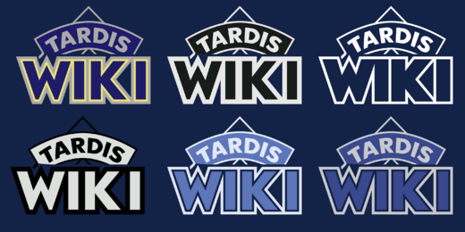
TheGreatGabester ☎ 21:32, 28 May 2023 (UTC)
- Another variant, because why not - taking cues from the horizontal version of the new logo:

TheGreatGabester ☎ 09:43, 29 May 2023 (UTC)
- Ok, but can you articulate why? I personally think the TARDIS looks a bit awkwardly tacked on. It only works on the current logo, because it actually brushes up against the words, it's a more unified design. TheGreatGabester ☎ 09:53, 29 May 2023 (UTC)
- Sure, but the edges are the exact same as on the new logo (or one version of it):

TheGreatGabester ☎ 10:28, 29 May 2023 (UTC)
- Sure, but the edges are the exact same as on the new logo (or one version of it):
- They're the same edges though... never mind. TheGreatGabester ☎ 10:43, 29 May 2023 (UTC)
- I still prefer OS25's version, as to me it's more aesthetically pleasing, but if nobody wants that one, I wouldn't mind going for the flat colourful one. Aquanafrahudy ☎ 16:09, 29 May 2023 (UTC)
- I'm not fond of the "half a diamond" design, with the triangle poking out the top. I'm sure some might think it's cute but it just feels very "Look at me, I'm different!" There is an official "cropped" design for the logo, and it's the variant you can see on covers like Daleks! Genesis of Terror. I also think if we use this variant we must fix how the TARDIS banner appears totally cropped off on the left side. Finally, while I hate to be egotistical, I still prefer the 3D design I pitched. OS25🤙☎️ 16:29, 29 May 2023 (UTC)
- There’s no rule saying it has to be perfectly horizontal, I did that on purpose. Still, I’ll try tweaking it . TheGreatGabester ☎ 17:22, 29 May 2023 (UTC)
Of course. I’m also just elaborating a bit more on what I meant. :) Danniesen ☎ 17:35, 29 May 2023 (UTC)
Nice to see some variants. I was interested in seeing flatter versions but I'm not too keen on the ones TGG has posted. No offence - I don't think they're bad, I just prefer the vibrancy of OS25's version. (Also not sure on the pointed diamond sticking out of the top.)
If we're voting on ones now posted in this discussion (I agree with Scrooge that we don't want to over-complicate or have too many designs right now, although tweaks and different versions could be considered later on), my vote goes to the original on that OS25 posted (right below the "Introduction" header) without the TARDIS. We have the TARDIS as our favicon.ico anyway, and we have the word 'TARDIS' in the logo. I think the TARDIS png stuck next to it just feels awkward and clumsy, and makes the design as a whole look off-balance. I wouldn't be against the occasional variant (the Beep one is kinda cute) for anniversaries or special occasions though :) Fractal Doctor ☎ 18:12, 29 May 2023 (UTC)
- In order of preference (maybe we should all do this, to see a general consensus between us?), I'd go: Preference #1: OS25's first logo without the TARDIS png. Preference #2 OS25's logo with the 'angled' TARDIS png (first in the grid of four above). Preference #3: The Great Gabster's 5th variant (in the grid of 6 above) but without the diamond 'surround'. Preference #4: The Great Gabster's latest variant (standalone above) but without the diamond 'surround'. Fractal Doctor ☎ 18:19, 29 May 2023 (UTC)
- For me: Preference #1: OS25's first logo. Preference #2: OS25's with angled Tardis. Preference #3: The Great Gabester's first logo. Preference #4: Great Gabester's fifth. Aquanafrahudy ☎ 18:37, 29 May 2023 (UTC)
Even if my design goes unused, I think OS25’s ought to have some adjustments done. If you pay attention to the official logo, there’s no gap between “W” and “H” - I copied this on my design, between the “W” and the “I”. I also think the text in the arch needs to be adjusted - the alignment is slightly off, it’s not perfectly centered. And again, the 3D look isn’t that convincing to me, it’s clearly just done with gradients. If other people aren’t bothered by that, it’s fine, I just personally feel that going 2D is classier, if having it fully 3D and textured isn’t an option. TheGreatGabester ☎ 09:45, 30 May 2023 (UTC)
- You know, I never asked how the artist was creating the logo but I had presumed it was 3D. It looks 3D to me. As per the other thing, I appreciate the dedication to the real logo but not to the extent that we have to copy the poor kerning choices. I think not having a space between a W and an O looks alright, but doing it with a W & I makes it immediately stand out that the letter spacing is off. OS25🤙☎️ 14:00, 30 May 2023 (UTC)
- Voicing my support for OS25's first logo version (no TARDIS) as the regular logo for the Wiki for 2024 and the new era - with hopeful additional support beforehand for the Meep variant as a special anniversary variant from now until late November & for the Christmas tree variant for December. JDPManjoume ☎ 18:48, 30 May 2023 (UTC)
- I agree with OS25 here, regarding the spacing. Also, if the tiny space between "W" and "I" was lost, surely you'd also have to get rid of the space between the "K" and the other "I"? And that'd make it all feel squished and off, IMO. I do agree with TGG's point about tweaking the alignment of the arched text. Fractal Doctor ☎ 19:35, 30 May 2023 (UTC)
- Disagree about the K and the I, I think that'd probably look pretty good. TheGreatGabester ☎ 15:06, 31 May 2023 (UTC)
My personal preference is the Black and Cream (with the Cream inside the top box)one by the Great Gabester, as is reminds me of the old school Target logos. I myself will miss the Data Core part perhaps we can give it a mention in the introduction? I don’t know. But the only reason I want to keep it is pure nostalgia and in my opinion that is not a valid reason as everyone calls it TARDIS Wiki and thus the name Data core has fallen out of fashion. I would like to say that to me it seems that the diamond logo is more a temporary 60th anniversary logo kind of like how we had one for the 30th? I do however think the Beep and Christmas variants should exist. I also do like the little Tardis but honestly I have no valid argument to defend it beyond personal preference.Anastasia Cousins ☎ 14:46, 2 June 2023 (UTC)
- It's not that it fell out of fashion, it's that people never called it that in large numbers. Najawin ☎ 17:45, 2 June 2023 (UTC)
- well my point stand the only reason I want it to be called TARDIS datacore your point just reinforces that fact that it does need to be changed. I love Data Core but the fact that it was never used (or is no longer used it does not matter) shows that TARDIS wiki is the right answer weather I like it or not. Anastasia Cousins ☎ 19:22, 2 June 2023 (UTC)
Vote
- I feel that the fairest way to close this would be to do a simple vote. It would be great if everyone interested in this could indicate both their first and second choices from the options presented by both User:OttselSpy25 and User:TheGreatGabester. You can also indicate to keep the current logo as one of your two choices. If someone doesn't vote but has taken part in the discussion so far, I will try to put together first and second choices for them based on their previous messages. It would be better to have dedicated voting messages, though. First choices will be allocated 2 points and second choices will be allocated 1 point. After two weeks, I will close the vote and set the site's logo to the logo variant with the greatest total points. Bongo50 ☎ 15:55, 3 June 2023 (UTC)
I vote firstly for my 3D logo without any TARDISES, and secondly for the 3D logo with the sideways TARDIS. OS25🤙☎️ 16:07, 3 June 2023 (UTC)
- I think I'm going to go with 3D logo sans TARDIS first, white logo second. Scrooge MacDuck ⊕ 16:08, 3 June 2023 (UTC)
- My first place vote goes to OS25's 3D logo without TARDIS, and my second place vote goes to OS25's 3D logo with the angled/sideways TARDIS. Fractal Doctor ☎ 17:32, 3 June 2023 (UTC)
- My first place is my first logo (the blue and gold one), second is OS25's 3D design minus the TARDIS. (Also guys, you can just call me TGG - my username is slightly embarrassing, I might change it soon). TheGreatGabester ☎ 18:28, 3 June 2023 (UTC)
- My first vote goes to the First one on the bottom row by the GreatGabester my second goes to the first one with the TARDIS. – The preceding unsigned comment was added by Anastasia Cousins (talk • contribs) .
- My first place is my first logo (the blue and gold one), second is OS25's 3D design minus the TARDIS. (Also guys, you can just call me TGG - my username is slightly embarrassing, I might change it soon). TheGreatGabester ☎ 18:28, 3 June 2023 (UTC)
- My favourite is the digital render, but I do feel the two "I"s should be the same thickness as the rest of the letters, like TGG's. I like the variants (Meep and the Dalek) with the little pictographic icons, but I feel the proposed versions with the TARDISes look off. I've asked a friend if they have the original picture used so we can recreate it at a higher resolution version.
- Although I do also like TGG's pure white logo, which also matches the more minimalist logos used on some recent releases. 19:44, 3 June 2023 (UTC)
- Sorry if this is really too late to add this but here is the original photo and a version of the Wiki logo with it. Obviously someone with Photoshop could do better but I made this in under five minutes. 20:10, 3 June 2023 (UTC)
