Talk:The Giggle (TV story)
Thumbnail
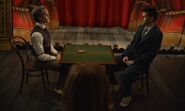
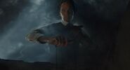
We could still use a conclusion over at Talk:Wild Blue Yonder (TV story). Feel free to suggest some here as well. Here are the ones I noticed.
I personally really like 2 and think 1 works as well. I didn't catch any good shots of the Toymaker vs the Doctor, one always seemed to have their back to the camera when they were both in frame. Najawin ☎ 20:04, 9 December 2023 (UTC)
- Oh, there we go. 5 works as well, thanks Walt. I still prefer 2, but think I prefer 5 to 1. Not a fan of 4 and 6, but that's personal preference, it puts too much emphasis on just the Toymaker. Najawin ☎ 20:21, 9 December 2023 (UTC)
- 2 is excellent, as is 5 and I'd say 1 as my third choice. StevieGLiverpool ☎ 21:36, 9 December 2023 (UTC)
- Definitely 5 among these, but what about a bi-generation screenshot?!HarveyWallbanger ☎ 21:40, 9 December 2023 (UTC)
- #2 is my choice. I'd also be against a bigeneration image as I really would rather this episode not be defined by that controversial twist, over the actual meat of the episode. 22:32, 9 December 2023 (UTC)
- For me, 5>4>3>2>1>6. 6 is too dark in my opinion. 5 is also quite dark but having both the Fourteenth Doctor and the Toymaker boosts the image's rank for me. I really like the dynamic of 3, but it's not that representative of the episode. 2's a better representation but I feel is far too wide to work at a small scale. Bongo50 ☎ 22:53, 9 December 2023 (UTC)
We can trim down 2 if it's just the width. I really quite like 2, cards on the table. I think the contrast is great. But 5 is a perfectly acceptable substitute if it's not viable. Najawin ☎ 23:01, 9 December 2023 (UTC)
I quite like 5 as well. Succinctly demonstrates the main conflict in the episode: 14 and the Toymaker facing off in a universe-deciding duel through simple games, with Donna's inclusion also subtlety noted, as is the environment of the Toymaker's domain through the background of his puppet show. Snivy ✦ The coolest Pokemon ever ✦ 18:49, 10 December 2023 (UTC)
I like #1 the best, as it shows the cause of the titular giggle without spoiler anything not previously advertised. BananaClownMan ☎ 20:22, 10 December 2023 (UTC)
Crew table note
The camera section of this episode's broadcast credits read:
- A Camera and Steadicam Operator Focus Pullers: Martin Stephens, Martin Payne
- Clapper Loaders: Jonathan Vidgen, Sophie Hardcastle
- Camera Trainee: Sarah Macleod
- SAW Camera Trainee: Elesha Pederson
- Digital Imaging Technician: Kudzai Dzokamushure
- Data Manager: Nick Everett
- Key Grip: David Buckley
- Grip: Bobby Williams
- Grip Trainees: Ken Hodgson, Alexander Jones
- SAW Entry Level Grip Trainees: Rhys Jones, Emily Badger-Knight
Based on the incoherence of the first credited position and a comparison with the previous two episodes' credits, I strongly suspect this to be a formatting error: it should read "A Camera and Steadicam Operator: Martin Stephens", then "Focus Pullers: Martin Payne, Jonathan Vidgen", and then continue with each name thus moved up one position, ending with the single SAW Entry Level Grip Trainee: Emily Badger-Knight. (This amendment renders it identical to the corresponding slate of credits in Wild Blue Yonder, and nearly so to The Star Beast.) I have entered the credits on the main page proceeding under this assumption for sanity's sake, but left a note leading here by way of explanation and record-keeping. Starkidsoph ☎ 11:50, 10 December 2023 (UTC)
- Due to talk page archiving, I feel that linking to this talk page is suboptimal. I think that placing the above information in either a footnote or simply in the "notes" section may be a better idea. Aquanafrahudy 📢 🖊️ 13:40, 10 December 2023 (UTC)
- I believe that you're correct to have made this correction to the credits and to have left the note, but I don't think it should lead here. Instead, I think there should be a lengthy {{note}} placed instead of the link here which explains the situation, giving the evidence for the conclusion that you came to. However, I am going to page User:SOTO who I believe to be more experienced in these matters. Bongo50 ☎ 14:29, 10 December 2023 (UTC)
The length of the lede of the article
Asking this first for confirmation before I trim it. A simple question really: is the lede meant to be so long? It seem excessively detailed with several lengthy paragraphs with several long sentences. It reads like a mini essay that also repeats much of the plot, continuity and note sections of the article. Surely it can be cut down, perhaps to even half its current length? Snivy ✦ The coolest Pokemon ever ✦ 19:30, 10 December 2023 (UTC)


