User:SOTO/Forum Archive/A new Tardis, at last/@comment-188432-20141212015511/@comment-188432-20150106164925
Rob T Firefly wrote: ...if we must do it this way why do Facebook, Twitter, Reddit, and Google Plus all get their own knobs? Collapsing them into one collective social-network round thing would be slightly less out-of-place than keeping only three functional knobs with all their useful things collapsed into fiddly submenus while keeping root-level single-click knobs for each individual social-network flavor out on display.
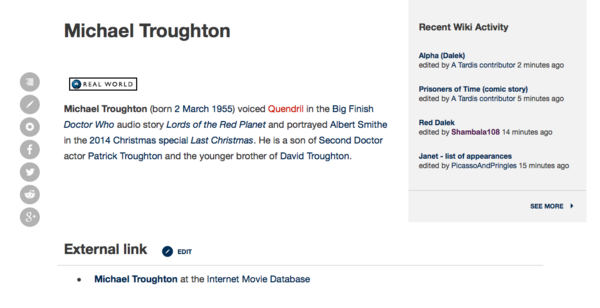
Both things happen with the social icons. When you first load a page, you get a series of icons for each individual social platform, like this:
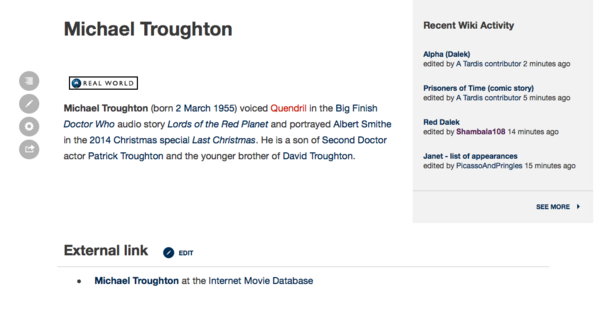
Then, as you scroll down the page, or edit it, or use the TOC (on multi-sectioned articles), the individual social icons "roll up" into the social icon menu, seen here at the bottom:


