Doctor Who logo: Difference between revisions
Stardizzy2 (talk | contribs) No edit summary |
Gingerfool (talk | contribs) mNo edit summary |
||
| (739 intermediate revisions by more than 100 users not shown) | |||
| Line 1: | Line 1: | ||
{{retitle|''Doctor Who'' logo}} | |||
{{real world}} | {{real world}} | ||
{{big toc}}{{Gallerylink}} | |||
= | {{You may|Doctor Who logo (The Kingmaker)|n1=the ''Doctor Who'' logo that exists in-universe|Doctor Who logo/Gallery|n2=a Gallery of variations to the ''Doctor Who'' logo}} | ||
Over the decades, numerous '''logos''' have been used for the ''[[Doctor Who]]'' televised series and spin-off merchandise. | |||
== Overview == | |||
=== 1963-1967, 2013 === | |||
''[[An Unearthly Child (TV story)|An Unearthly Child]]'' - ''[[The Moonbase (TV story)|The Moonbase]]'' + ''[[The Day of the Doctor (TV story)|The Day of the Doctor]]'' (Seasons 1 to 4 + 50th Anniversary) | |||
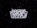
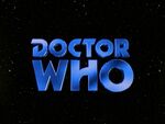
The first logo featured the words "DOCTOR WHO" in block white capitals, written in a simple sans serif font. The weight and size of the two words were arranged to keep both at the same width, a trend that would continue through the next two logos. Emphasis was placed on the word "WHO" by use of a heavier, more elongated typeface than that used for "DOCTOR". | |||
Although this logo is primarily associated with [[William Hartnell]]'s tenure as the [[First Doctor|Doctor]], it remained in use for [[Patrick Troughton]]'s first four stories, through to ''The Moonbase''. This logo saw some use in merchandising; such as [[Doctor Who annual]] and the [[Frederick Muller]] novelisations. The latter utilised a variant of this logo, in which the word "WHO" is shown to be fuzzy and distorted. In the 1980s, [[Marvel Comics]] merged elements of the 1963 & 1973 logos for its [[Doctor Who (1984)|Doctor Who]] comic book. | |||
An updated version of this logo (featuring the BBC logo, as was common practice since [[2011 (releases)|2011]]) was used for ''[[The Day of the Doctor (TV story)|The Day of the Doctor]]'' in [[2013 (releases)|2013]]. | |||
=== | <gallery position="center" captionalign="center" widths="150"> | ||
Doctor Who logo 1.jpg|As seen in Season 1 to 4 | |||
Doctor Who 50th anniversary logo.jpeg|As seen in the 50th Anniversary special, ''The Day of the Doctor'' | |||
</gallery> | |||
=== | === 1967-1969 === | ||
''[[The Macra Terror (TV story)|The Macra Terror]]'' - ''[[The War Games (TV story)|The War Games]]'' (Seasons 4 to 6) | |||
[[ | |||
This logo again featured white capital letters, this time presented in 'Times New Roman'. The use of identical font and weight in both words severely diminished the differential emphasis featured in the 1963 logo. | |||
This logo made its first appearance in Patrick Troughton's fifth serial, ''[[The Macra Terror (TV story)|The Macra Terror]],'' alongside a new [[title sequence]] and [[Doctor Who theme|theme]]. This logo was not widely used in merchandising, but an altered version of the logo was featured on record release ''[[Doctor Who - Variations on a Theme (soundtrack)|Variations on a Theme]]'' years later. | |||
[[ | |||
=== | <gallery position="center" captionalign="center" widths="150"> | ||
DWLogoTroughton.jpg|As seen in ''The Macra Terror'' to Season 6 | |||
</gallery> | |||
=== 1970-1973 === | |||
''[[Spearhead from Space (TV story)|Spearhead from Space]]'' - ''[[The Green Death (TV story)|The Green Death]]'' (Seasons 7 to 10) | |||
This logo gave the programme a much more unique visual identity. It featured a specially styled typeface and was presented in a bold shade of cyan, contrasting the simplistic, white logos of the 1960s. The enlargement of "WHO" as opposed to "DOCTOR" continued a trend that would remain in all future logos until the series' revival in 2005. | |||
This logo was the first to be shown in colour, debuting with the [[Third Doctor]]'s first serial. Although primarily associated with [[Jon Pertwee]], this logo was later used as the basis for the logo used in the [[Doctor Who (TV story)|1996 television movie]]. This updated logo would continue to be used in several pieces of non-televised media in later years, including comics by [[Titan Publishing Group]] ([[2014 (releases)|2014]]-[[2018 (releases)|2018]]) and the [[Dr. Men (series)|Dr. Men]] series. | |||
=== | <gallery position="center" captionalign="center" widths="150"> | ||
Doctor Who logo Pertwee logo.jpg|As seen in Season 7 to 10 (Version 1) | |||
Doctor Who Pertwee logo 2.jpg|As seen in Season 7 to 10 (Version 2) | |||
Doctor Who Season 8 (Third Doctor) logo.jpg|As seen in ''Terror of the Autons'' and ''The Mind of Evil'' | |||
< | </gallery> | ||
== | === 1973-1980 === | ||
''[[The Time Warrior (TV story)|The Time Warrior]]'' - ''[[The Horns of Nimon (TV story)|The Horns of Nimon]]'' (Seasons 11 to 17) | |||
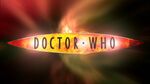
This logo, known informally as the "diamond logo", featured a bluish tint when used on-screen. The diamond-shaped background was often omitted in merchandising (e.g. the [[Target novelisation]]s in [[Target Books/1975|1975]]-[[Target Books/1975|1981]] and [[DWM 44]]-[[DWM 45|45]]), with the colouring of the lettering and background also sometimes changed. | |||
[[ | Although commonly associated with [[Tom Baker]]'s time as the [[Fourth Doctor]], this logo was introduced on screen during Jon Pertwee's [[Season 11 (Doctor Who 1963)|final season]] as the Third Doctor, and was first used extensively in the [[Doctor Who Special (1973)|Radio Times 10th Anniversary Special]] published in [[November (releases)|November]] [[1973 (releases)|1973]] — several weeks before the broadcast of the first part of ''[[The Time Warrior (TV story)|The Time Warrior]]''. | ||
This logo was used greatly during the 1980s and 1990s, being used for the [[VHS]] releases (in lieu of whichever logo featured in the actual programme) and the [[Virgin Missing Adventures]] book line, as well as replacing the [[1987 (releases)|1987]] logo on most tie-in publications and merchandising during the early 1990s. After being phased out in the late 1990s, it was briefly reused for [[BBC Audio]]'s new series of [[Fourth Doctor]] adventures. | |||
In [[2023 (releases)|2023]] this logo was reintroduced for the [[List of anniversaries|60th Anniversary]], also known as the "diamond anniversary", although with a modern touch in upgraded colouring and shading. | |||
The non-diamond variant of this logo has the distinction of being the only series logo to be acknowledged in-universe. ''[[The Kingmaker (audio story)|The Kingmaker]]'' includes references to a series of books, ''[[Doctor Who Discovers]]'' (in turn a reference to the [[Doctor Who Discovers (real world)|real-world series of books]] of the same title). The cover art for the audio incorporates the cover of one of these books, featuring this logo. | |||
<gallery position="center" captionalign="center" widths="150"> | |||
Doctor Who diamond logo.jpg|As seen in Season 11 to 17 | |||
Doctor Who Tom Baker logo (The Ark in Space Part 1).jpg|As seen in ''The Ark in Space'' Part One | |||
</gallery> | |||
=== 1980-1984 === | |||
''[[The Leisure Hive (TV story)|The Leisure Hive]]'' - ''[[The Caves of Androzani (TV story)|The Caves of Androzani]]'' (Seasons 18 to 21) | |||
This logo featured the words "DOCTOR WHO" presented in a neon-tubing style, leading to it being commonly referred to as the "neon-tubing logo". After one season of use, the logo was noticeably cleaner when [[Peter Davison]] made his debut as the [[Fifth Doctor]], with fringing around the edges having been removed. | |||
Introduced in the final season of Tom Baker's era, this revamp of the logo complemented the new "star-field" title sequence, as well as the first non-[[Delia Derbyshire]] arrangement of the theme. It was then used throughout [[Peter Davison]]'s entire tenure as the [[Fifth Doctor]]. | |||
<gallery position="center" captionalign="center" widths="150"> | |||
Doctor Who Season 18 (Fourth Doctor) logo.jpg|As seen in Season 18 | |||
Doctor Who logo 5.jpg|As seen in Season 19 to 21 | |||
</gallery> | |||
=== 1984-1986 === | |||
''[[The Twin Dilemma (TV story)|The Twin Dilemma]]'' - ''[[The Ultimate Foe (TV story)|The Ultimate Foe]]'' (Seasons 21 to 23) | |||
With the introduction of [[Colin Baker]] as the [[Sixth Doctor]], the logo was tinted purple to give it a more colourful hue, matching the updated title sequence. It also took on a slightly curved appearance. | |||
This variation of the logo was used almost exclusively on TV, with merchandising and books from the Colin Baker era tending to use either the 1973 or 1980 logos. | |||
In the "Season 23: The Collection" re-edited standalone version of ''[[Terror of the Vervoids (TV story)|Terror of the Vervoids]]'', the curved sign was presented inside a star-filled purple-ish space-like [[Time Vortex]] instead of a "star-field". | |||
<gallery position="center" captionalign="center" widths="150"> | |||
Title-6a.jpg|As seen in Season 22 and 23 | |||
</gallery> | |||
=== 1987-1989 === | |||
''[[Time and the Rani (TV story)|Time and the Rani]]'' - ''[[Survival (TV story)|Survival]]'' (Seasons 24 to 26) | |||
This logo was the first to be a three-dimensionally animated element of the title sequence. The word "Doctor" appeared at an angle in a signature-esque font over "WHO", which was presented in a metallic style with a red glow surrounding it. It underwent major modifications when featured on the rebranded New Adventures books, beginning with ''[[Happy Endings (novel)|Happy Endings]]''. "Doctor" became less angled and more central, and the entire logo was more stencilled, with no texturing applied. | |||
Following the TV series' end in 1989, this logo and variations on it would continue to be used for the [[Virgin New Adventures]] novels and other merchandise including ''[[Doctor Who Magazine]]'' until the early 1990s when it was replaced on most products (except the New Adventures) by the more famous 1973 logo. It was also featured on the spine of the majority of Virgin Publishing books, both fiction and non-fiction, was used for BBC Video's "Years" series of retrospective VHS releases in the early 1990s, and featured in the 1993 special ''[[Dimensions in Time (TV story)|Dimensions in Time]]'', which remains its final TV use. | |||
<gallery position="center" captionalign="center" widths="150"> | |||
Doctor Who logo 7.jpg|As seen in Season 24 to 26 and ''Dimensions in Time'' | |||
</gallery> | |||
=== 1996 === | |||
''[[Doctor Who (TV story)|Doctor Who]]'' (TV Movie) | |||
This logo was essentially a modified version of the 1970 logo. The colouring was changed from cyan to a darker blue, and a metallic texture applied. Some letters were largely reshaped (noticeably C, T, R, and W). It was presented as a three-dimensional object in space, echoing the 1987 logo. The logo is also seen from the rear. This logo has seen continual use in merchandising from 1996 to 2021. As such, there have been multiple variations. These include: | |||
* In merchandise from 1997 to 1999, an ice-like pallet was applied to the logo rather than the dark blue tone seen in the TV Movie. The TV Movie design started to be used in merchandise in 1999, around the same time as ''[[Doctor Who Magazine]]'' finally adopted it to replace the diamond logo (which never used this version of the 1996 logo). | |||
* To mark the show's 40th anniversary in 2003, the "H" in "WHO", was modified to make the logo read "W40". This was notably used, for example, on classic series VHSs and DVDs released in Australia during 2003, and for ''[[The Reign of Terror (TV story)|The Reign of Terror]]'' box set, which became the final story to be released on home video that year. | |||
* The logo was stylised to feature the 'howl around' effect of the original title sequence for the 50th anniversary year, with a BBC logo included in the upper left. | |||
* The logo was retextured to match the "steel" look used in merchandising throughout Matt Smith's final year as the Doctor. This featured a grey-white-grey gradient. | |||
* The logo continued to be used until 2021, usually being featured in block colours such as white, blue, black, gold, and silver (similar to the usage of the 2014 logo). | |||
Following the TV Movie, it was used as part of the [[BBC Eighth Doctor Adventures]] and [[BBC Past Doctor Adventures|Past Doctor Adventures]], and largely replaced the diamond logo to represent the classic series as a whole in merchandise after 1996. It was used extensively during the 40th and 50th anniversary years (as mentioned above). | |||
Although it was replaced when the series was revived in 2005, this logo remained the franchise's official logo on merchandise such as books, DVDs, and audio releases (including the [[Big Finish Productions]] line, but not [[AudioGO]]'s Fourth Doctor line) which related to the first eight Doctors. The logo was in continuous use in one form or another from 1996 to 2019, making it the longest-running logo.<ref>Although the 1973 logo has been used frequently since its introduction and continued to be used on some merchandise as recent as [[AudioGO]]'s ''[[Serpent Crest]]'' in 2011, it has not been used without interruption.</ref> While the 2018 logo became the primary logo on nearly all ''Doctor Who'' merchandise in 2018, the 1996 logo continued to appear on [[The Complete History covers|''The Complete History'' covers]], ''[[The Target Storybook (anthology)|The Target Storybook]]'' in [[2019 (releases)|2019]], and [[Target novelisation]]s up to [[2021 (releases)|2021]]. | |||
<gallery position="center" captionalign="center" widths="150"> | |||
Doctor Who TV Movie Titles.jpg|As seen in the TV Movie | |||
</gallery> | |||
=== 2005-2010 === | |||
''[[Rose (TV story)|Rose]]'' - ''[[The End of Time (TV story)|The End of Time]]'' (Series 1 to 2008-2010 Specials) | |||
For the first time, the two words of the title were presented horizontally, upon a shield. This logo was used for [[Christopher Eccleston]] and [[David Tennant]]'s tenures as the [[Ninth Doctor|Ninth]] and [[Tenth Doctor]]. | |||
Beginning with ''[[The Runaway Bride (TV story)|The Runaway Bride]]'', this logo was modified, and now featured lettering considerably more squat than the 2005 logo, and a new background for the 'shield'. However, the overall design would've impacted too heavily. Variations of this logo used in merchandising have seen the shield changed to an off-white or grey, with black lettering, or a gold or black shield with white lettering. | |||
After being updated for the 2006 Christmas special, this logo was used in ''[[Doctor Who Magazine]], ''BBC trailers, the [[BBC Tenth Doctor Adventures]] book line, comic books, and in ''[[Doctor Who Confidential]]''. This logo was used for the last time on television in ''[[The End of Time (TV story)|The End of Time]]'' ''Part 2''. ''[[Doctor Who Magazine]]'' used its alteration of the logo for the last time with [[DWM 416|Issue #416]]. | |||
The logo was phased out gradually, however, as several pieces of merchandise, including Tenth Doctor audios from [[BBC Audio]], a [[Quick Reads]] novel and the American ''[[Doctor Who Ongoing]]'' comic book series continued to use the logo into April 2010. The [[Doctor Who DVD Files]] magazine series was the only ''Doctor Who'' merchandise to continue using this logo, all the way up to its final edition in 2014. It is also still used on the [http://www.bbc.co.uk/doctorwho/classic/index.shtml BBC Doctor Who The Classic Series] website (presumably as it was archived and no longer updated when the logo was phased out). | |||
<gallery position="center" captionalign="center" widths="150"> | |||
Doctor-who-logo-nine.jpg|As seen in Series 1 and 2 | |||
10th title HD.jpg|As seen in Series 3 to the 2008-2010 Specials | |||
</gallery> | |||
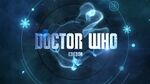
=== 2010-2011 === | |||
''[[The Eleventh Hour (TV story)|The Eleventh Hour]]'' - ''[[The Doctor, the Widow and the Wardrobe (TV story)|The Doctor, The Widow and the Wardrobe]]'' (Series 5 and 6) | |||
This logo was the first to be comprised of two distinct elements, which were both presented in different arrangements in differing contexts. The words "DOCTOR" and "WHO" comprise one element, with a "DW" icon, representing the shape of [[the TARDIS]] (which it also transforms into during the title sequence), comprising the second. | |||
Upon the first release in late 2009, the logo had the words "DOCTOR" and "WHO" on two levels, with the DW icon sitting alongside to form a square-shaped logo. The BBC logo was featured underneath, but wouldn't be featured in a televised logo until 2011. Later released was the far more commonly used horizontal arrangement, with the DW icon being positioned between the two words. After one season of use, the on-screen appearance was largely updated. The BBC logo was added, the texture largely altered, and the flare largely increased to give a more purple hue. | |||
The BBC began using this logo for promotional trailers and its website within days of the broadcast of''The End of Time'', the horizontal version of the logo being adopted by ''[[Doctor Who Magazine]]'' with [[DWM 417|issue #417]]. In merchandise, the size of the DW was decreased. The arrangement of the logo with the words on two lines was almost never used. This logo was used on most Eleventh Doctor merchandise, including books, audios and magazines, as well as for ''[[Doctor Who Confidential]]''. | |||
The DW icon was used in BBC promotions for the series, often without any other wording. This would lead to a large alteration of the logo in 2012. Although the DW was no longer featured in the show's logo, the DW was still used extensively in promotions and merchandise until about 2014. | |||
<gallery position="center" captionalign="center" widths="150"> | |||
Doctorwho series5 2010-titles.jpg|As seen in Series 5 | |||
Series 6 titles.jpg|As seen in Series 6 (on this version of the logo, the BBC logo was added under the word "WHO") | |||
</gallery> | |||
=== 2012-2013 === | |||
''[[Asylum of the Daleks (TV story)|Asylum of the Daleks]]'' - ''[[The Time of the Doctor]]'' (Series 7 to 2013 Christmas special) | |||
Following extensive use of the DW icon separately to any other element of the 2010 logo, the logo was largely adjusted for Series 7. The DW icon was moved to the right of "DOCTOR WHO", leaving the title uninterrupted and impacting how the logo was presented in the title sequence. During Part 1, "DOCTOR WHO" appeared on screen, with the BBC logo directly underneath. It would then fade away, with the DW appearing, transforming into the TARDIS as previously. From The Snowmen, the DW icon was dropped on-screen. | |||
Series 7 featured many variations of the logo's texture - throughout the Part 1, it differed from episode to episode. These variations included: | |||
* For ''[[Asylum of the Daleks (TV story)|Asylum of the Daleks]]'', it was bronze with numerous golden spheres, representing [[Dalekanium]]. | |||
* For ''[[Dinosaurs on a Spaceship (TV story)|Dinosaurs on a Spaceship]]'', it had a texture of green scales, representing the dinosaurs that appeared in the story. | |||
* For ''[[A Town Called Mercy (TV story)|A Town Called Mercy]]'', it had a texture with a wooden look with gunshots, representing the story's {{w|Western (genre)|Western}} setting. | |||
* For ''[[The Power of Three (TV story)|The Power of Three]]'', it had a texture that resembled the ubiquitous, black [[Shakri cube]]s featured throughout the story. | |||
* For ''[[The Angels Take Manhattan (TV story)|The Angels Take Manhattan]]'' it had marks resembling the [[Statue of Liberty]]'s crown, representing the story's [[New York City]] setting. | |||
* For ''[[The Snowmen (TV story)|The Snowmen]],'' it had an icy texture, representing the story's Christmas setting. | |||
* From ''[[The Bells of Saint John (TV story)|The Bells of Saint John]]'' to ''[[The Time of the Doctor (TV story)|The Time of the Doctor]]'', the logo had a weathered metallic texture. | |||
This rearranged logo was used by ''[[Doctor Who Magazine]]'' from [[DWM 450|#450]] to [[DWM 476|#476]]. During 2012 and 2013, merchandising featured two variants of the logo: the familiar blue texture (used during Series 7 Part 1), and a gradient grey-white-grey (used during Series 7 Part 2). This marked the first time a logo was used across multiple title sequences, and starting with ''[[The Snowmen (TV story)|The Snowmen]]'', the title sequence featured the Doctor's face again for the first time since 1989. | |||
<gallery position="center" captionalign="center" widths="140"> | |||
Asylum of the Daleks logo.jpg|As seen in ''Asylum of the Daleks'' | |||
Dinosaurs on a Spaceship logo.jpg|As seen in ''Dinosaurs on a Spaceship'' | |||
A Town Called Mercy logo.jpg|As seen in ''A Town Called Mercy'' | |||
The Power of Three logo.jpg|As seen in ''The Power of Three'' | |||
The Angels Take Manhattan logo.jpg|As seen in ''The Angels Take Manhattan'' | |||
The Snowmen logo.jpg|As seen in ''The Snowmen'' | |||
Series 7b logo.jpg|As seen in ''The Bells of Saint John'' to ''The Time of the Doctor'' | |||
</gallery> | |||
=== 2014-2017 === | |||
''[[Deep Breath (TV story)|Deep Breath]]'' - ''[[Twice Upon a Time (TV story)|Twice Upon a Time]]'' (Series 8 to Series 10) | |||
This logo featured a shiny, bluish metal texture, along with a thicker version of the typeface that had been used for the previous logo. Introduced with a new title sequence, marking [[Peter Capaldi]]'s debut as the [[Twelfth Doctor]], the logo no longer fades away, instead, zooming into the screen. | |||
From 2014, merchandising featured this version of the logo, presented as a block colour, often white, with the BBC logo on the upper left of "DOCTOR". This version was used by ''Doctor Who Magazine'' from [[DWM 477|#477]] to [[DWM 522|#522]]. The "DW" logo is no longer incorporated in the logo but is still frequently seen separately. | |||
For the [[2015 (releases)|2015]] [[Christmas special]] ''[[The Husbands of River Song (TV story)|The Husbands of River Song]]'' only, the logo was given a large icy tinge to match the vibe of the episode. | |||
Counting the 2005 logo and its modifications in ''The Runaway Bride'' as separate logos, this logo has the highest episode count of any used in the revived series, at 39 episodes. | |||
<gallery position="center" captionalign="center" widths="150"> | |||
Doctor Who Series 8 Logo.jpg|As seen in Series 8 to 10 | |||
Last Christmas logo (2014).jpeg|As seen in ''Last Christmas'' | |||
The Husbands of River Song logo.jpg|As seen in ''The Husbands of River Song'' | |||
</gallery> | |||
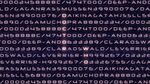
=== 2015 "Found footage" logo === | |||
''[[Sleep No More (TV story)|Sleep No More]]'' (Series 9) | |||
During the broadcast version of the [[Series 9 (Doctor Who 2005)|Series 9]] episode ''[[Sleep No More (TV story)|Sleep No More]]'', a special logo was used to reflect the found footage style of the story (as well as resembling the code text seen in the openings of the ''Matrix'' films). The letters DOCTOR and WHO are highlighted shown vertically among what appears to be horizontally-aligned text similar to computer code, appearing alongside numerals and various character names from the story, including "[[Gagan Rassmussen|GAGANRASSMUSSEN]]", "[[Osamu Aimi-Chopra|OSAMUCHOPRA]]", "[[Haruka Deep-Ando|DEEP-ANDO]]", "[[Le Verrier|LEVERRIER]]", and "[[Clara Oswald|CLARAOSWALD]]", shortly after [[Gagan Rassmussen]]'s beginning video message. | |||
<gallery position="center" captionalign="center" widths="150"> | |||
SleepNoMore special titles.jpg|The ''Doctor Who'' logo used only in ''Sleep No More'' | |||
</gallery> | |||
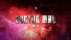
=== 2018-2022 === | |||
''[[The Ghost Monument (TV story)|The Ghost Monument]]'' - ''[[The Power of the Doctor (TV story)|The Power of the Doctor]]'' (Series 11 to 2022 Specials) | |||
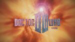
On [[20 February (releases)|20 February]] [[2018 (releases)|2018]], the BBC released a short teaser featuring a new version of the logo. The logo was created by design agency Little Hawk. | |||
This new logo had a largely golden texture and a thin typeface with the "D" and the "WHO" appearing to have been pierced. The BBC logo was moved from below it to above it. Like the previous logo it would zoom in to the screen and disappear, with the large alteration that it spin sideways as it closes in. | |||
Since the 2005 return of ''Doctor Who'' to television, the 1996 version of the logo had been used on most merchandise pertaining to the "classic" era of the programme (that is, the first eight Doctors), and the then-current version of the logo was used for most merchandise related to the [[21st century]] incarnations. However, with the introduction of this logo, that practice was abandoned, with the new [[2018 (releases)|2018]] logo being used on all new ''Doctor Who'' merchandise, with the exception of [[The Complete History covers|''The Complete History'' covers]], ''[[The Target Storybook (anthology)|The Target Storybook]]'' in [[2019 (releases)|2019]], and [[Target novelisation]]s up to [[2021 (releases)|2021]]. | |||
This logo was used on the cover of ''[[Doctor Who Magazine]]'' from [[DWM 523]] onwards on [[8 March (releases)|8 March]], as well as the covers of [[Titan Comics]] publications, starting with [[Free Comic Book Day 2018]] on [[5 May (releases)|5 May]]. | |||
The first [[Big Finish Productions]] story to feature the new logo was a vinyl re-release of ''[[Energy of the Daleks (audio story)|Energy of the Daleks]]'' on [[26 May (releases)|26 May]], although the logo was used by them in the trailer for ''[[Jago & Litefoot Forever (audio anthology)|Jago & Litefoot Forever]]'' just days earlier on [[24 May (releases)|24 May]]. Despite all of this, Big Finish had adopted the new logo as its new "placeholder" image for future ''Doctor Who'' releases weeks prior to this. | |||
With Series 13, the logo was changed largely, now with "''FLUX''" appearing below "''Doctor Who''", forming a subtitle for the series. In keeping with the theme of the series, the logo would now dissolve into ashes as it zooms in on the screen. The accompanying BBC logo was replaced with the new version released earlier that month. The "''FLUX''" subtitle was subsequently removed in the [[Series 13 (Doctor Who 2005)#2022 Specials|2022 Specials]]. | |||
<gallery position="center" captionalign="center" widths="140"> | |||
2018 logo from title sequence.jpg|As seen in Series 11 and Series 12 | |||
Revolution of the Daleks logo (2021).jpg|As seen in ''Revolution of the Daleks'' | |||
Doctor Who Flux.jpg|As seen in Series 13 | |||
2022 logo from title sequence.jpeg|As seen in the 2022 Specials | |||
</gallery> | |||
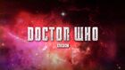
=== 2022-present === | |||
''[[The Star Beast (TV story)|The Star Beast]]'' - present (60th Anniversary Specials to present) | |||
On [[25 October (releases)|25 October]] [[2022 (releases)|2022]], the [[BBC]] announced that they had entered a partnership with [[Disney Branded Television]] for the broadcasting of future episodes of ''[[Doctor Who]]'' outside of the [[United Kingdom]].<ref>https://www.doctorwho.tv/news-and-features/bbc-and-disney-branded-television-join-forces-on-doctor-who</ref> | |||
A new logo was simultaneously unveiled, reusing the "Classic" [[1973 (production)|1973]] "diamond logo" design, albeit with updated colouring and shading, causing it to appear more 3D. The ''[[Radio Times]]'' noted that the diamond logo was fitting for the forthcoming "[[List of anniversary specials|diamond anniversary]]" of the series in [[2023 (releases)|2023]].<ref>https://www.radiotimes.com/tv/sci-fi/doctor-who-diamond-logo-returns-newsupdate/</ref> | |||
Four variations of the logo were made: | |||
# Primary: The logotype with the diamond. | |||
# Stacked: The logotype without the diamond. | |||
# Horizontal: The BBC logo above the logotype in a line without the diamond. | |||
# Single line: The BBC logo in a line with the logotype without the diamond. | |||
''[[Doctor Who Magazine]]'' made use of the new "Primary" logo for their covers, fading out the blue colour a bit and adapting the logo with a plaque in the same colouring, reading "Magazine", starting with [[DWM 584]], while [[Big Finish]] audio used the "Stacked" variant of the logo for their story cover releases as well as their anthology covers which also used the "Single line" logo interchangably and the [[Doctor Who website|''Doctor Who'' website]] took to using the "Horizontal" version in black & white. | |||
On [[23 November (releases)|23 November]] 2022, ''Doctor Who Day'', a brand new version of the logo was unveiled, removing the blue diamond-shape in favour of a real [[diamond]]. The word "Doctor" had been changed to look more metallic, and a blue plaque at the bottom was added, reading "60 Years".<ref>https://www.radiotimes.com/tv/sci-fi/doctor-who-60th-anniversary-logo-newsupdate/amp/</ref> | |||
This variant of the logo was largely only used on [[Doctor Who social media|social media]] and during the initial ''[[Once and Future]]'' Big Finish teasers and trailers, as the [[60th Anniversary Specials]] would prove to make use of the originally announced "Primary" logo. The BBC logo positioned itself above, fading in and out. | |||
The "Primary" logo would be used on the subsequent [[Christmas special]] ''[[The Church on Ruby Road (TV story)|The Church on Ruby Road]]'' and [[Series 14 (Doctor Who)|Season 1]] onwards. The BBC logo now enlarged and shrunk itself in vertical motions, instead. The "Primary" logo was enlarged slightly and made to look more 3D and shiny for the season itself. | |||
<gallery position="center" captionalign="center" widths="140"> | |||
60th Anniversary Specials logo.jpg|As seen in ''The Star Beast'' to ''The Church on Ruby Road'' | |||
Season 1 2024 logo.jpg|As seen in Season 1 | |||
</gallery> | |||
== Logo Variants == | |||
: ''Full article: [[Doctor Who Logo/Gallery]]'' | |||
== External links == | |||
* [http://www.throup.org.uk/doctor_who.php The ''Doctor Who'' Logo Collection] (up to 2010 logo) | |||
== Footnotes == | |||
{{reflist}} | |||
[[Category:Production information]] | |||
Latest revision as of 10:15, 4 September 2024
- For a gallery of images depicting Doctor Who logo, see Doctor Who logo/Gallery.
- You may be looking for the Doctor Who logo that exists in-universe or a Gallery of variations to the Doctor Who logo.
Over the decades, numerous logos have been used for the Doctor Who televised series and spin-off merchandise.
Overview[[edit] | [edit source]]
1963-1967, 2013[[edit] | [edit source]]
An Unearthly Child - The Moonbase + The Day of the Doctor (Seasons 1 to 4 + 50th Anniversary)
The first logo featured the words "DOCTOR WHO" in block white capitals, written in a simple sans serif font. The weight and size of the two words were arranged to keep both at the same width, a trend that would continue through the next two logos. Emphasis was placed on the word "WHO" by use of a heavier, more elongated typeface than that used for "DOCTOR".
Although this logo is primarily associated with William Hartnell's tenure as the Doctor, it remained in use for Patrick Troughton's first four stories, through to The Moonbase. This logo saw some use in merchandising; such as Doctor Who annual and the Frederick Muller novelisations. The latter utilised a variant of this logo, in which the word "WHO" is shown to be fuzzy and distorted. In the 1980s, Marvel Comics merged elements of the 1963 & 1973 logos for its Doctor Who comic book.
An updated version of this logo (featuring the BBC logo, as was common practice since 2011) was used for The Day of the Doctor in 2013.
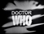
As seen in Season 1 to 4
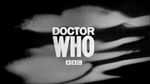
As seen in the 50th Anniversary special, The Day of the Doctor
1967-1969[[edit] | [edit source]]
The Macra Terror - The War Games (Seasons 4 to 6)
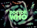
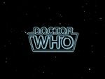
This logo again featured white capital letters, this time presented in 'Times New Roman'. The use of identical font and weight in both words severely diminished the differential emphasis featured in the 1963 logo.
This logo made its first appearance in Patrick Troughton's fifth serial, The Macra Terror, alongside a new title sequence and theme. This logo was not widely used in merchandising, but an altered version of the logo was featured on record release Variations on a Theme years later.
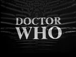
As seen in The Macra Terror to Season 6

1970-1973[[edit] | [edit source]]
Spearhead from Space - The Green Death (Seasons 7 to 10)
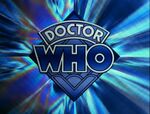
This logo gave the programme a much more unique visual identity. It featured a specially styled typeface and was presented in a bold shade of cyan, contrasting the simplistic, white logos of the 1960s. The enlargement of "WHO" as opposed to "DOCTOR" continued a trend that would remain in all future logos until the series' revival in 2005.
This logo was the first to be shown in colour, debuting with the Third Doctor's first serial. Although primarily associated with Jon Pertwee, this logo was later used as the basis for the logo used in the 1996 television movie. This updated logo would continue to be used in several pieces of non-televised media in later years, including comics by Titan Publishing Group (2014-2018) and the Dr. Men series.
As seen in Season 7 to 10 (Version 1)
As seen in Season 7 to 10 (Version 2)
As seen in Terror of the Autons and The Mind of Evil
1973-1980[[edit] | [edit source]]
The Time Warrior - The Horns of Nimon (Seasons 11 to 17)
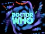
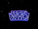
This logo, known informally as the "diamond logo", featured a bluish tint when used on-screen. The diamond-shaped background was often omitted in merchandising (e.g. the Target novelisations in 1975-1981 and DWM 44-45), with the colouring of the lettering and background also sometimes changed.
Although commonly associated with Tom Baker's time as the Fourth Doctor, this logo was introduced on screen during Jon Pertwee's final season as the Third Doctor, and was first used extensively in the Radio Times 10th Anniversary Special published in November 1973 — several weeks before the broadcast of the first part of The Time Warrior.
This logo was used greatly during the 1980s and 1990s, being used for the VHS releases (in lieu of whichever logo featured in the actual programme) and the Virgin Missing Adventures book line, as well as replacing the 1987 logo on most tie-in publications and merchandising during the early 1990s. After being phased out in the late 1990s, it was briefly reused for BBC Audio's new series of Fourth Doctor adventures.
In 2023 this logo was reintroduced for the 60th Anniversary, also known as the "diamond anniversary", although with a modern touch in upgraded colouring and shading.
The non-diamond variant of this logo has the distinction of being the only series logo to be acknowledged in-universe. The Kingmaker includes references to a series of books, Doctor Who Discovers (in turn a reference to the real-world series of books of the same title). The cover art for the audio incorporates the cover of one of these books, featuring this logo.
As seen in Season 11 to 17
As seen in The Ark in Space Part One
1980-1984[[edit] | [edit source]]
The Leisure Hive - The Caves of Androzani (Seasons 18 to 21)
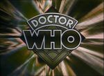
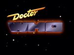
This logo featured the words "DOCTOR WHO" presented in a neon-tubing style, leading to it being commonly referred to as the "neon-tubing logo". After one season of use, the logo was noticeably cleaner when Peter Davison made his debut as the Fifth Doctor, with fringing around the edges having been removed.
Introduced in the final season of Tom Baker's era, this revamp of the logo complemented the new "star-field" title sequence, as well as the first non-Delia Derbyshire arrangement of the theme. It was then used throughout Peter Davison's entire tenure as the Fifth Doctor.
As seen in Season 18
As seen in Season 19 to 21
1984-1986[[edit] | [edit source]]
The Twin Dilemma - The Ultimate Foe (Seasons 21 to 23)
With the introduction of Colin Baker as the Sixth Doctor, the logo was tinted purple to give it a more colourful hue, matching the updated title sequence. It also took on a slightly curved appearance.
This variation of the logo was used almost exclusively on TV, with merchandising and books from the Colin Baker era tending to use either the 1973 or 1980 logos.
In the "Season 23: The Collection" re-edited standalone version of Terror of the Vervoids, the curved sign was presented inside a star-filled purple-ish space-like Time Vortex instead of a "star-field".
As seen in Season 22 and 23

1987-1989[[edit] | [edit source]]
Time and the Rani - Survival (Seasons 24 to 26)
This logo was the first to be a three-dimensionally animated element of the title sequence. The word "Doctor" appeared at an angle in a signature-esque font over "WHO", which was presented in a metallic style with a red glow surrounding it. It underwent major modifications when featured on the rebranded New Adventures books, beginning with Happy Endings. "Doctor" became less angled and more central, and the entire logo was more stencilled, with no texturing applied.
Following the TV series' end in 1989, this logo and variations on it would continue to be used for the Virgin New Adventures novels and other merchandise including Doctor Who Magazine until the early 1990s when it was replaced on most products (except the New Adventures) by the more famous 1973 logo. It was also featured on the spine of the majority of Virgin Publishing books, both fiction and non-fiction, was used for BBC Video's "Years" series of retrospective VHS releases in the early 1990s, and featured in the 1993 special Dimensions in Time, which remains its final TV use.
As seen in Season 24 to 26 and Dimensions in Time
1996[[edit] | [edit source]]
Doctor Who (TV Movie)
This logo was essentially a modified version of the 1970 logo. The colouring was changed from cyan to a darker blue, and a metallic texture applied. Some letters were largely reshaped (noticeably C, T, R, and W). It was presented as a three-dimensional object in space, echoing the 1987 logo. The logo is also seen from the rear. This logo has seen continual use in merchandising from 1996 to 2021. As such, there have been multiple variations. These include:
- In merchandise from 1997 to 1999, an ice-like pallet was applied to the logo rather than the dark blue tone seen in the TV Movie. The TV Movie design started to be used in merchandise in 1999, around the same time as Doctor Who Magazine finally adopted it to replace the diamond logo (which never used this version of the 1996 logo).
- To mark the show's 40th anniversary in 2003, the "H" in "WHO", was modified to make the logo read "W40". This was notably used, for example, on classic series VHSs and DVDs released in Australia during 2003, and for The Reign of Terror box set, which became the final story to be released on home video that year.
- The logo was stylised to feature the 'howl around' effect of the original title sequence for the 50th anniversary year, with a BBC logo included in the upper left.
- The logo was retextured to match the "steel" look used in merchandising throughout Matt Smith's final year as the Doctor. This featured a grey-white-grey gradient.
- The logo continued to be used until 2021, usually being featured in block colours such as white, blue, black, gold, and silver (similar to the usage of the 2014 logo).
Following the TV Movie, it was used as part of the BBC Eighth Doctor Adventures and Past Doctor Adventures, and largely replaced the diamond logo to represent the classic series as a whole in merchandise after 1996. It was used extensively during the 40th and 50th anniversary years (as mentioned above).
Although it was replaced when the series was revived in 2005, this logo remained the franchise's official logo on merchandise such as books, DVDs, and audio releases (including the Big Finish Productions line, but not AudioGO's Fourth Doctor line) which related to the first eight Doctors. The logo was in continuous use in one form or another from 1996 to 2019, making it the longest-running logo.[1] While the 2018 logo became the primary logo on nearly all Doctor Who merchandise in 2018, the 1996 logo continued to appear on The Complete History covers, The Target Storybook in 2019, and Target novelisations up to 2021.
As seen in the TV Movie

2005-2010[[edit] | [edit source]]
Rose - The End of Time (Series 1 to 2008-2010 Specials)
For the first time, the two words of the title were presented horizontally, upon a shield. This logo was used for Christopher Eccleston and David Tennant's tenures as the Ninth and Tenth Doctor.
Beginning with The Runaway Bride, this logo was modified, and now featured lettering considerably more squat than the 2005 logo, and a new background for the 'shield'. However, the overall design would've impacted too heavily. Variations of this logo used in merchandising have seen the shield changed to an off-white or grey, with black lettering, or a gold or black shield with white lettering.
After being updated for the 2006 Christmas special, this logo was used in Doctor Who Magazine, BBC trailers, the BBC Tenth Doctor Adventures book line, comic books, and in Doctor Who Confidential. This logo was used for the last time on television in The End of Time Part 2. Doctor Who Magazine used its alteration of the logo for the last time with Issue #416.
The logo was phased out gradually, however, as several pieces of merchandise, including Tenth Doctor audios from BBC Audio, a Quick Reads novel and the American Doctor Who Ongoing comic book series continued to use the logo into April 2010. The Doctor Who DVD Files magazine series was the only Doctor Who merchandise to continue using this logo, all the way up to its final edition in 2014. It is also still used on the BBC Doctor Who The Classic Series website (presumably as it was archived and no longer updated when the logo was phased out).

As seen in Series 1 and 2
As seen in Series 3 to the 2008-2010 Specials

2010-2011[[edit] | [edit source]]
The Eleventh Hour - The Doctor, The Widow and the Wardrobe (Series 5 and 6)
This logo was the first to be comprised of two distinct elements, which were both presented in different arrangements in differing contexts. The words "DOCTOR" and "WHO" comprise one element, with a "DW" icon, representing the shape of the TARDIS (which it also transforms into during the title sequence), comprising the second.
Upon the first release in late 2009, the logo had the words "DOCTOR" and "WHO" on two levels, with the DW icon sitting alongside to form a square-shaped logo. The BBC logo was featured underneath, but wouldn't be featured in a televised logo until 2011. Later released was the far more commonly used horizontal arrangement, with the DW icon being positioned between the two words. After one season of use, the on-screen appearance was largely updated. The BBC logo was added, the texture largely altered, and the flare largely increased to give a more purple hue.
The BBC began using this logo for promotional trailers and its website within days of the broadcast ofThe End of Time, the horizontal version of the logo being adopted by Doctor Who Magazine with issue #417. In merchandise, the size of the DW was decreased. The arrangement of the logo with the words on two lines was almost never used. This logo was used on most Eleventh Doctor merchandise, including books, audios and magazines, as well as for Doctor Who Confidential.
The DW icon was used in BBC promotions for the series, often without any other wording. This would lead to a large alteration of the logo in 2012. Although the DW was no longer featured in the show's logo, the DW was still used extensively in promotions and merchandise until about 2014.

As seen in Series 5
As seen in Series 6 (on this version of the logo, the BBC logo was added under the word "WHO")


2012-2013[[edit] | [edit source]]
Asylum of the Daleks - The Time of the Doctor (Series 7 to 2013 Christmas special)
Following extensive use of the DW icon separately to any other element of the 2010 logo, the logo was largely adjusted for Series 7. The DW icon was moved to the right of "DOCTOR WHO", leaving the title uninterrupted and impacting how the logo was presented in the title sequence. During Part 1, "DOCTOR WHO" appeared on screen, with the BBC logo directly underneath. It would then fade away, with the DW appearing, transforming into the TARDIS as previously. From The Snowmen, the DW icon was dropped on-screen.
Series 7 featured many variations of the logo's texture - throughout the Part 1, it differed from episode to episode. These variations included:
- For Asylum of the Daleks, it was bronze with numerous golden spheres, representing Dalekanium.
- For Dinosaurs on a Spaceship, it had a texture of green scales, representing the dinosaurs that appeared in the story.
- For A Town Called Mercy, it had a texture with a wooden look with gunshots, representing the story's Western setting.
- For The Power of Three, it had a texture that resembled the ubiquitous, black Shakri cubes featured throughout the story.
- For The Angels Take Manhattan it had marks resembling the Statue of Liberty's crown, representing the story's New York City setting.
- For The Snowmen, it had an icy texture, representing the story's Christmas setting.
- From The Bells of Saint John to The Time of the Doctor, the logo had a weathered metallic texture.
This rearranged logo was used by Doctor Who Magazine from #450 to #476. During 2012 and 2013, merchandising featured two variants of the logo: the familiar blue texture (used during Series 7 Part 1), and a gradient grey-white-grey (used during Series 7 Part 2). This marked the first time a logo was used across multiple title sequences, and starting with The Snowmen, the title sequence featured the Doctor's face again for the first time since 1989.
As seen in Asylum of the Daleks
As seen in Dinosaurs on a Spaceship
As seen in A Town Called Mercy
As seen in The Power of Three
As seen in The Angels Take Manhattan
As seen in The Snowmen
As seen in The Bells of Saint John to The Time of the Doctor
2014-2017[[edit] | [edit source]]
Deep Breath - Twice Upon a Time (Series 8 to Series 10)
This logo featured a shiny, bluish metal texture, along with a thicker version of the typeface that had been used for the previous logo. Introduced with a new title sequence, marking Peter Capaldi's debut as the Twelfth Doctor, the logo no longer fades away, instead, zooming into the screen.
From 2014, merchandising featured this version of the logo, presented as a block colour, often white, with the BBC logo on the upper left of "DOCTOR". This version was used by Doctor Who Magazine from #477 to #522. The "DW" logo is no longer incorporated in the logo but is still frequently seen separately.
For the 2015 Christmas special The Husbands of River Song only, the logo was given a large icy tinge to match the vibe of the episode.
Counting the 2005 logo and its modifications in The Runaway Bride as separate logos, this logo has the highest episode count of any used in the revived series, at 39 episodes.

As seen in Series 8 to 10

As seen in Last Christmas
As seen in The Husbands of River Song
2015 "Found footage" logo[[edit] | [edit source]]
Sleep No More (Series 9)
During the broadcast version of the Series 9 episode Sleep No More, a special logo was used to reflect the found footage style of the story (as well as resembling the code text seen in the openings of the Matrix films). The letters DOCTOR and WHO are highlighted shown vertically among what appears to be horizontally-aligned text similar to computer code, appearing alongside numerals and various character names from the story, including "GAGANRASSMUSSEN", "OSAMUCHOPRA", "DEEP-ANDO", "LEVERRIER", and "CLARAOSWALD", shortly after Gagan Rassmussen's beginning video message.
The Doctor Who logo used only in Sleep No More

2018-2022[[edit] | [edit source]]
The Ghost Monument - The Power of the Doctor (Series 11 to 2022 Specials)
On 20 February 2018, the BBC released a short teaser featuring a new version of the logo. The logo was created by design agency Little Hawk.
This new logo had a largely golden texture and a thin typeface with the "D" and the "WHO" appearing to have been pierced. The BBC logo was moved from below it to above it. Like the previous logo it would zoom in to the screen and disappear, with the large alteration that it spin sideways as it closes in.
Since the 2005 return of Doctor Who to television, the 1996 version of the logo had been used on most merchandise pertaining to the "classic" era of the programme (that is, the first eight Doctors), and the then-current version of the logo was used for most merchandise related to the 21st century incarnations. However, with the introduction of this logo, that practice was abandoned, with the new 2018 logo being used on all new Doctor Who merchandise, with the exception of The Complete History covers, The Target Storybook in 2019, and Target novelisations up to 2021.
This logo was used on the cover of Doctor Who Magazine from DWM 523 onwards on 8 March, as well as the covers of Titan Comics publications, starting with Free Comic Book Day 2018 on 5 May.
The first Big Finish Productions story to feature the new logo was a vinyl re-release of Energy of the Daleks on 26 May, although the logo was used by them in the trailer for Jago & Litefoot Forever just days earlier on 24 May. Despite all of this, Big Finish had adopted the new logo as its new "placeholder" image for future Doctor Who releases weeks prior to this.
With Series 13, the logo was changed largely, now with "FLUX" appearing below "Doctor Who", forming a subtitle for the series. In keeping with the theme of the series, the logo would now dissolve into ashes as it zooms in on the screen. The accompanying BBC logo was replaced with the new version released earlier that month. The "FLUX" subtitle was subsequently removed in the 2022 Specials.
As seen in Series 11 and Series 12
As seen in Revolution of the Daleks
As seen in Series 13

As seen in the 2022 Specials

2022-present[[edit] | [edit source]]
The Star Beast - present (60th Anniversary Specials to present)
On 25 October 2022, the BBC announced that they had entered a partnership with Disney Branded Television for the broadcasting of future episodes of Doctor Who outside of the United Kingdom.[2]
A new logo was simultaneously unveiled, reusing the "Classic" 1973 "diamond logo" design, albeit with updated colouring and shading, causing it to appear more 3D. The Radio Times noted that the diamond logo was fitting for the forthcoming "diamond anniversary" of the series in 2023.[3]
Four variations of the logo were made:
- Primary: The logotype with the diamond.
- Stacked: The logotype without the diamond.
- Horizontal: The BBC logo above the logotype in a line without the diamond.
- Single line: The BBC logo in a line with the logotype without the diamond.
Doctor Who Magazine made use of the new "Primary" logo for their covers, fading out the blue colour a bit and adapting the logo with a plaque in the same colouring, reading "Magazine", starting with DWM 584, while Big Finish audio used the "Stacked" variant of the logo for their story cover releases as well as their anthology covers which also used the "Single line" logo interchangably and the Doctor Who website took to using the "Horizontal" version in black & white.
On 23 November 2022, Doctor Who Day, a brand new version of the logo was unveiled, removing the blue diamond-shape in favour of a real diamond. The word "Doctor" had been changed to look more metallic, and a blue plaque at the bottom was added, reading "60 Years".[4]
This variant of the logo was largely only used on social media and during the initial Once and Future Big Finish teasers and trailers, as the 60th Anniversary Specials would prove to make use of the originally announced "Primary" logo. The BBC logo positioned itself above, fading in and out.
The "Primary" logo would be used on the subsequent Christmas special The Church on Ruby Road and Season 1 onwards. The BBC logo now enlarged and shrunk itself in vertical motions, instead. The "Primary" logo was enlarged slightly and made to look more 3D and shiny for the season itself.
As seen in The Star Beast to The Church on Ruby Road
As seen in Season 1
Logo Variants[[edit] | [edit source]]
- Full article: Doctor Who Logo/Gallery
External links[[edit] | [edit source]]
- The Doctor Who Logo Collection (up to 2010 logo)
Footnotes[[edit] | [edit source]]
- ↑ Although the 1973 logo has been used frequently since its introduction and continued to be used on some merchandise as recent as AudioGO's Serpent Crest in 2011, it has not been used without interruption.
- ↑ https://www.doctorwho.tv/news-and-features/bbc-and-disney-branded-television-join-forces-on-doctor-who
- ↑ https://www.radiotimes.com/tv/sci-fi/doctor-who-diamond-logo-returns-newsupdate/
- ↑ https://www.radiotimes.com/tv/sci-fi/doctor-who-60th-anniversary-logo-newsupdate/amp/