Talk:Wild Blue Yonder (TV story): Difference between revisions
GabesterTGG (talk | contribs) No edit summary |
Tag: 2017 source edit |
||
| Line 44: | Line 44: | ||
</gallery> | </gallery> | ||
[[User:TheGreatGabester|TheGreatGabester]] [[User talk:TheGreatGabester|<span title="Talk to me">☎</span>]] 23:02, 2 December 2023 (UTC) | [[User:TheGreatGabester|TheGreatGabester]] [[User talk:TheGreatGabester|<span title="Talk to me">☎</span>]] 23:02, 2 December 2023 (UTC) | ||
My vote goes to #3. — [[User:FractalDoctor|Fractal Doctor]] [[User talk:FractalDoctor|<span title="Send a space-time telegraph">@</span>]] 23:26, 2 December 2023 (UTC) | |||
Revision as of 23:26, 2 December 2023
Thumbnails
Okay, this one is a bit harder to find good shots for, imo. These were the ones I thought were even slightly decent. Obviously other can suggest new ones, this episode didn't have any standout moments for an infobox thumbnail imo.
- 1
- 2
- 3
- 4
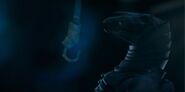
- 5
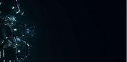
- 6


Najawin ☎ 20:15, 2 December 2023 (UTC)
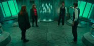
- Personally I'm partial to 2>1>4>3, but I can definitely see how some people would really like 3. It's just my own personal preference putting it so low. 2 basically shows nothing about the plot, but I think it's the best single shot in the episode. Najawin ☎ 20:17, 2 December 2023 (UTC)
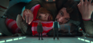
- Adding #5 and #6. I quite like #1 and #3, but I'd prefer #6 as I feel it'd evoke a sense of astrophobia, which I feel this episode had a large theme of. 20:33, 2 December 2023 (UTC)
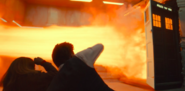
- My personal preference is 3>6>4. Don't like the others - seems weird to summise the episode in one picture and choose the beginning Newton gag or the dead horse captain. 1 is fine but also not really a shining moment for me - whereas the others showcase either the Not-Things or the edge of the universe, which I greatly appreciate. StevieGLiverpool ☎ 21:11, 2 December 2023 (UTC)
Yeah, I personally really don't like 3, just personal preference. Gives the game away wayyyyy too much. I get the 2 criticism, I just think it's the best shot even still. 6 is decent. I could live with 6. Violates looking left, but that actually is a good thing for what it's trying to evoke. Najawin ☎ 21:15, 2 December 2023 (UTC)
- The dead space (pun not intended) is, like you said, evocative of the themes. Sometimes unconventional cinematography is used to deliberately "break" the rules, which I feel this is a case of. 21:27, 2 December 2023 (UTC)
- I think #6 is the best choice, followed by #1. Evocative, representative of the episode, but doesn't completely give the game away. Aquanafrahudy 📢 🖊️
- To be fair space is dark. 22:09, 2 December 2023 (UTC)
- Surely #4 spoils the episode to the same extent as #3? Aquanafrahudy 📢 🖊️ 22:12, 2 December 2023 (UTC)
- I know that space is dark, but I feel that it is hard to make out details at thumbnail size. Number 4 is a little spoilery, but I do not feel that it is to the same degree as 3. 3 clearly shows that there is some weirdness with doppelgangers. I feel that 4 keeps it more ambiguous as to what is going on. Bongo50 ☎ 22:15, 2 December 2023 (UTC)
I'm with Bongo on 4 vs 3, 4 is just so bizarre that it doesn't give much away. I think the darkness works thematically on 6 though, so I'm fine with it. I do think it's an issue on 5. Najawin ☎ 22:38, 2 December 2023 (UTC)
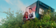
- The one with the horse-creature corpse doesn’t have much contrast, I don’t think it would work that well for the infobox. I liked a similar shot though:

TheGreatGabester ☎ 23:02, 2 December 2023 (UTC)
My vote goes to #3. — Fractal Doctor @ 23:26, 2 December 2023 (UTC)