Forum:The new transmats
Opening post
Hello everyone,
So, this discussion is continuing on from both:
However, those discussions have got quite knotty and difficult to follow, so I'll summarise things as best I can:
- A redesign of the main page is being discussed. This includes a new version of the 'transmats' - if you somehow don't know already, the transmats are a special graphic that link to various topics (and to 'transmat pages', specifically). This is what the current transmat graphic looks like (it displays much larger on the front page, of course):

- I, TheGreatGabester, have been developing a concept for a new version of the transmats. This is the current draft - it focuses on media, rather than in-universe elements:
- I'm also putting together a 'transmat kit', containing the isolated aspects of the design, a scaling grid (for the hexagonical pattern), etc. This will allow the graphic to be adjusted with relative ease.

- However, there is a lack of clear consensus for how this project can be progressed.
- Some people have signalled their approval for my design, and want to see it implemented.
- Some people like my design, but want to see some adjustments - it mostly seems like these people take issue with the transmats' content, rather than the overall design.
- Some people want a completely different transmat design.
- Some people are doubting the necessity of transmats, and even think they should be scrapped entirely.
I believe this issue should receive its own dedicated thread - on the previous discussions pertaining to the entire main page redesign, the conversation became somewhat scattershot and fragmented, and as I said, difficult to keep track of. So it's my opinion that we should address the main page redesign one element at a time, rather than trying to discuss every aspect all at once. If admins wish to overrule this, or change this thread to be about the entire main page (or delete it), that's fine. But, it's my view that this will be a more effective approach to take.
So yes, I'd appreciate if contributors to this thread made their current perspectives and thoughts as clear and easy to follow as possible. That way, new contributors can pitch in, without needing to wade through all the earlier discussions. Cheers TheGreatGabester ☎ 14:17, 24 May 2023 (UTC)
Discussion
Okay, so I want to start off here by giving a bit of context as per my end. I have been one of the people recommending that we have the transmat image focus on in-universe topics. This is because I have my own test design for a landing concept. You can see my two variants here and here.
In my designs, this is what I suggested for the spinoffs:


I believe this is more intuitive design than the big transmat wildly linking to every spin-off, both live action and EU. I also think it is the most healthy in terms of being evergreen, as it will not be a stress to update this whenever we officially know about future spin-offs. OS25🤙☎️ 19:20, 24 May 2023 (UTC)
- Yeah, I think I prefer OS25's design; it seems a lot more intuitive, and I think that it's actually much easier to see what things are what, as here, instead of linking by company, we are linking by series, which to me is much more intuitive. Aquanafrahudy ☎ 19:29, 24 May 2023 (UTC)
- The ability to easily swap out elements is appealing, for sure. It's a solid option. The main aspect I'm personally not so keen on, however, is the mismash of colour palettes between all these images. Some of these images individually contain a lot of strong colours, let alone when they're all put together. Functionally, this concept works well, but on an aesthetic level, I think there's more refinement that would have to be done. That's just me though, maybe other people aren't so bothered by the clashing colour palettes. TheGreatGabester ☎ 22:11, 24 May 2023 (UTC)
- Doom's Day is not a spinoff in its own right, it just doesn't belong, even if we adopt OS25's approach.
- But there's a more fundamental issue here, and it's that for newer users there's just too much being thrown at them. Imagine you're a new user coming to the franchise for the first time, you've already heard about the show, you know that it's been on since 2005, maybe you're vaguely aware that it had an older series back in 60s-80s, but you're already worried about 13 seasons of content to get through on the new show and you're not sure where to start. You come to our front page and you see that. A wave of colors wash over you and you see that there are four other TV shows?!!? And what's all that further down?! How much of this do you have to understand?
- The legacy of the show is already intimidating to new viewers, and OS25's graphic only makes the problem worse. It is actively harmful to the onboarding experience of users most likely to harmed by hostile site design on the main page. Moreover, there's just no reason to do it. There was a previous thread that had consensus for the transmat design in the OP, and there's been no reason given to change it out. (I will note to the one concern about linking to company rather than series - the transmat graphic doesn't link to the normal pages that are in the regular namespace, it links to specially curated landing pads called transmats that explain the basics of the thing discussed, providing context for those interested.) Najawin ☎ 22:52, 24 May 2023 (UTC)
- Once again, Najawin and I have one major disagreement about new editors coming to our website. Najawin believes that the majority of new users who will visit our site in the next few years will be former viewers who are now adults and are only coming to read content about the current run of episodes. People who stopped watching after Tennant or Smith and now only want to read about the Fourteenth and Fifteenth Doctors.
- Whereas I believe, from solid experience, that users who come to our website are often brand new viewers who are furthermorenot terrified of the expanded universe. They are instead people who want to learn more about parts of the show and universe inaccessible to them. They want to know what the Sarah Jane Adventures is, they want to read more about the Third Doctor and Frobisher and the like.
- Look at it like this. The ultimate peak in popularity for the franchise was during the Matt Smith era, probably around series 6. Imagine if you discovered the show during that era and you looked for a fan wiki... And the landing said something like
- FACTS ABOUT THE DOCTOR. THE DOCTOR THINKS BOWTIES ARE COOL. THE DOCTOR WEARS FEZES AND OTHER HATS. THE DOCTOR SAYS JERONIMO. THESE ARE ALL THE FACTS ABOUT THE DOCTOR. THIS CONCLUDES THE TARDIS WIKI LANDING PAGE.
- Doesn't that feel under-stimulating? And even if we do agree that new users are often returning from not watching the show for several years, who's to say they won't want to find out info about the eras they missed? We simply can not undermine our readers by presuming they don't have an interest in the obscure and fascinating. OS25🤙☎️ 23:08, 24 May 2023 (UTC)
But this isn't what I think? I think that there are going to be returning users, new users, and current fans all coming to the wiki! What I said was the following:
- There are four groups to consider when talking about people who come to the wiki. Enfranchised users who are coming to the wiki already using it and comfortable with it. Users who haven't yet been to the wiki, but when they do won't be scared off by our basic design decisions/organizing principles in any way. Users who are committed to the show but have the potential to be put off by our basic design decisions/organizing principles and so are less likely to use the wiki. Users who are not committed to the show and have the potential to be put off of the show by our basic design decisions and organizing principles. (Theoretically there's a fifth, those who will come back to the wiki but not the show, and you can fine grain this to consider returning users rather than first time, but it's ultimately not a super important distinction.)
Users of the first type aren't people we should care about with our changes here - they're competent enough in navigating the wiki that our front page changes won't effect their usage. Users of the second type are, by definition, people we shouldn't care about either. This leaves us only with users of the third and fourth type. Your contention previously was that new users will be predominately of the third type, that is to say, people who were in the fandom but didn't necessarily use the wiki, and you provided some anecdotes in support of this. I took very strong objection to this.
Indeed, you seem to be suggesting something similar still, but making an additional conflation, which is that type four users are necessarily returning. I don't think this; I think returning viewers vs first time viewers is irrelevant to my analysis. I'm worried about the users that we are potentially scaring off by making hostile design decisions, be them returning or entirely brand new. (And, indeed, the hypothetical I constructed above assumes the person is a completely brand new viewer, so I'm not certain why you're suggesting I think most people will be returning. I think most people in November will be returning, but I don't think that necessarily holds for S14.)
This brings us to a question. Why do you think most users will be type 3? Easy answer, you're a heavily enfranchised fan, and so you're going to gravitate towards the spheres of fan discussion where people are more invested from the get go and are really interested in the topic. Nothing wrong with this, we all are. But we need to account for our own biases, we need to consider people who aren't yet in the fan communities you interact with or simply never will be. Are there people we can scare off from the show all together with our design choices? I think the answer is yes - even the BBC Wales series is intimidating to a new viewer that hasn't watched anything and wants to know where to start. And I think we need to be cognizant of that fact. Najawin ☎ 23:40, 24 May 2023 (UTC)
- I like OS25's design, although I'd like to point out that on mobile it becomes a long line down, with each circle beneath the previous one. That probably needs fixing. Oh, and uh yeah people go to the wiki to find new stuff, not what they already know. Cousin Ettolrahc ☎ 05:22, 25 May 2023 (UTC)
- It's not that important that the feature works on mobile - it's pretty easy to set it up so it just doesn't show up.
- I think Najawin is still massively overthinking the whole user base thing. Users are mostly driven by curiosity when they visit fan wikis.
- So OS25, when you say there's still a need for a transmat directory, what would that look like?
- Even if not blue and gold, some kind of colour scheme needs to be considered. This is why I like the original transmats: because they are a well-designed, aesthetically pleasing visual, which all feels 'of one piece'. And having it all be in a limited colour palette contributes to that. Basically, these images need to work as icons - the simpler, the better. In my view, the Big Finish and Iris Wildthyme images are just way too visually busy - too many visual elements, and too many colours. TheGreatGabester ☎ 06:49, 25 May 2023 (UTC)
- Of course people coming to a wiki are here because of curiosity - to learn new things rather than what they already know. Nobody here is disputing this. The issue is rather what they're curious about, and if throwing them in the deep end might put them off of either the wiki or the franchise. (Or, alternatively, if not giving them large amounts of EU lore on the first page they see will put them off of the wiki or the franchise. - There will be sidebars that discuss more obscure EU stuff ostensibly anyhow, yes? The facts that OS25 is talking about. If we do these properly I think these concerns are just misplaced.) Najawin ☎ 07:12, 25 May 2023 (UTC)
- I my self quite like the bright colours I found the gold and blue seemed rather bland as the gold to me just comes of a rather dull beige. Not very interesting and I am lightly to miss it. So I support the bright colours and simple design the phrasing makes it obvious that one does not need to worry about the EU. And if I may say how I discovered the wiki. It goes a little like this I was no long a Doctor Who super fan. Once I had been I still loved the show but when you have rewatched the show so many times it gets a bit Repetitive. It was late 2019 Covid was just coming up. I has just finished watching all of Star Trek what was I to do with my spare time. So I want to read a new book and watch some new shows. So I type in to Google the 8th Doctor. I head to the Eighth Doctor page and promptly discover Faction Paradox. At this point I finish watching classic who with Britbox. So I need a new book to read I buy myself a copy of “of the City of the Saved…” and then “Alien Bodies” I read the and fall in love with them thanks to that help I start using the wiki regally and buy myself more books. More audios. Then I start on the discussion pages talking about My reinvigorated love for Doctor Who. I also grab myself a cheap copy of K9 and fall in love with that. Finally I start editing pages and talking on the temporary forums. I am not saying this is universal but I am sure quite a lot of people will come here only once they have watched a fair bit of the show and want more. A person think about getting into Doctor Who won’t type in “Doctor Who wiki” they will type in something like “where to start getting into Doctor Who” which will take them to and entirely different place. So the fact is people looking ti get into Doctor Who won’t immediately come here will they? We will not be their first stop. We are the gateway into the beyond not the gateway into the nearby. Anastasia Cousins ☎ 10:03, 25 May 2023 (UTC)
- Of course people coming to a wiki are here because of curiosity - to learn new things rather than what they already know. Nobody here is disputing this. The issue is rather what they're curious about, and if throwing them in the deep end might put them off of either the wiki or the franchise. (Or, alternatively, if not giving them large amounts of EU lore on the first page they see will put them off of the wiki or the franchise. - There will be sidebars that discuss more obscure EU stuff ostensibly anyhow, yes? The facts that OS25 is talking about. If we do these properly I think these concerns are just misplaced.) Najawin ☎ 07:12, 25 May 2023 (UTC)
- Well, yes, but when I was looking into Doctor Who, I went and read the Wikipedia page. Other people might do that with fandom. But I certainly see what you mean about the gateway to the beyond, rather than the entry point. Aquanafrahudy ☎ 10:49, 25 May 2023 (UTC)
I like (and prefer) OS25's design. The different clashes of colour don't bother me, although I can agree it visually looks quite busy. Maybe it can be simplified: use the Torchwood logo instead of the photo of the trio; replace Sarah/Clyde/Luke with the SJA logo; for the sake of consistency therefore replace K9 with that series logo; same for Class.
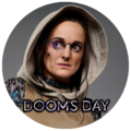
I like the whole 'roundel' vibe it has, and it just feels neat to me and way less fussy than a fancy graphic. Looking at it, you can immediately see each individual show/series/part of the Whoniverse, and click through. Maybe if people are bothered by colour clashes, is it possible to have them all 'washed out' with a colour but then they appear full colour when you hover over them with a mouse/click on them? Or, as with my logo suggestion, just find different images that better compliment each other when lined up? Logos alone could be boring, but they'd do the job. Or else an alternative suggestion is to find photos akin to the one used for "Doom's Day" - plainish background, one person/object as the focus of the image. Simple, effective, recognisable. Fractal Doctor ☎ 16:27, 25 May 2023 (UTC)
- I don't think they'll type in something like "where to start getting into Doctor Who", rather, the first search will be something like "Doctor Who". We're on the first page of Google results. We're an incredibly prominent site on all things Doctor Who related and this is the express intent of FANDOM. There will still be links to the EU in the transmat graphic. There will still be a sidebar with randomized tidbits. There will even be, if the proposal in the other thread succeeds, guides on how to venture into the various areas of the EU. All I'm suggesting is that the initial site design be less overwhelming for users who might come here without that context and might be put off by it. Focusing on the wiki/mainpage being a "gateway for the beyond", or a place people go to learn about things they don't know - nobody has argued against these things. Not a one. All that has been suggested is that the visual design on our main page do its best to not marginalize and scare off any type of user coming to this site. Najawin ☎ 16:33, 25 May 2023 (UTC)
- when I Google Doctor Who the first result if the Wikipedia page not this wiki. If I was new I would go there. Between that and this is a few news articles. If I am new and think about just getting into it I would go with Wikipedia. Not a place called TARDIS Data core (which is on the second page of safari not the first yes it is on the first of Google. But there are other widely used search engines such as Firefox) this wiki is cool. It is amazing. It is useful. But it also sometimes (I think) likes to think it is more important than it really is. Don’t get me wrong I love this place. But in the end it is just a website and whilst we want to make it the best website of all time we will not succeed as there is no best website. We can improve. But in the end we are still a website. And Doctor Who is just a Franchise. If someone wants to get in to a new show they will either Google how to get in or the name. If they Google how to get in they will be taken to somewhere like quora (or whatever it is called) if they search the name they will go to Wikipedia and find out that is basically restarts in 2005 and jump on at that point. They won’t go to a website they know nothing about. Like why would you go a website you have not heard of first instead of Wikipedia if you are only vaguely interested in starting watching it. I know I would not.I will only use a shows dedicated wiki once I have got really into it and want to do more in depth research. If I am only going to read about the show then I would use Wikipedia. This like said is not a place for introductions to the DWU it is an entrance way in to that which is beyond the show. The behind the scenes, the in-depth lore and links between Stories. And yes the EU. If this place was made to welcome new people to the franchise we would cover the eu less than we do now. Anastasia Cousins ☎ 17:03, 25 May 2023 (UTC)
My main opinion is above but I wanted to add: I hope this doesn't just become a circular discussion about hypotheticals and what fans/newbies may or may not 'see'. Because the truth is, everyone is different. Everyone researching the show is different, every new fan looking for info is different. Surely that topic is just a non-starter cos you can debate the ins and outs forever? Anyway, I'll dip, just my two cents. I hope you guys find a resolution, and I hope the focus about how a portal/menu can be displayed is found rather than just circular debates. (Apologies if this sounds rude; not at all intentional, just an observation.) Fractal Doctor ☎ 17:08, 25 May 2023 (UTC)
- I mean, part of the issue with going to wikipedia is that they necessarily have limited info about a show, I tend to hit wikipedia and then the franchise's wiki for whatever I'm looking at. (Also, it absolutely is first page, did you use a private window? It + Wikipedia + Doctorwhotv + Imdb are the only non social media, non BBC sites on the front page, iirc.)
- Can we please stop talking about the site as a whole? It has never once been something under discussion. I've never suggested that we try to make the site as a whole more welcoming for new users by toning it down. I know people who have said that. I think the proposals that try to do this are unworkable from an administrative standpoint and would require years of work from all of our editors to bring the site in line with.
- The only thing under contention is whether the main page should have accessible design for new users that might be put off or whether it should display all facets of the EU like OS25 is proposing. And let us note - I still want the main page to discuss the EU! I just want it to be more understated and less garish, as TGG's transmat graphic is, as well as sidebar modules. Nobody has ever suggested that the main page should only cater to things people already know about or that the site as a whole should be focused on the show and made less EU friendly. This has not happened. I do not believe this, and, indeed, I reject this view in the strongest terms. I merely think that this one, singular page, should be made as accessible as possible. Najawin ☎ 17:48, 25 May 2023 (UTC)
I agree with Fractal Doctor, I’m a bit sick to death of the circular discussion. But I’ll offer my perspective on it (again), regardless. In my view, the top of the page should probably contain the most ‘accessible’, current-DW focused stuff. But, the further you scroll down, the more references to obscure stuff you’ll find. I have quibbles with OS25’s concept, but I like that it has that dynamic, almost like those ‘iceberg’ videos you see - more well-known stuff at the top, before becoming slightly less accessible the ‘deeper’ you go down. I really think that could work. We don’t have to fall into false dichotomy-syndrome, where it’s either ‘accessible’ or ‘non-accessible’.
Having said that, I will say that this is basically what I was trying to achieve with my transmat design, just from a different angle. Making it clear how everything branches from the main show, kind of like a mind map. It makes sense to highlight what’s most current, in some way. Either by frontloading stuff at the top of the page, or by having a big central ‘DW’ transmat from which everything branches, etc. That’s all well and good, but there should be a bit of space for other stuff, and it needn’t be quarantined to the sidebar, in my view. TheGreatGabester ☎ 18:16, 25 May 2023 (UTC)
- for me on safari it is on the second page I can show a screen shot if you like. And whilst you make valid points I disagree with it for reason I have outlined above. I believe the Iceberg approach would be a nice compromise between our two conflicting views we have the main show at the top (possibly split in to classic and modern?) bellow it we have tv spin offs (including K9 and Company and K9) under that we have the more obscure parts of the EU but ones which still have the Doctor Who name attached and bellow that we have the PROBE and Faction Paradox section with at the bottom of the rabbit hole. With a clear distinction between each section. Like the “down the rabbit hole Alice?” Bit which I myself personally loved (I do have a soft spot for the book). So that is my proposed compromise we make it clear that each section is not required for the current show before we move on the more complex parts. And when we get the the three times removed section of City of Saved and Cwej: the Series we thus place them further down. Like the iceberg. We must however also make clear that whilst shown below we do not see them as less than the current show just that the current show can be enjoyed with out them. It is purely to outline how closely related they are to the current show not there importance. And I think someone said it is not important how it looks on mobile I disagree I myself often use a tablet which uses a similar display to a mobile I use because I find it is easy to use than a computer the main page I find however is almost illegible with text boxes over lapping and obscuring the main text leaving the main page a bit of mess. Thus we must make sure the transmats work on mobile as well. By excluding mobile is far worse than excluding the EU or new fans as most people (I think?) use mobile to search for things and are less likely to use their computers. Anastasia Cousins ☎ 19:29, 25 May 2023 (UTC)
- I agree with Anastasia Cousins' proposal whereby we have an iceberg effect, where the further down you go, the obscurer you get. Well, not obscurer, but further away from mainstream DW, if you see what I mean. Start with the main TV series, then EU, then TV spin-offs, then EU spin-offs, then spin-offs of those EU spin-offs, if you see what I mean. Although EU DW can be provided by sidebars, so maybe not that. Aquanafrahudy ☎ 19:56, 25 May 2023 (UTC)
I will clarify that the the spin-offs linked above are meant to be sorted first into TV spin-offs of any kind, and then into current EU spin-offs. The idea being these would be things that are currently ongoing or at least are trying to be. I had many other circles designed for a potential third segment of historical spin-offs, but I didn't included it because I never finished it and I've never considered it load bearing.
However, the spin-offs could easily be reorganized under the idea of starting with the very pressing "Doctor Who" mainstream stuff, then getting around to thinks like the Dr. Who films, and finally getting to those spin-offs which aren't titled Doctor Who etc. Of course, this would naturally start another debate over what deserves to be included. OS25🤙☎️ 20:24, 25 May 2023 (UTC)
- ^The proposed compromise isn't a compromise. It's simply OS25's proposal.
- Look. Let me suggest the following. Try to consider coming to the main page as a new viewer of the show, having no knowledge of the EU, and being perhaps a little intimidated by the history you do know of. Compare OS25's proposal, the clashing colors and various spinoffs all thrown together as a full section with the idea of a transmat graphic at the bottom. Does OS25's proposal have the potential to scare you off, either of the wiki or of the franchise entirely? And honestly try to put yourself in the mindset of a new viewer who's a little intimidated of the expansive history of the show.
- Now try to put yourself in the mindset of a user who is already familiar with the franchise, and comes to the wiki with the transmat graphic + the sidebar with rotating EU tidbits over OS25's sections. How does this impact you in comparison? Either in scaring you away from the franchise, or making you less likely to engage with the wiki or just not being sure where to start in your search. And, again, try to place yourself in the relevant mindset, rather than thinking of the knowledge and biases you have now.
- It's not about, imo, what we like - I would like for the Capaldi era to get the entire main page to itself :P - it's about what's better for the users of the wiki. Any discussion that doesn't focus on this first and foremost is dross. Najawin ☎ 21:16, 25 May 2023 (UTC)
- Najawin, you’re welcome to share your view but there is a clear need and desire to move beyond these circular arguments. Unless I’m mistaken, I don’t think what’s being discussed is the content at the very top of the page. That’s yet to be decided completely, but that’s probably just a welcome message, plus some links to relevant current characters (and possibly cast?). All this stuff that’s being debated would be underneath. Imo, the worrying about people being alienated just isn’t needed, because a lot of people won’t even bother scrolling past that very first part. You’re clearly very concerned about this, but I honestly think this worry is slightly misplaced. TheGreatGabester ☎ 21:37, 25 May 2023 (UTC)
- But the arguments are circular insofar as people are insisting "I like the other option", which just isn't a compelling rebuttal. If there are reasons to think one design is superior other than mere preference, related to actual harm it might do to the user base, there has to be engagement with the discussion at that level or any discussion of aesthetics simply fails to move the needle. Aesthetics is the least of our concerns.
- And, indeed, we're not discussing the content at the very top of the page. This is irrelevant to the point I'm making - OS25 wants these to be sections of the page rather than a transmat graphic further down the page. Najawin ☎ 21:47, 25 May 2023 (UTC)
- I am not trying to argue what I like I simply mean that I do not believe that this wiki is where people think of getting in to the franchise would go. When I want to get into a new franchise what I usually do is go round a charity shop of a car boot and try to find myself a guide book. I know this is not universal at all. But when I wanted to get into Star Trek I did not go to Star Trek wiki first. I did not go to Star Trek wiki until I was halfway through Voyager. I did first search how to get into Star Trek. Yahoo answers said suggested I watch the reboot movies I did that I enjoyed them to a degree. I then acquired a copy of a Star Trek guide book second hand at a charity shop and decided that I might enjoy voyager. Going to the wiki never once entered my mind not until at least halfway into season three when I wanted to know when species 8675 or whatever shows up. That fact is I recon most people will come here for a similar reason they will not buy a guide book. But nor will they go to a wiki. When I get into a show I like it to be long and have a history I do not find a long show scary or daunting I look forward to have something which will keep me entertained for a while. I do not understand why someone would be intimidated by a large backlog. To me that would be a reason to get into it. The EU is what reinvigorated my interest in Doctor Who and this wiki having a large coverage of it is what led me to the EU and to still being part of the Fandom. I had watched almost all of classic who and finished new who. If this wiki hid the EU in the main page I would not be on this wiki debating it. I would be over on Memory Alpha debating something similar with the good fellow over there. The little boxes on the side brought me in. And the EU is what keeps me in. If it was more obvious I would have been editing on this wiki at least a few months earlier than I did. And for the final time I will say this wiki is not the entrance to Doctor Who it I’d the Doorway to the Grounds the world beyond the screen. To me that is what it function is. And whilst I would hate to loose a new user I feel that only having the current show information will put people of not welcome them. Like I said I would not be here I would be on Memory Alpha or maybe Memory Beta. I would wave the Trekkie flag not the Whovian. I would never have read Faction Paradox I would be a very different person if we did not have the EU boxes on the side and I would have reached this point sooner if they where in the Transmats. I do see your point but I say it is built on the flawed premises that someone who has never even watched an episode will come here before watching it. (Or built on the premise that they have only watched a few but the point stands I believe that premise is flawed). However whilst I could learn to live with your idea about the transmat the only thing I will insist on is the Colour of I find the Beige is mor of putting than the colour I struggle to even tell what is going on with the Beige and find it much more friendly to my eye and understand to have the colour I will settle with the proposal above or any other you suggest as long as it has colour . Of course my insistence on colour may be due to my autism and the fact I can sometimes struggle with sepia tinted or other things which lack colour. I can enjoy black and white but I can not enjoy non moving objects with only beige. I struggle to understand it. So if you can propose a new compromise in which we keep the colour I will settle for that. But until then I will stand by my argumentAnastasia Cousins ☎ 21:55, 25 May 2023 (UTC)
- And, indeed, we're not discussing the content at the very top of the page. This is irrelevant to the point I'm making - OS25 wants these to be sections of the page rather than a transmat graphic further down the page. Najawin ☎ 21:47, 25 May 2023 (UTC)
Again, I almost always look at fan wikis first! Nobody's experience is universal, we need to think minimizing the risk while recognizing that everyone is different. Part of my worry here is that I've seen people say that they want to get into Doctor Who but that 13 seasons is intimidating. Multiple times. Sure, to many people that sounds fun! But to many others it sounds like homework - like you need to catch up on 13 seasons before you can understand the stuff currently going on. And it gets even worse with the classic series. I've seen people who have desperately begged people to tell them that the DWEU isn't canon because they were such completionists that they felt that if it was "canon" then they would need to consume the entire thing. Everyone is different, and the question is, given that fact, how can we best minmax our main page. Have just enough stuff on the EU so that people who are already fans have places to start their search, but not so much that anyone new to the show will feel overwhelmed. (And, indeed, the reason I feel so strongly about this is because I'm trying to make things accessible as possible for the influx of new users in the next two years and these were discussions among the types of people who are most likely to visit the wiki in that time. People engage with television in all sorts of different ways. It's important to keep this in mind - pretty much everyone we talk to in fan spaces is the minority.) Najawin ☎ 22:16, 25 May 2023 (UTC)
- and now we have the compromise some EU. We do need some we don’t want to much and agree on that point but the question becomes how much eu. However we still need the colour. I just don’t feel there will be a significant amount of new users maybe some people who will return, but I don’t think many new people will be arriving. And yes neither of our experiences are universal as I have said before. What we really need to do to answer this question is run a survey to see how people joined this wiki. But the question Is where do we put this survey? We in discussions? I don’t think many of the people there do editing or talk on forums. But then again we are looking at a far too small survey size. Social media? Perhaps but to any of us have a large enough platform to gain a significant advantage over discussions. So whilst running a survey would help with this problem. It would still be rather inaccurate and biased. Anastasia Cousins ☎ 08:55, 26 May 2023 (UTC)
A survey isn't needed. We just need the homepage to showcase Doctor Who and its expanded worlds, is the long and short of it. How we do that - a grid, a fancy graphic, a basic list, individual box-outs... that's the key, and obviously how much. I'd suggest a simple overview like OttselSpy25 showed. TV show, TV spin offs, Big Finish, and a handful of other slightly more obscure things. We can surely decide that between ourselves, and swap things out later if we think something needs more or less prominence. It's not that deep. Fractal Doctor ☎ 09:22, 26 May 2023 (UTC)
- The transmat graphic presented in the OP does showcase the EU. It was very carefully worked on to do just this. I spent a large amount of time trying to argue for the inclusions of certain things! (Indeed, it's almost surreal to me that I spent so much time arguing for T:NPOV in relation to that graphic and on the subpage issue that I'm now being accused of trying to erase the EU from the main page. Dear lord.) What OS25 has presented isn't workable not because it showcases the EU but because it's overwhelming. It forces you to consider the stuff presented, and treats these things as a section of the main page in their own right. The transmat graphic is more muted and abstract and is the very last thing on the page. Is it important? Yes. And I want to trim down the page substantially so that it's much higher up - see User:Najawin/Sandbox 8 - I prefer a very minimalist design, but this is up for debate and will be discussed later. Having the EU as part of our main page is not in and of itself bad. Having the EU as part of our main page in a way that it cannot be avoided by new users is. Najawin ☎ 15:09, 26 May 2023 (UTC)
- okay my misunderstanding. But I still do not want the beige it need colour maybe only or three two but more than just dull. Off putting beige. I can not stand it. The beige is the worst part of the front page it has not life it is just bland monotone and in general this makes it feel uncomfortable. The reason I put my backing behind OS25’s was because it was bright and easy to see compared to the the beige and muted tones of the original. And it was simple and explained which was which inviting you to discover more with out implying it was necessary.Anastasia Cousins ☎ 17:34, 26 May 2023 (UTC)
Najawin, it is quite irritating that you’re straight-up ignoring everyone else’s wishes about moving past this cul de sac. Everyone else has clearly communicated their perspective: that the user base thing is a minor issue at the most, if not a non-issue. Learn to read the room, please. TheGreatGabester ☎ 11:41, 27 May 2023 (UTC)
- See above. The discussions are circular - a cul-de-sac - because there are rarely serious arguments presented against my position. I've reframed my argument in new ways to try and get past this circularity which I've been accused of in this thread - see above where I suggested that people try to place themselves in the shoes of the people in the scenario. Why can the people who think it's not an issue not simply provide a coherent rebuttal about why the design OS25 is suggesting wouldn't be at risk of scaring off T4 users? The only serious attempts have confused T4 and T3 users, all others simply insist it won't be a problem, which isn't a serious rebuttal.
- With all due respect, when the first three responses to me are:
- Najawin believes that the majority of new users who will visit our site in the next few years will be former viewers who are now adults and are only coming to read content about the current run of episodes.
- Oh, and uh yeah people go to the wiki to find new stuff, not what they already know.
- Users are mostly driven by curiosity when they visit fan wikis.
- Najawin believes that the majority of new users who will visit our site in the next few years will be former viewers who are now adults and are only coming to read content about the current run of episodes.
- Not a one of which actually response to anything present in my comments, they're just completely invented wholecloth, responding to positions I actively don't hold, I can't say I find the suggestion to "read the room" - because the room has decided that these issues are non issues - particularly compelling. Najawin ☎ 19:22, 27 May 2023 (UTC)
- "Why can the people who think it's not an issue not simply provide a coherent rebuttal about why the design OS25 is suggesting wouldn't be at risk of scaring off T4 users?"
- The reason is that my design doesn't have any risk of scaring off anyone. It's a wiki landing page for a famously long-lasting franchise. No one is going to decide to stop watching the show because we make it clear that spin-offs exist. It's not even info that will be at the top of the page, so we're not leading with the existence of the spin-offs, it's something users will only find when they scroll down past the more typical Doctor Who landing content. We've all said this many times and every single time we've been very, very "coherent" about it.
- This debate is the biggest piece of evidence for why we need time limits on these forums. Since this disagreement began there have been no new arguments, it's just the same talking points on a loop forever. We clearly aren't going to sway either side or find a common ground. The only solution that's ever been possible is an admin making a decision on day 30. OS25🤙☎️ 19:38, 27 May 2023 (UTC)
- We're not discussing the higher up content on the page, but your proposal there has the exact same issue, so it simply can't be a response. But given that I just pointed out that the responses to me were often arguing against invented positions, why did you think it was reasonable to invent yet another position for me in your response to my comment? Nobody has suggested saying "don't mention spinoffs" on the main page. The transmat graphic proposed in the OP has spinoffs. This is an egregious strawman. The issue is one of prominence and a design that purposefully stands out.
- Again, merely insisting that people won't stop watching because of overwhelming information is just factually incorrect. It confuses your experiences and how you consume media for how everyone consumes media. This is why serialized network TV and soap operas are so popular - you don't have to watch the entire history to understand it, you can onboard at any time.
- As for the idea that this proves we need a time limit, let me impress upon you that I've attempted to reframe my points and provided solid reasoning for my claims. You've simply not engaged with this reasoning. See my very first response to you and your complete failure to respond. Everyone in a fan space is the minority of the people who watch the show. The Not we and people who have simply never seen the show in the first place overwhelmingly outnumber us, and we need to think about what might scare them off vs actually encourage them. While we can't compromise on T:NPOV, we have to keep this fact in mind on our main page of all pages. I simply cannot imagine why this fact is controversial except for what it entails in this particular thread. Najawin ☎ 20:14, 27 May 2023 (UTC)
🤦♂️ Fractal Doctor ☎ 22:01, 27 May 2023 (UTC)
- I'm not engaging with your argument because I don't think it's very sound logic. In other words, I don't agree with it. I don't need to "engage" with your logic if I don't share your worldview, simply saying that I think differently is a completely coherent form of responding to a talking point which I think is wrong. OS25🤙☎️ 22:12, 27 May 2023 (UTC)
- The thing I don't understand is that if linking to spin-offs and EU stuff is overwhelming and will alienate new users, how is File:Transmats layout concept.png not an issue? It's just doing the same thing but all at once and with no coherent organisation or theme? It's just BAM Big Finish Class Doctor Who Magazine Torchwood SJA These Are All The Same. What makes that a design which doesn't turn off potential new users? Just the fact that it's all a big clump of unlabeled stuff, thus those likely to be overwhelmed won't even know what they're looking at? OS25🤙☎️ 22:17, 27 May 2023 (UTC)
- Declining to engage with an argument because you think the logic is poor is the opposite of what you do. Unless there are defeaters for an argument/belief/position the argument stands. No matter how poor you think the argument is, unless you assign it zero credence, if there are defeaters to the arguments in favor of the position you hold that you've put forward but not to the argument in favor of the position you don't hold, it wins out. (In this hypothetical the defeaters are, well, defeaters - if there's good responses to the arguments against then it becomes more messy. But given you just haven't done this, it's a moot point.)
- Finally, at last, we have an argument. "Why do I think TGG's transmat design is less egregious in terms of isolating new users? It's just a big clump of unlabeled stuff." - Putting aside that most of it is labeled to greater or lesser extent.
- It does not have a section in its own right, it is the bottom of the page after giving them advice on where to start with the franchise.
- It matches the color tone of the rest of the main page. I know neither you nor User:Anastasia Cousins likes this, but it makes these things stand out less and be less visually overwhelming. Obviously some level of tweaking can be done.
- The abstract nature of the design means that it's easier for users to treat it as ancillary to the main page - something that they can come back to when and if they're more comfortable, something easily ignored.
- As I'm writing this I'd like to highlight where a potential solution might be and where we differ. Look at Forum:Temporary forums/Updating the main page & theme. While I really like TGG's updated graphic, and I'm not a fan of how you handled this, it wasn't quite my original proposal, and it's not a design I'm wedded to. What I'm objecting to before any further discussion of aesthetics is the notion that this should have its own section rather than being a graphic at the bottom of the page and the idea that it shouldn't match the color tone of the rest of the page. These two things are the most likely to overwhelm new users. I have no issue discussing if there should be writing in the circles, labeling the spinoffs - if we should arrange it like TGG's (though I think this is greatly preferable) or in simple lines or some other pattern entirely. I'm not objecting on the basis of aesthetic. I'm objecting on the basis of decisions that are actively hostile to new users. Najawin ☎ 22:57, 27 May 2023 (UTC)
- Finally, at last, we have an argument. "Why do I think TGG's transmat design is less egregious in terms of isolating new users? It's just a big clump of unlabeled stuff." - Putting aside that most of it is labeled to greater or lesser extent.
- Colourful is not a bad thing. And I don’t know who came up with the idea that it is. Many different colours would be a good design and something the world needs. Colours that are BAM right in your face and standing out is something that is really needed. Not just on the wiki, but in general in the real world. But we can start by colourising the wiki a bit. Danniesen ☎ 01:58, 28 May 2023 (UTC)
- To clarify: I’m not 100% anti colour. I personally would just prefer a more restrained, bland colour palette over an ‘everything goes’ approach. But I’m sure there’s a good middle ground to be found. My bigger issue is actually the other thing I mentioned: the amount of detail and elements within each image. Some of the images within OS25’s concept are too visually dense to be effective icons, imo. TheGreatGabester ☎ 05:30, 28 May 2023 (UTC)
- I agree that having that much detail in the pictures is a problem and I had been hoping it nail that out when we had reach a compromise however it has been made clear that we won’t. So I think we should with with simply having the logos not the cast. I would like to have them in their full original colour, however there is some resistance to this which I understand, so perhaps we should have a colour pallet of three or so colours in which each image is formatted in (of course this has its own problems which I assume are immediately obvious)Anastasia Cousins ☎ 08:45, 28 May 2023 (UTC)
- To clarify: I’m not 100% anti colour. I personally would just prefer a more restrained, bland colour palette over an ‘everything goes’ approach. But I’m sure there’s a good middle ground to be found. My bigger issue is actually the other thing I mentioned: the amount of detail and elements within each image. Some of the images within OS25’s concept are too visually dense to be effective icons, imo. TheGreatGabester ☎ 05:30, 28 May 2023 (UTC)
- I've been trying to wrap my head around this argument and I find the battle-lines rather confusing. As I see it, a major concern with the radiating transmat-graphic is that it would turn off new viewers for being confusing, making the more in-your-face Ottsel design much more newbie-friendly. I imagine the not-we looking at that peculiar asymmetrical diagram of interlinked circles bearing unfamiliar logos, and scratching their head at what they're even looking at, and thinking, "man, Doctor Who is a lot more impenetrable than I thought" — whereas the Ottsel pitch with individual thumbnail would be much more parsable at first glance, what with including pictures of the cast and such; and therefore much more accessible to the not-wes. It's not that I don't understand the argument about appearing daunting/overwhelming to new audiences, but I would personally assume that to be a much weaker effect than the risks of a home-page which seems hard to understand. At heart our primary duty as a Wiki is to present all the information legibly and accurately; obfuscating information in some effort to appear more newcomer-friendly seems to me to rankle, as a basic proposal. Scrooge MacDuck ⊕ 08:48, 28 May 2023 (UTC)
- imo the abstract nature of the design makes it seem less like a sort of rigid presentation of things that you should know about and instead, well, just a graphic that you can pay attention to or not. But, I do want to stress, I'm not wedded to the particular organization TGG has. I think this "stylized" perspective is a plus, but it's not something that's necessary in any way. To me the main points are what I listed as 1 and 2. #3 is just a bonus, and can be jettisoned without issue. If everyone wants circular icons like what OS25 has, (obviously not directly analogous) so long as 1 and 2 are met, I have no strong objection, though I'll obviously have thoughts and aesthetic preferences. Najawin ☎ 09:13, 28 May 2023 (UTC)
- I myself find myself agreeing with Scrooge. Because the fact that it is very obvious that the EU parts are not needed because of the title “Down the Rabbit Hole, Alice?” In being presented as a question not a statement it is inviting you to have a look but says it it not required. To be this is glaringly obvious. The Alice in Wonderland allusion reinforces this, it is the are beyond what is commonly known. And area of strange imaginative worlds yet one which is not required to understand the main world. The Map layout at the top is more confusing to me and would confuse me even more if I was knew. It has no distinction between the easily observable and a a series which has been out of print longer than I have been alive. Whilst the other one doses distinguish quite clearly. I myself would still add a section above the other TV shows for the main show entitled something like “the core of the series” or possibly something less ambiguous I don’t know what to call it but thats my thruppence. Anastasia Cousins ☎ 10:09, 28 May 2023 (UTC)
- imo the abstract nature of the design makes it seem less like a sort of rigid presentation of things that you should know about and instead, well, just a graphic that you can pay attention to or not. But, I do want to stress, I'm not wedded to the particular organization TGG has. I think this "stylized" perspective is a plus, but it's not something that's necessary in any way. To me the main points are what I listed as 1 and 2. #3 is just a bonus, and can be jettisoned without issue. If everyone wants circular icons like what OS25 has, (obviously not directly analogous) so long as 1 and 2 are met, I have no strong objection, though I'll obviously have thoughts and aesthetic preferences. Najawin ☎ 09:13, 28 May 2023 (UTC)
Further to my post on 25 May, as noted above: I like OS25's roundel vibe, and whilst I'm a fan of their suggestion, I've put a quick concept together using my own idea of simplifying - I've used promotional images, but kept it to one focus/character per roundel, with relatively plainish backgrounds. Simple, effective, recognisable. (Obviously this was tricky with Class cos it's an ensemble piece - and people may want to debate whether or not a solo image of Harkness/Barrowman is appropriate, but hey.) I've kept the colour but desaturated it a little so as not to be over-powering or too vibrant.

I did have a go at making this with just the logos - it works, but it feels a bit lifeless and lacks character (heh). Anyway. Just thought I'd throw this into the discussion to accompany other debates. Fractal Doctor ☎ 18:46, 29 May 2023 (UTC)
- Still feels far too vibrant to me! :P
- Re: the point above about "Down the Rabbit Hole" - I just don't see how this response makes sense, they've already scrolled far enough to see the stuff, you are, from a design perspective, mentioning it as an afterthought. Moreover, knowing that there's more to cover, even if not necessary, can still be intimidating if not presented in the right way. Simply saying "oh, you don't have to worry about this" really isn't sufficient. Having this as a section in its own right is simply unworkable. Najawin ☎ 19:04, 29 May 2023 (UTC)
Having re-looked at the "down the rabbit hole" layout above, I also think the core issue is that 10 "portals" in a row is probably just too much in one small space, screen/page-wise. If the top row were to be 4 roundels/shows wide, then I think that design should be the pattern for the EU stuff too. Four in a row, and (sorry) ditch 2 of them.
Since we're also struggling to decide what should appear to start with, could it be feasible to have the first row be 4 of the most current/prominant/recognisable shows (at present: Torchwood, SJA, Class, K9) but change this up if new shows do materialise (say, for example, a UNIT spin off materialised on TV, that'd be bumped into the line-up with a pre-existing one bumped down)? Then two rows of Expanded Universe stuff, four in each, most prominent/recognisable/recent first. I know this is all continuously up for debate, but if we have a simple layout (eg. OS25's rows of roundels), it's super easy to change things around if and when necessary to keep the homepage as revelant as possible.
If we had the fancier graphic, it's more work to tweak/change it, and it also doesn't quite provide the same concept of a 'timeline' - everything seems to have equal prominence, whereas the rows of roundels feel more like stepping stones as to what's more current/recent? I have a feeling people may be against this whole idea, but hey, just throwing it out there.
Alternatively, would it make life a lot easier if we did away with the idea of highlighting individual titles/shows/brands, and instead simplify it down to: TV SPIN OFFS / COMICS / BOOKS / AUDIO SERIES, somehow? Just spitballing ideas, and I'm suggesting this because the show is only going to produce more and more spin-offs as time goes on, which makes the whole prospect of showcasing select items even more daunting and potentially overbearing if we end up with loads that people here believe should be featured. I know some other Wikis have individual boxed off sections (say, one for BOOKS, one for AUDIOS, etc. and then highlight just a couple of recent releases in each one) and do it that way. Dunno! Just ideas and questions :) Fractal Doctor ☎ 19:06, 29 May 2023 (UTC)
- Further semi-related question: will the homepage eventually feature, as it does currently, an updated version of clickable character boxes with recent cast/characters? Cos actually, that's the best of both worlds regarding the vibrancy/colour issue in this discussion: all of those images are sepia coloured until you hover over them to click them, when they turn into full colour? That could be a workaround? Or will a new design simply have full-colour images? I'm posing this question here cos if we were to introduce a full-colour version of what's presently on the main page, why would it be so bad to do similar with further image menus further down the page? (Conversely, if the plan is to do a subdued colour scheme at the top with character boxes, then, fair enough, the rest of the menus going down the page should probably follow suit so it all works aesthetically in tandem.) Fractal Doctor ☎ 19:14, 29 May 2023 (UTC)
- My original proposal for transmat groupings in Forum:Temporary forums/Updating the main page & theme, which was moved away from, was (Off the air TV spinoffs) + (EDAs/VNAs/PDAs/NSAs) + (Book spinoffs that don't license The Doctor, though focused on brands) + (Audio spinoffs) + (Comic spinoffs) + (Potentially one for new TV spinoffs grouped together). Ultimately it was pointed out to me that I did miss some stuff, but the basic principle here is similar to what you're suggesting.
- There was significant disagreement between myself and OS25 about how to proceed with the rest of the mainpage as well. Najawin ☎ 19:18, 29 May 2023 (UTC)
- I only just thought about it, but this discussion sort of relies on what the plan is for the rest of the main page too (more so if we opted for OS25's design, I think ... because one thing I would say about the fancier design by TGG is that it would work regardless of what comes before/above it on the main page, and could be dubbed with any colour if it weren't the current sepia/yellow). If the rest of the main page is to be full colour, I think that makes it more agreeable that portals/menus below can also be full colour too, and I would vote for 0S25's concept as presented. If not, then the design of everything should at least be consistent. (Say we did character boxes like we have now but with a blue hue, then I feel similar should happen with whatever comes below - whether that be TGG's graphic in blue, or OS25's rows of roundels in-keeping with an overall blue aesthetic somehow).
- Tricky one. But I'm very open to the idea of different transmat groupings too, if it made picking and choosing what to feature less troublesome. (It could also feel more or less overbearing depending on your POV but I'm not going into that, given the circular discussions above lol) Fractal Doctor ☎ 19:25, 29 May 2023 (UTC)
- I'm not seeing what's in MediaWiki:Mainpage.css that's causing the fade in/out, but I don't really do css. Should be possible to replicate anywhere we place them (and, indeed, based on OS25's current code I think it'll just happen -he's using the same box as he is for characters). So the color issue is fixed, good catch. Still against having them as a full section that far up. Najawin ☎ 19:28, 29 May 2023 (UTC)
- I'm no CSS expert either but I think it's the "#gallery filter:sepia(0%); transition: 1s // filter: sepia(1)opacity(.5)" type of stuff. It's relatively simple to do. Fractal Doctor ☎ 20:00, 29 May 2023 (UTC)
- As a total sidenote, one thing that does surprise me is that we've not had a transmat graphic done in the shape of the TARDIS itself, which would have 4 rows of 2 (windows, then 6 panels). Seems like such an obvious idea now I've said it. Anyway, back to the discussion lol Fractal Doctor ☎ 20:10, 29 May 2023 (UTC)
Not up to date on the latest arguments, but I wanted to comment that FractalDoctor's version is pretty good. I will say that if you're going to do a single person for Torchwood, go with Gwen. The reason I went with three people for the circles was something of a mental compromise - I didn't want Jack representing Torchwood alone but I felt people would want him there. I also think the Class image I picked is a little better... Class promo photos are pretty weak honestly.
I also don't like the idea of grouping stuff together - the Transmat landings are a mess as it is. Trying to condense Sarah Jane and Torchwood into one landing is a very bad idea and ignores that the two shows being polar opposites appealing to different demographics was the main selling point. Having the goofy Disney Channel show and the edgy CW sex sex sex sex sex show at the same transmat would be weird - let alone combining them further. OS25🤙☎️ 20:14, 29 May 2023 (UTC)
- Well I was greatly trying to reduce the number of OOU transmats needed and still keep the IU ones. When this approach was abandoned I suggested that we merge Class/TW and K9/SJ. Najawin ☎ 20:36, 29 May 2023 (UTC)
Not saying we should copy, but could we take some inspiration from the Russian DW Wiki's main page, maybe? Just trying to nudge this discussion along and open up more ideas. Fractal Doctor 💎 17:40, 3 June 2023 (UTC)
Suggestion: What about a consistent-colour border around each roundel? Personally I really dislike the current design's desaturation, I think having actual colours makes stuff jump out in a much more engaging way, but I think a little border and some tweaking of the exact image choices (cf. Fractal Doctor's version, though I think I still prefer the CoE trio for Torchwood) could produce a good balance of harmony and interest. In general I really like OS25's primary page design – TheGreatGabester, I do love your transmat design aesthetically, but it's hard to argue against the visual simplicity of OS25's roundels.
As for the scope of this particular forum, I understand the logic of discussing the different elements separately, but (especially since the little pop-up thing doesn't link to us any more) I'm ever-wary of getting bogged down in minutiae. At any rate I think there should be a single central forum page for the redesign as a whole, even if it does end up with subpages on specific elements – but also, as we've seen here, the desired function of a particular section is very hard to discuss without simultaneously arguing its place within the whole.
Finally, I would like to put a word in for urgency: sometimes it's easier to make little tweaks once a rough design is actually implemented and can be experienced in practice, and it's a really bad look to have the homepage so outdated when promo on the specials and next series is so intense. Like, if someone comes to the wiki right now and sees the homepage first, they're going to think we've been dead for over a year – literally the most bare-bones and unexciting baseline homepage would be an improvement from that point of view. Starkidsoph ☎ 08:01, 10 June 2023 (UTC)
- I think Starkidsoph raises a good point about urgency. Whilst I'm against rushing into things, I agree that any newcomers visiting the Wiki will see that outdated homepage and we want to avoid that - more so now that we're getting more and more updates regarding the upcoming era. The homepage even has lines like "It's easy to get into Doctor Who this year! Not only is it a single, six-part adventure..." and "Just jump right in at this year's first story" - which dates the homepage by 2 years at this point, since Flux was 2021 (!)
- Maybe an updated homepage could be implemented, whilst we work out and debate how best to showcase portals/transmats. We could have relatively simple tables or infoboxes for the time being, so that at least people visiting the Wiki are aware that this place is up to date even if the specifics and aesthetic is still a work in progress.
- (On a similar subject, we should get a new logo for the Wiki soon too, as a vote is ongoing in its relevant thread. So at least part of the look of the Wiki will be updated soon - I'd like a homepage to follow.)
- As for the design of the transmat, I wonder if a simple vote could help move the discussion along. Maybe a vote on whether people prefer TGG or OS25's design, held for X amount of time, and then the discussion can move on to whichever wins and how it can look. Otherwise this discussion feels like it could just go on forever, and it's already been going on for a long period of time, across various places. — Fractal Doctor @ 18:19, 10 June 2023 (UTC)
- Okay. Look. We seriously need to come to some sort of consensus for an update on the homepage, and this is taking too long. Let me suggest a compromise that might not thrill everyone involved - and I promise, it doesn't thrill me entirely either, but compromises can often be frustrating. It arguably violates T:POINT, but for me these are fundamentally the same issue, accessibility and onboarding for returning fans and non fans who are heavily likely to be influenced by our design choices. (As I don't think it likely that those who have already committed to the show will be scared off by our not promoting it enough.)
- I can live with something between User:OttselSpy25's roundels and User:FractalDoctor's. Slightly less cluttered where possible (if not possible, that's understandable), cut out the logos, and remove the things that aren't actually spinoffs, even as a section onto itself, if it's at the bottom of the page, below the How To Doctor Who section which discusses the basics of the series and why you shouldn't be overwhelmed as well as links Quickstart guides, which we're working on in a separate thread.
- I'm really not happy with this; I think it's alienating to new viewers even still, but if what I suggest next is agreed to I think it's manageable.
- The top section should be about the current era, no focus on past Doctors on the main page until S14 is over. It has been suggested elsewhere that this is an attempt for me to force people to accepting my design for the next 1.5-2 years. I really, fundamentally, do not care if it follows User:Najawin/Sandbox 8. I churned that out in ~30 min based on the current design. People can design the rest of the main page however they want to, and we can have another thread for that - so long as it's focused on the specials and then S14. I truly believe that the combination of Gatwa + the return of RtD + the Disney+ deal is a perfect storm of an expansion into demographics we just aren't prepared for as a community and we need to do everything in our power to soften this transition. (Not merely racial; the actor choice + Disney deal is going to do a lot for causing different people to take it seriously in the US who didn't before.)
- Maybe I'll be wrong, and in 2 years time you can laugh at how I worried. But I'm not the only one who thinks this, and similar things have happened to other communities. And I don't think I'll have an objection to focusing on other content after the end of S14, the era will be well established at that point and you can highlight other things as well. And maybe you think this is a T:POINT violation. But I'm just trying to find a compromise here so we can actually update the main page. They're the same issue to me, and this is the more important bit - I don't believe you can isolate them. If people aren't buying it we can go back to discussing the transmats on their own terms. Najawin ☎ 07:45, 23 June 2023 (UTC)
- Totally agree with you about urgency, the compromise seems reasonable. Aquanafrahudy 📢 08:46, 23 June 2023 (UTC
Conclusion
This has been a lengthy debate, initially beginning early this year. It has seen a number of proposed designs but, ultimately, only finitely many of them can be included. Factor in differing preferences and priorites, and this sort of thing gets tricky fast. So tricky that, despite spearheading the very beginning of this discussion, I took a step back and just hoped things would resolve themselves. But we can't wait forever so, as User:Najawin brought up, a compromise is necessary and that's what I've attempted to implement over at the main page, Doctor Who Wiki. I'll go through it a bit with some commentary:
Starting with the left column, the top is largely based on Najawin's designs. Making things easy for both new and returning viewers is important and so, hopefully, this can achieve that. I've updated "How to Doctor Who" with some new images. The TARDIS one remains as it is until a better image can be found. The one for comapnions could also likely be improved but I think what's currently there is better than keeping things stuck in the Thirteenth Doctor's era.
The next section is taken from OS25's design. It is placed further down to give returning readers something more to obscure while not immediately jumping out at new readers. I decided to add the washed out colours to make the section match better with the rest of the page. It would be good to have another roundel in the "Step Back in Time" section if anyone has any ideas and is able to put an image together. Clutter is a concern that has been raised. I personally think that it's fine as is, but I'm open to suggestions
Following that is the traditional transmats. I think the ideal scenario here would be to repurpose TGG transmat design into something focussed on in-universe transmats and use that instead.
Moving on to the right column, it is mostly the same as it was. I've removed the Twitter embded as that was broken and effectively replaced it with a new box on Doom's Day. As this is a currently ongoing spin-off and one of the main bits of currently releasing Who, it felt appropriate to highlight it. What follows is the same down to the bottom where we meet a reworking of OS25's section on the Doctor. I think that this works well down here and pads out the page nicely. Above this, we currently have boxes on comics and audios. It might be nice to add to this boxes on novels and maybe games as well.
Obviously, this is a compromise, and it's not perfect. However, it's definetly better and more relevant than what we had. Further minor changes can be discussed at Talk:Doctor Who Wiki while more major changes should receive forum threads. Feel free to start such discussions if you have ideas. We are not laden to this design and we don't want the page to stagnate like it did previously. Bongo50 ☎ 19:52, 26 June 2023 (UTC)