Overhauling image policies
Opening post
So I felt I might be the best person to write an OP for this, since T:GTI was partially made in response to my own images uploaded to the wiki. Back in 2012, I use to upload images from VHS rips on YouTube of various oddities, and these ended up all over the site. Eventually, the head admin User:CzechOut made the page and featured several of my images as "bad examples" of images, and featured a bunch of better pictures to show better examples.
Alongside this, we also have T:IUP, which is a less flashy list of basic rules about use. GTI and IUP are so similar that we should consider merging them into one simple guide. But more importantly, along side this, we need to question two things. Should this new guide be written from scratch, and how many of these decade-old-rules don't hold up anymore?
The main point of this debate is to state that A) these guides should be combined, B) the writing needs to be updated and newer images need to be found, and C) many of the rules in both T:GTI and T:IUP should be changed or retired.
Before we start this, there's also a third page for image rules, T:ICC. I think this should be updated but not merged. Having one rule list that goes into detail and another that is a "cheat sheet" works for me!
Main strife
Widescreen images
This was the favored practice of admins a decade ago, but isn't so in-vogue today. Basically the idea was that by cropping the top and bottom of images to look "widescreen" instead of 4:3, it would made the focus of the images more clear.
To me, this seems like something that might have seemed cool in 2011, but is just odd in 2023. It's my belief that since over 65% of televised Doctor Who stories were broadcast in 4:3, it should not be our official policy that we have to cut out details on the top and bottom just to make it look more slick. The cropping on our files, in my opinion, should correlate to whatever looks best and gives an accurate view of the story itself.
BACK UP YOU'RE TOO CLOSE!!!
Next, I wanted to bring up another policy that I think makes the site actively worse.
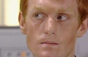
It was the opinion of CzechOut and others when making these guides that the SINGLE MOST IMPORTANT FEATURE ON THE HUMAN BODY... was the eyes. It was very important that any reader on any platform be able to immediately see the eyes. This was so true that it was suggested that cropping the hairline and chin of infobox photos was for the best.
I think this looks horrible, and is a photo technique used by no one else on the planet. Look at the infobox image for Vislor Turlough. It looks bad, it doesn't accurately show what Turlough looks like, and indeed even a hard-core fan might need a moment to recognize the actor. According to the framing, the most important detail is the lack of eyebrows and the pale skin. Maybe it's Matt Smith? If I could just see his chin and hair, maybe the distinction would be more obvious. :/
The eyes are not always the most important feature, and it should not be our official policy that infobox images shouldn't show an actor's chin or hairline.
When it comes to what is important in an infobox image, it really should be a case-by-case basis. Like, Fourth Doctor should have the hair and scarf in the image. Ninth Doctor has the Dalek in the background for obvious thematic reasons. Rarely is the most important thing the eyes, nor is it typically the same across every image.
TURN LEFT
Okay, so this is a big one that might initially appear a little blasphemous. I've taken some graphic design courses since I started on this wiki, and I have never had someone repeat to me the rule about all images facing inside of the design. Like, I've never never never never had someone tell me "the person's face must never face away from the book's spine because then the reader will remember that reality exists and they'll close the book." Never.
So I do think it would be a good idea for this being our official preferred policy to be retired.
Colour Comics
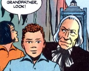
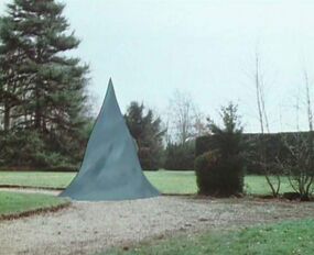
According to our official policies, this image is actually banned.
So this has been one of my big disagreements over the past decade with this guide. If you're out of the loop, I'm talking about: "No colourisation allowed". So why is this disagreeable to me?
Well, let me put it like this. A few years ago, on a forum which sadly wasn't archived at all, we had a mini-debate about SPECIAL EDITIONS! (The Five Doctors, Dalek Invasion of Earth, a bunch of stuff on The Collection, etc) And it was the concluding opinion of CzechOut (again, to my memory, since that era is gone) that it didn't matter. We, as a wiki, should count all episode editions as valid, and we should use whichever image looks best at a thumbnail level.
If this is the case, why do we ban the use of colourized comics? If a colour comic, published officially, looks better at a thumbnail size that the black-and-white original, I think that's what should be used. This is also an impractical rule due to how obscure some first edition comics are.
For instance, I (as an American) collect old back-issues of TV Comic. Let me tell you that these issues are so rare and hard to get that it isn't even funny. And the reprints featured in Doctor Who Classic Comics are gorgeous and much easier to get a hold of, but according to our own rules they aren't good enough. If you don't have a hyper-obscure first-edition copy of some comic from 1965, you're out of luck because the reprint is banned.
Basically, I think this one needs thrown out immediatley.
Separate rules for out-of-universe images

This has come up recently in the edit history of the image used on Rafe Wallbank. Basically, some editors on this wiki believe that images used on out-of-universe pages should have separate rules from those on in-universe pages. That is, the basic standard for cropping and framing, and what sort of images we use.
I am inclined to agree with this position. Looking at Rafe's page, it is a little silly that he's framed like one of the main Doctors, and cropping it just hides extra details in the photo.
One Image Per Section
This is a rule I don't think used to be here, and I personally think it's not needed. This made sense back when we were combining of all of the Master's pages into one, meaning the page was the length of War and Peace and was likely to blue screen your laptop
Since then, bandwith standards have increased around the world, and I haven't had a problem with the site in ages. Most loading issues I used to have were more about there being too many ads, which isn't even something we can control!
So I think we should replace this with the more practical and easy-to-remember maximum of "one picture per paragraph." I think most editors can see when a section is too bloated with images just by looking at it, so really it's just a thing of case-by-case discretion.
Allowing promotional images
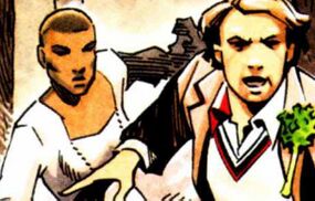
So I thought I would include this one, since it's a rule we changed years ago, and I think it's generally been for the worse.
Basically, for characters/stories/moments who didn't otherwise have illustrations (stuff from audio/prose mostly) we used to allow promotional artwork, mainly the miniature comics printed in Doctor Who Magazine. But years ago, we had another debate in another unarchived forum, and one of the admins came to the decision that because "advertisements are not stories," we would discontinue this policy.
I think this has been a mistake, as do others, and I'd like to make this part of our official policy once-more.
To be more precise, I think it would make complete sense for the Wiki to cover promotional images from DWM previews, slideshow-y BF video trailers, and so on, which are essentially illustrations that happen to be released separately from the story they illustrate. Sure, they're not exactly "part" of the audio story, but neither are images cropped the cover, or illustrations from the booklet, and we already allow these without trouble, considering them an accessory to the story.
Tabbed galleries in infoboxes
Since we are now adapting the use of Tabbed galleries in multi-incarnation characters like The Master or The Doctor.
It's been suggested by User:Scrooge MacDuck that we could also use this for other uses, such as non-regeneration recasts. The obvious example is that First Doctor could have a main image for William Hartnell, then you click on the other tabs and there's also images for Richard Hurndall and David Bradley.
I can think of a ton of uses for this right away. Maybe Oswin Oswald could have a tab featuring her as a human, and another as her as a chained-up Dalek. Maybe Hob could have a pre/post Erdrich horror tab system. etc.
Galleries
Since this already covers a lot, I thought I'd thrown in another quick recommendation we have in TARDIS:Temporary forums that is quite popular.
By User:MrThermomanPreacher and with 13 supporters:
The usage of galleries on in-universe articles in the same vein as Memory Alpha (example).
MrThermomanPreacher ☎
I'm old enough to remember that we did use to do this. I don't really go one way or the other about this, but I do think this would make the site a lot more appealing and approachable to more casual fans.
One suggestion I've heard just today is that we could have a /Gallery subpage system. Similar to how we have things like Ninth Doctor/Appearances and Death's Head/Appearances. This could be a really cool way to bring in newer editors who love to contribute but don't want to just write essays all day.
File Size limit
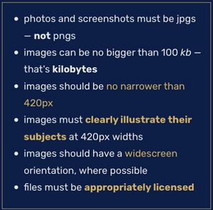
Finally, comes the big one. File size limit. This has long been a struggle on this wiki, as we are requested to stick to a file size limit of 100kb, while also being asked to post images above 250px wide. Having to use third party software to compress images is a major pain and is not user-friendly.
At the end of the day, Fandom has a file size limit of 10MB. So if the company investing money into us don't have a 100kb file size limit, neither should we.
Conclusions
I believe that A) we should probably start our image guides from scratch, B) we should consider new sensibilities based on what's best for fresh-faced readers, and C) many of the rule changes above should be taken.
OS25🤙☎️ 22:27, 21 February 2023 (UTC)
Discussion
Largely uninterested in this, don't do much with images. Will read what's going on though. With that said, my opening positions are this:
- I slightly prefer images looking towards the main body of the page but don't think it should be mandated if the other image is better. List it in the policy as something explicitly to be considered as a reason to choose an image but not disqualifying? imo.
- Don't really care about the IU/OOU issue, but I think it's a bit silly that the issue came about given that Rafe Wallbank intended his unedited picture to be used. (I also think that 1 month blocks are, in general, excessive unless repeated after the user has recently been blocked. But that's a larger concern I have with blocking policy here.)
- Unsure about promo images for audio, slightly lean towards? Complicated feelings.
- I'd like to see examples of galleries before I comment, the examples linked at MA don't have clear analogues here.
- File size limit absolutely needs to be upped, but idk if going all the way to the fandom limit is the best idea. (Of course, given how many ads they stick here, we could make sure we drain em for all they're worth.)
Najawin ☎ 23:29, 21 February 2023 (UTC)
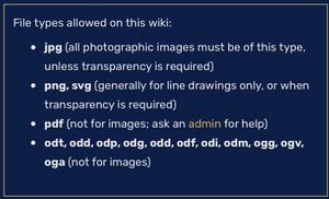
- I support this proposal, but I would add an addendum regarding filetypes. Promotional photographs and screengrabs should be exclusively .JPEG files and illustrations can be either .PNG or .JPEG. If we're implementing galleries, we ought to have a standard of some sort. NoNotTheMemes ☎ 23:35, 21 February 2023 (UTC)
- Brilliant work OttselSpy. I completely agree with all of this. It’s something that needs to be changed. The sooner the better. The wiki will be all the better for it. Although, one thing you did not mention was the rule of strictly JPGs. While we should not go crazy and wildly just allow any file type, I think it would do nicely if we’d allow PNGs to be used as well. It is a pain to have to go through a third party just to change what is arguably a completely fine file type, the PNG, to a JPG just because the wiki rules require it. It’s an outdated system. Danniesen ☎ 23:40, 21 February 2023 (UTC)
A quick correction to what's in my post. I say above that the minimum width of an on-site image is 250px, but I forgot that it's actually 420 now! Which is even worse considering the file size limit. OS25🤙☎️ 23:59, 21 February 2023 (UTC)
- Eh, it’s fine. No one can keep up with everything going on here. Danniesen ☎ 00:04, 22 February 2023 (UTC)
- I think I support all the proposed changes. I admit that I'm not as enthusiastic about some as I am about others, but I have no objection to any of them.Time God Eon ☎ 00:17, 22 February 2023 (UTC)
I support all of these proposed changes. Quite frankly, our image policies are a mess, and are in desperate need of modernization. Pluto2☎ 02:12, 22 February 2023 (UTC)
- I too support all of the proposed changes, including the filetype loosening and especially the cropping and widescreen and
[[/Gallery]]subpages and colour comics and ... well, and all of it! Great opening post OttselSpy, can't wait to see this omnibus of much-needed fixes pass through! – n8 (☎) 02:19, 22 February 2023 (UTC)
- I just want to chime in with a bit of technical insight and say that the images that get uploaded are technically not the same ones that end up on articles anymore (they would have been when these rules were first made). When you include an image and give it a specific width of, say, 120px, the server will actually resize the image and load that instead of the full-sized version. It will also convert the image into a format called WebP, which is just a super-optimised format for images online, and so the file size is going to be a fraction of what you upload it as. This means there's not really a technical reason to have any limitations on width (at upload-time), nor on the file size or even file format, because all of those have changed when the image actually ends up on a page. guyus24 (talk) 04:42, 22 February 2023 (UTC)
- I support all of the proposed changes, especially including tabbed galleries on non-overview pages, like First Doctor having all his TV actors, and Oswin Oswald having human and Dalek appearance. Additionally, I think this could maybe allow us to show a doctor's two main outfits, like blue and brown coat for the Tenth Doctor, and normal and purple for the Eleventh. although I understand if this is "too far", and am happy sticking with just everything outlined in the post. 82.132.245.154talk to me 07:50, 22 February 2023 (UTC)
- I also support everything that is being proposed. It's been a long time coming. Dmitriy Volfson ☎ 09:00, 22 February 2023 (UTC)
I hugely support everything being suggested in this thread. The wiki has a few outdated rules and regulations, and I think - like with the new tabbed galleries on various pages - overhauling the current guidelines would help freshen up the wiki.
My biggest bugbears as a reader of the wiki have been the insanely cropped close-up widescreen images, and the notion that every subject has to be facing left. I would say the "facing inwards/left" thing should still be a guideline but if there's a better image where the subject is facing a different direction, then that should be allowed and not instantly dismissed. An example of where these new changes would help is on Ian Chesterton's page. There's an ongoing discussion about the best image to use, but current guidelines are far too restrictive and result in us using (imo) a terrible image for him. If we could make it so images don't have to be cropped and zoomed into a face, and if there's at least an option to allow use of an image where the subject faces any direction, suddenly so many more image options become available for suggestion.
I also agree that out of universe pages should be handled differently, on a case by case basis.
All in all, I fully support everything in the OP. Just wanted to put forward a couple of thoughts on particular parts of it. Fractal Doctor ☎ 11:33, 22 February 2023 (UTC)
- Don't forget the file type thing just below that the OP didn’t feature. Danniesen ☎ 12:06, 22 February 2023 (UTC)
- I support op in all of their points especially the suggestion for a Gallery, which I believe is one of the biggest things this wiki is missing.Anastasia Cousins ☎ 12:21, 22 February 2023 (UTC)
- I also support the suggestion of changing policy so we can upload other file types too. Fractal Doctor ☎ 13:18, 22 February 2023 (UTC)
Regarding tabbed galleries in infoboxes, I'd also like to add that not only would it be great for recasts, but it would also be good for pages such as DWM 433 which had various different covers. It would arguably be tidier than a gallery on the page, and would let readers tab through the different covers with ease at the top of the page. Fractal Doctor ☎ 16:38, 22 February 2023 (UTC)
- That is an excellent point Fractal. I didn’t even think of that. While I was doing my overhaul of the DWM images (first issue to latest), it annoyed me that we didn’t have a system for adding multiple images (beyond "|image" and "|image2") to the infoboxes. To be honest this would be a better system than "|image" and "|image2" as it would make the infobox look normal sized rather than currently, which has one image on top of the other, making the infobox look like a tower. Danniesen ☎ 16:46, 22 February 2023 (UTC)
First of all, I wanted to thanks OS25 for this really good proposal. This is a subject very close to my heart, and I fully support this proposal. For the aspect ratio, cropping, and facing left issues, I frankly have nothing more to add. I think changing or even fully removing those would only make the wiki better. Honestly, I also think that not allowing official colorisation for comics is really a senseless policy, so I'll also be glad to see it go. As I view it, the wiki is also a place to gather visual information on Doctor Who, and well. Having a good quality, colored image to represent those comics seems like worthwhile information to have on a data base after all.
I don't have much of an opinion about an IU/OOU split, however I wouldn't be against having different rules. That Rafe Wallbank image really should not be cropped. Also, I think a general rule of one image per paragraph, plus allowing some leeway for a case by case decision if a page gets to bloated is a good idea, because we've introduced tabs, we've split the worst of the massive pages, and overall, having a few images on a page isn't going to slow down your browser, we're not in the early 2000s anymore.
Now!! I really, really want us to approve promotional images. It's incredibly difficult to find some older promotional material, and the entire point of view of "They're not stories, so they don't count" is really outdated, and I think, missing the point about what the wiki is. Having a place to see and collect promotional material would be nice. Same goes for tabbed galleries for infobox, it just is so incredibly useful, user friendly, and a good way to cover different incarnation.
The galleries, now that's the one subject I am rooting the most for. Tabbed galleries would be hugely beneficial to any users. Personally, I'm an artist who enjoys fanart, and the wiki is currently literally useless to gather reference for any character, unlike. Literally every single other wiki out there. It's a shame, but we can genuinely work on fixing that! As an example, picking a subject close to my heart, let's say we made a gallery page for Bernice Summerfield. It would be a tabbed page, and we coud organize it to cover her appearances in the various media she's been in. So let's say, one covering audios, featuring the audio covers she's one, one about book covers and illustration, one about comics, and one section about promotional material, that could cover both some photoshoot released by Big Finish when her ranged launched, some Vortex pictures, etc.
Of course, not every character would even get such a gallery page, and only the more major ones, like Benny, would have a more lengthy one. However, I genuinely feel this is an area where we are incredibly lacking, and one I've personally been annoyed about for years. I think making such galleries will become so much easier once we introduce this new policy too.
I also fully agree when it comes to file sizes, the limit we currently have might have made sense a decade ago, but it's rather ridiculous in 2023.
Overall, out of all the proposals we've had so far thanks to these forums, this is the one I'm the most excited for. I really hope we can makke this work! Liria10 ☎ 19:38, 22 February 2023 (UTC)
- The only part here I'm not too keen on is the idea of doing tabbed images for different actors on in-universe character pages. Recasts that aren't regeneration-related are supposed to be ignored. Everything else I'm game for. WaltK ☎ 00:11, 23 February 2023 (UTC)
- Perhaps the First Doctor wasn't the GREATEST example, since putting anyone but Hartnell in the infobox will be controversial. But that case specifically could go on a talk page. This is more about if the tabs should be allowed outside of regenerations as a base policy.
- A better example might be, say, Dave Oswald. OS25🤙☎️ 05:10, 24 February 2023 (UTC)
My feelings:
- Widescreen-Agreed
- Back Up-Agreed
- Turn Left-I agree with others that it's decent to have as a preference, but it definitely shouldn't be a major decision factor
- Color Comics-Agreed
- Separate Rules-No opinion
- One Image-I'm a bit hesitant about this, because paragraphs can be pretty small
- Promotional-Agreed in full, no mixed feelings
- Tabbed Galleries-Agreed, no hesitancy about in-universe concerns
- Gallery Subpages-Agreed
- Size Limit-I have no objection to just following Fandom's limits Schreibenheimer ☎ 12:03, 24 February 2023 (UTC)
- I support almost every proposed change in the opening post. The only thing I don't agree with is having different rules for in-universe and out-of-universe images. I feel that it is much simpler and more consistent to only have 1 set of rules for both. If we're already going to be changing the cropping policy to allow images to be cropped to whatever suits the subject best, I see no reason to have different rules for real and fictional people. Their respective images can just be cropped in accordance with this rule.
- 1 image per section is something that I'd particuarly like to be changed. To address Schreibenheimer's hesitance, 1 image per paragraph would be a maximum, not a minimum requirement for every paragraph. I feel that editors should be able to use their common sense here.
- /Gallery subpages are another thing that, out of everything else, is something I'd really like to see. This would make the wiki a so much more valuable resource for research, archival, presevertation and reference.
- Outside of the opening post, I also agree with allowing .png images for images that aren't transparent, although I think .webp images should be avoided. I also feel that we should be allowed to upload images at any width as the width will always be changed when the file is actually added to the page. Bongo50 ☎ 13:16, 24 February 2023 (UTC)
There are also some licenses we need that we don't have. Najawin ☎ 18:09, 24 February 2023 (UTC)
- Apologies if this makes things messy, but there's an additional idea/note I thought of after I wrote this OP that I think is worth quickly debating.
- Since we're talking about using promotional images for stories that don't have regular visuals, I'd like to make a suggestion. I think we should also set a precedent for using some promotional images for lost Doctor Who serials from the 1960s. This would be especially helpful for TV: Mission to the Unknown and The Massacre, which have no telesnaps. But there are also other episodes that don't have enough telesnaps for our purposes. Let's say, there's a character who appears in a lost story who doesn't have a surviving telesnap but does have an in-character promo image.
- So the idea is basically that if a promotional image for a lost episode of Who was clearly intended to be in-universe or consistent with the story, then we'll allow use on pages where they are needed. Hope this makes sense. OS25🤙☎️ 19:15, 24 February 2023 (UTC)
- This seems like a good idea to me. Bongo50 ☎ 20:14, 24 February 2023 (UTC)
- Me as well. In my mind, pictures are pretty much always better than no pictures, as long as they have some degree of officiality. Schreibenheimer ☎ 21:13, 24 February 2023 (UTC)
- This seems like a good idea to me. Bongo50 ☎ 20:14, 24 February 2023 (UTC)
Strongly disagree. I don't believe that out of universe reference images for things that are referred to in prose should be placed on articles. This is similar to articles where someone has placed an out of universe definition, which blatantly violates T:NO RW and I constantly find violations of that I have to remove. We do not know that something looks the same in-universe as it does out of universe. It's a violation of T:NO RW to suggest otherwise. Strongly, strongly oppose. Najawin ☎ 21:23, 24 February 2023 (UTC)
- To be clear, this is in reference to "In my opinion, every article on the wiki should have an image on it, of any kind, where possible." Not the idea of promo pictures being used. Mixed feelings on that. Najawin ☎ 21:25, 24 February 2023 (UTC)
- I realise that my message was a little unclear in that regard. I only support the use and inclusion of production and promotional pictures (and any other picture that has some form of official capacity and is directly connected to a work we cover). I do not support the use of real world images where they are disconected from a work we cover (apart from, perhaps, in behind the scenes sections). If you want general images for that, you can go to Wikipedia or Wikimedia Commons. Bongo50 ☎ 21:42, 24 February 2023 (UTC)
- I also was only intending to refer to in-universe concepts, not real world ones. I was interpreting "And we shouldn’t shun away non-in-universe images," to refer to things like promotional shoots. Schreibenheimer ☎ 01:25, 25 February 2023 (UTC)
- I realise that my message was a little unclear in that regard. I only support the use and inclusion of production and promotional pictures (and any other picture that has some form of official capacity and is directly connected to a work we cover). I do not support the use of real world images where they are disconected from a work we cover (apart from, perhaps, in behind the scenes sections). If you want general images for that, you can go to Wikipedia or Wikimedia Commons. Bongo50 ☎ 21:42, 24 February 2023 (UTC)
I agree with the proposal made by OS25🤙☎️ regarding 1960s stories with barely any surviving material. The example of the pic from "The Massacre" (Hartnell as Dr Who, Purves as Steven) in the tavern is representative of a scene from the serial and would work well. It's also a widely 'known' promo pic outside of this Wiki, and I think that's another reason why we should make some allowances. (What I would be against, however, is using imagery that strays too far - ie. just a publicity shot of Hartnell. The pic of Hartnell and Purves is arguably in-character, taken on one of the serial's sets, etc. so should be eligible for use in place of what would ordinarily be used if the serial existed. I would also say 'no' to any photoshopped photos, or mock-ups eg. a pic from the UCLAN recreation of 'Mission to the Unknown'.) Fractal Doctor ☎ 19:14, 25 February 2023 (UTC)
- Just relaying Epsilon's request that this discussion be kept open until after his block ends. In the old days of the forums discussions would go on for months, and with the switch to 3 week discussion periods, it's entirely possible to have a thread take place in span of what's generally the minimum block for a user. He's particularly interested in this topic and would like to offer his input.
- I don't think this request is unreasonable, but, then again, I think both the 3 week period is too short, and the 1 month usual minimum is too long. Najawin ☎ 22:35, 5 March 2023 (UTC)


